Arcserve specializes in data protection and recovery. As its Principal design leader for data driven and data security products, I created and maintained a company-wide design system that's based on Google's Material UI. I developed and maintained detailed design specifications, while meeting accessibility standards. This design system became the design standard across the entire company. Its achievement enabled designs to be clear, consistent, simple, and significantly enhanced project managers’ and developers’ work.
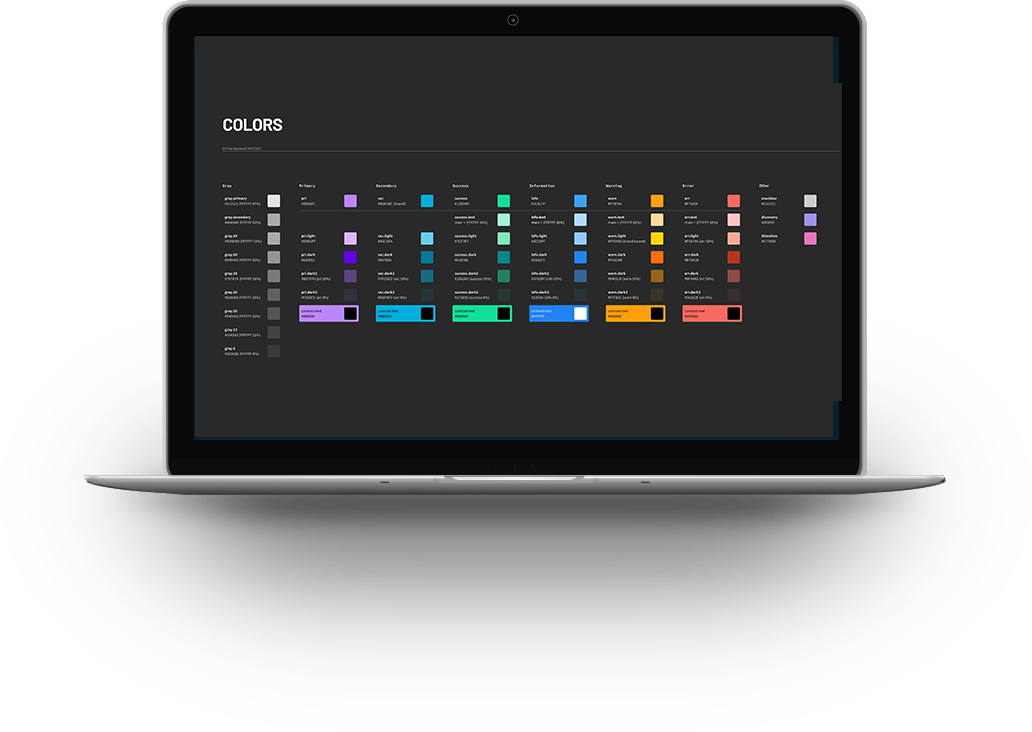
Arcserve had two primary colors that marketing was utilizing, but the existing design system only had one primary. Color differences made it challenging. For example, the brand's primary color marketing had been dark and saturated.
On the contrary, the existing design system’s primary color had a stronger hue. I had to experiment under various backgrounds and surrounding colors for light and dark and work. We ended compromising and went with what optimized our system.
The component design library was superfluous. It had many components that were not utilized not needed. I had to select the most relevant components and suit them to be optimal and trim down for the side system. I re-organized and categorized them to be more intuitive and simple. I fixed design errors, inconsistent labeling, sizing and accessibility issues.
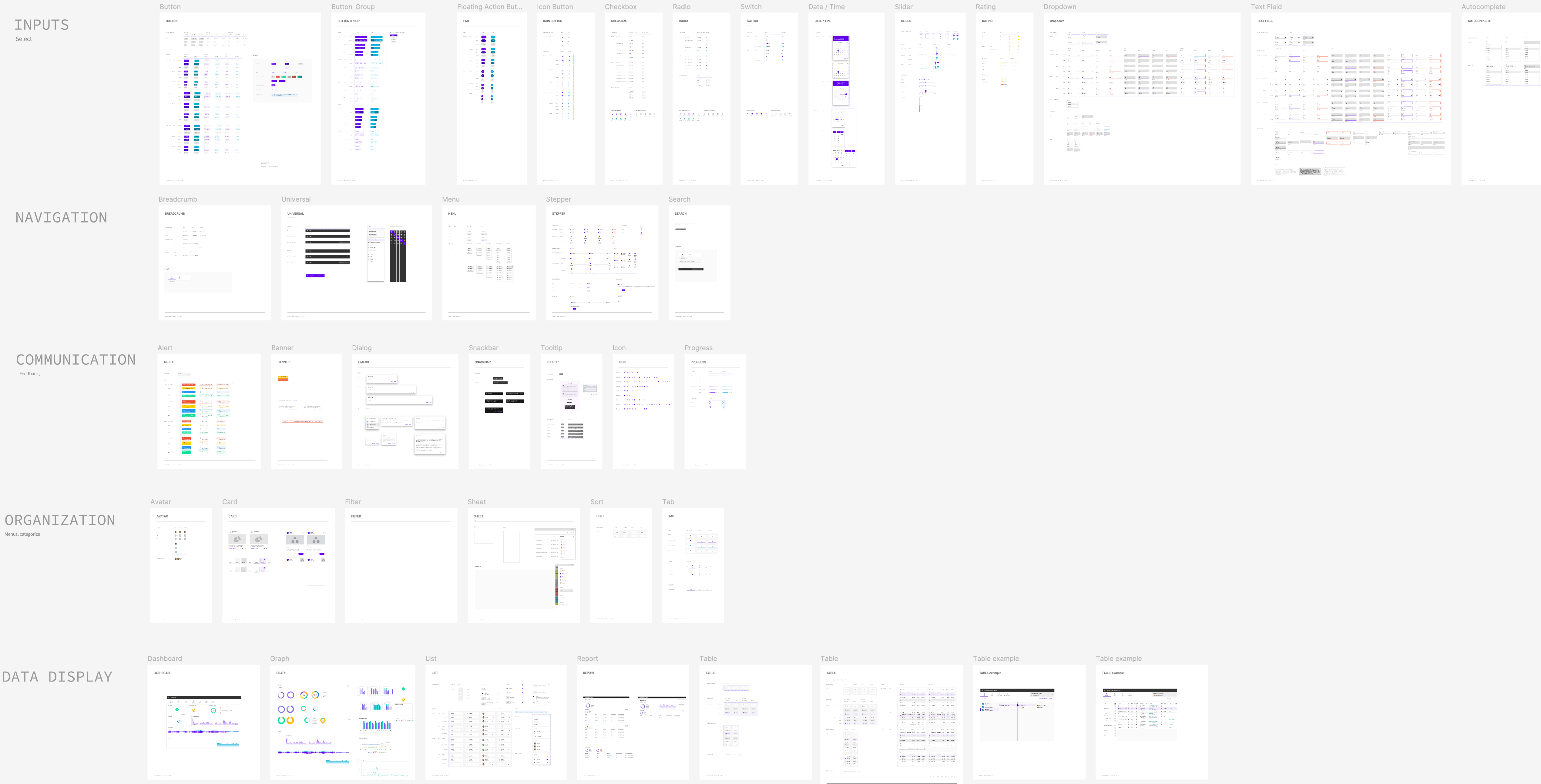
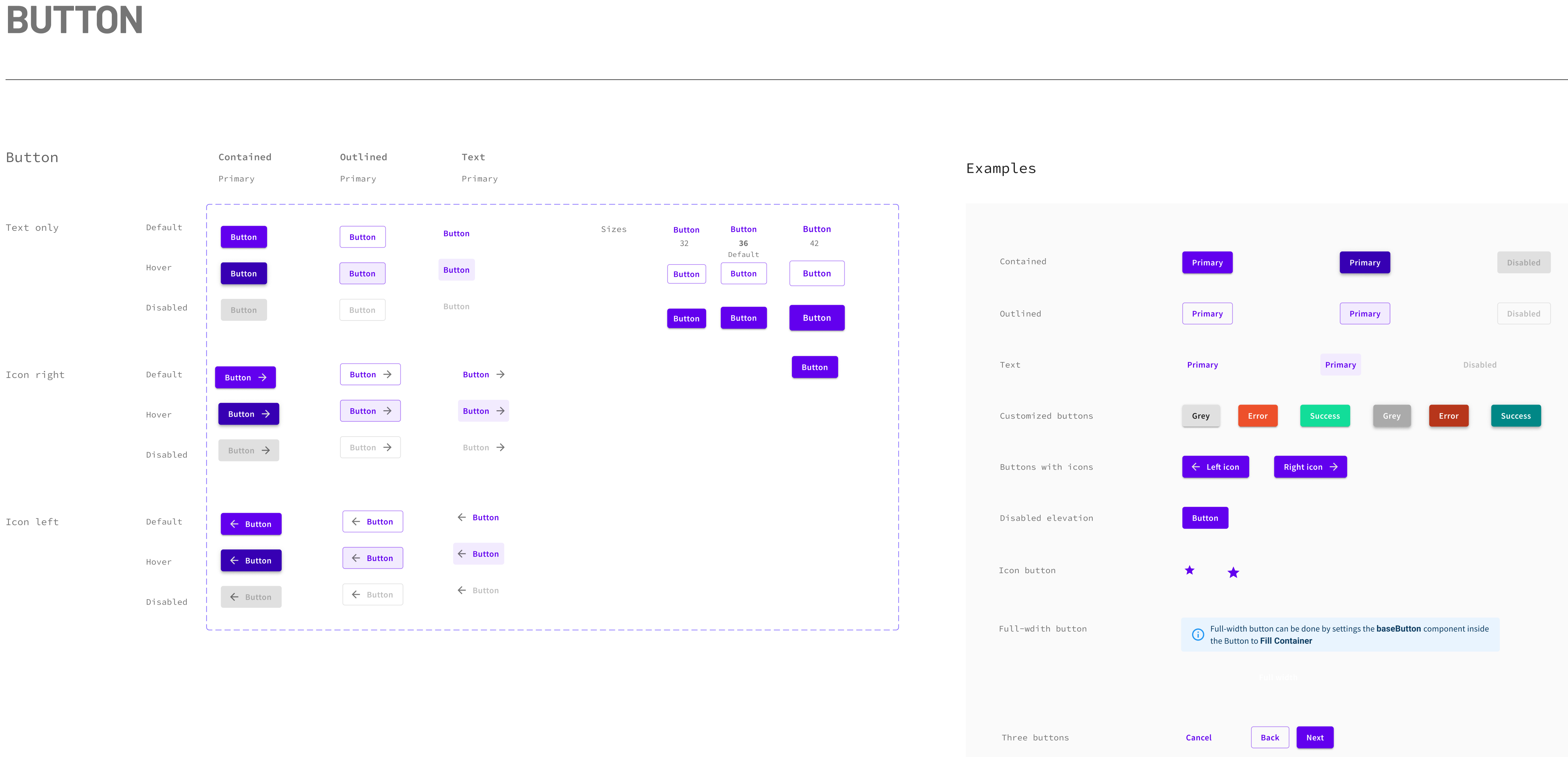
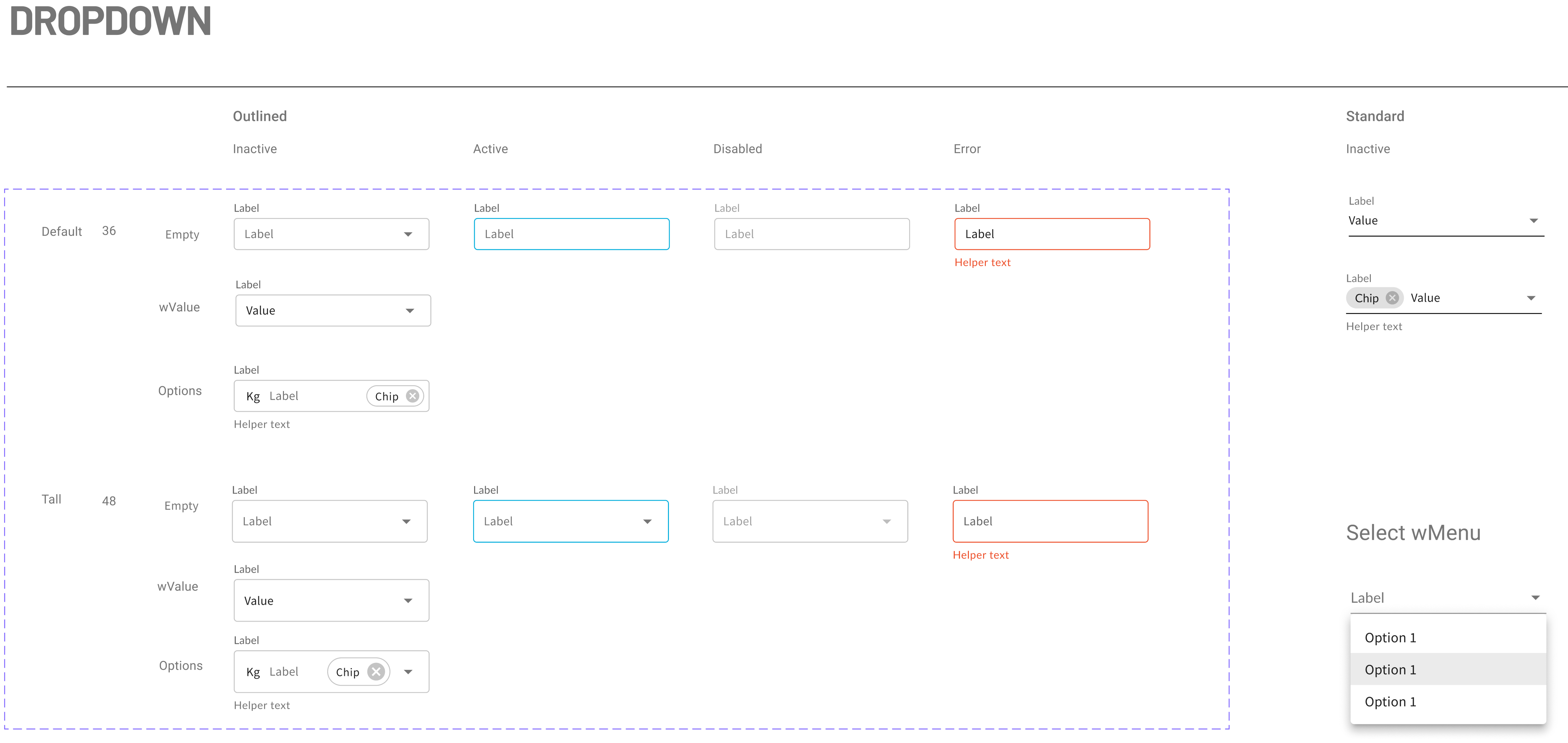
Colors and types were of top priorities. Components that were most used and immediately needed for projects given attention: buttons, text, drop downs, check boxes, filters chips were of top priorities. Others that were used less, such as slider and avatar were left for possible future improvements.
I only made modifications where they were really needed. Otherwise, they were left alone to be used as they were. I used icons from the Material UI, but also created them to be suitable for our data products Material didn’t have.


Since I decided to design for the desktop, I went with a grid style for 1440px width with 24px margin and 24px gutter.
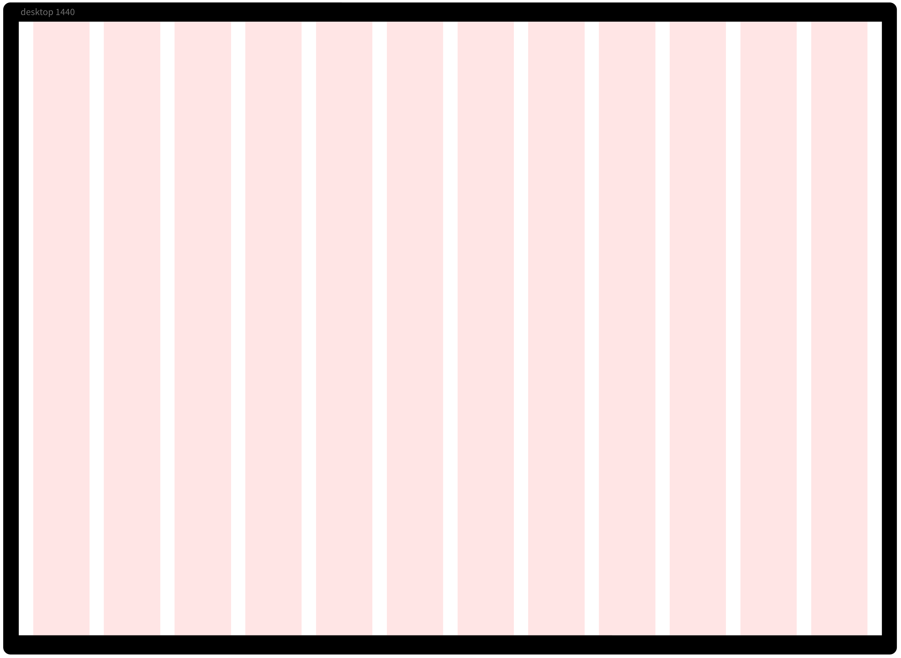

In 2021 Arcserve hired a third-party to assist with its design system. The team at that time utilized Google’s material UI design template. The template was good, it was vast and basic and its coverage. It was made for Google phone mobile primarily thus it had large interfaces and modules. Because our product is sophisticated with lots of data. It was most suitable for the desktop. It had to be adjusted for desktop use. I also adjusted it for faster prototyping by combining features within an object in some instances, allowing users to on/off features as needed.
The team who worked on it before only made some adjustments. Much of the design system needed to be improved to an extent, for the purpose of Arcserve’s use. Colors, types, layouts, components, graphs, had to be set up to optimize for design and for product managers, and developers to use them across the whole company.
Some of the behind the scenes of making the design system

In addition to some of the challenges I mentioned earlier, the previous design team did not work on the dark mode. At first, it looked like some of it was finished but it was too dark and had accessibility issues. When I investigated, I found that the team just put light components on dark backgrounds in most of the areas! I fixed that.
Several years before I joined, two companies merged under Arcserve. Each had their own design systems. I had to reconcile the two. Plus, they were different from company’s brand colors and type so I engaged with the marketing team who over saw company’s branding.
In spite of these many differences and inconsistencies I wanted to utilize what’s already in production as much as possible and did not want to fix unless it was really necessary. Engineers already had a lot to do so prioritizing was critical. I worked with engineering and product teams to optimize their resources. I had to balance the new with the existing and compromise where we could and focus on least effort maximum impact areas.
I successfully collaborated with the marketing team and came to agree on what would be most suitable for our products, feasible, and to design to scale. Colors, components, layout, etc. were different between what was in the design system with what was in production. I had to reconcile the two, set standards, and fix inconsistencies.
The establishment of the core design system I created had a huge impact on the speed of design workflows, consistency, component reusability, and estimation reduction. There was more I wanted to build out. For example, dark mode was partly finished.
Because my attention was needed toward urgent product builds, I had to suspend some to reengage at a later time. Overall design estimates for projects were lowered, leaving more time and budget to create additional pages and features as part of MVP launch, and to better market our products.