I accomplished designs and led a team of designers for Unified Developer Portal that uses Spotify’s Backstage.io. The portal is a central place for developers to discover, manage and contribute. The company-wide initiative that reduced the number of developer tools by 39%, created major engineering changes, and successful adoption of Backstage portal led to $42 million dollars in savings and productivity boost by its second year, and continued to grow.
I directed to create a unified vision and improve the journey of Expedia Group’s developers. I worked across teams, departments, and partners. The outcome simplified platform adoption, decreased time from ideation to real product, enhanced security, and improved financial performance of the company.
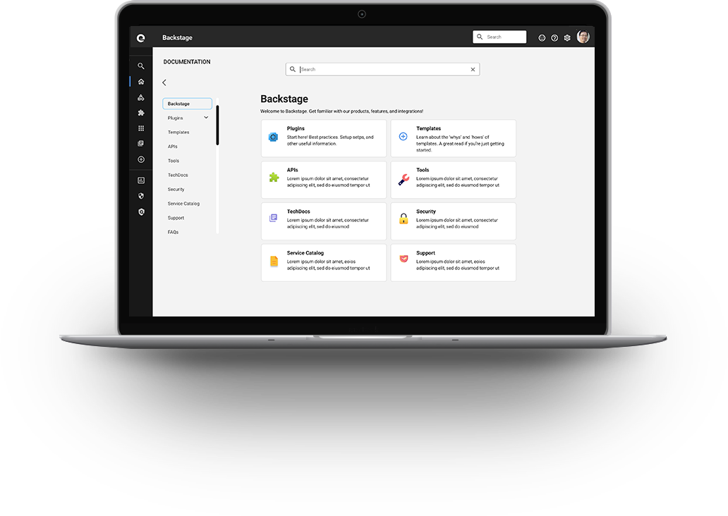

Expedia Group’s developers had many pain points across their development journey such as onboarding, search, access to tools, learning tech stack architecture, useful documents for writing code, etc.
The goal was to envision the future state of Backstage’s UX areas to solve key pain points across the developer journey. The emphasis laid heavily around its weakest areas: adoption and technical documentation.
For duration of the future state envisioning, I played the following roles:
1) UX design lead 2) UI designer 3) UX researcher 4) Product manager 5) Engineer
Over several years, product and engineering teams had identified initial personas, friction, tools, and process at a high level. They focused mainly on identifying problems. I was appointed as the lead person who’d provide solutions to those problems identified by envisioning the future state of Backstage
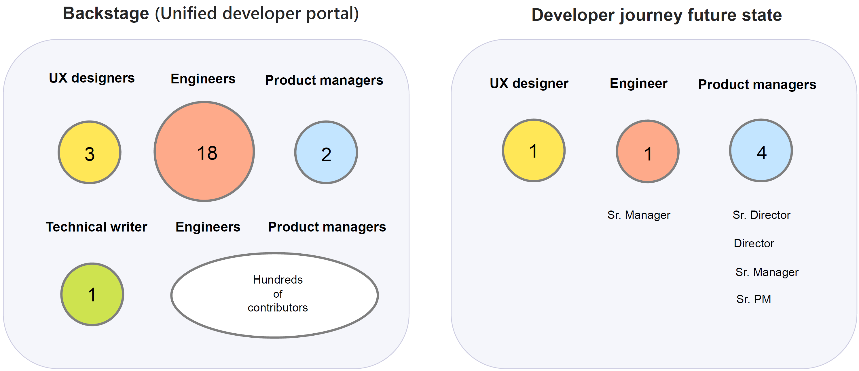
A steering committee (SteerCo) started with myself (Sr. UX Design Lead), several directors of product, and two UX designers. Product and engineering also came up with general ideas. I took mine and theirs to come up with more detailed flow diagrams as well as interactive Figma prototypes.
During a year period, Backstage’s future design envisioning happened in several phases - focusing on various needs that were deemed important. Toward the last phase, the steering committee evolved to myself, engineering manager, product managers, and product director.
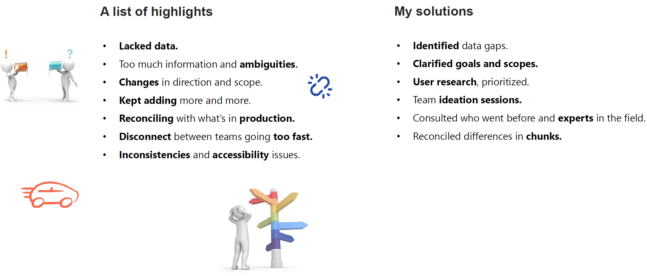
I led the steering committee and came up with not only greatly improved UX ideas, but UI, and some engineering as well. The process spanned across a year period with a good portion being accomplished near its end with key committees. I also provided design team resource estimation toward our efforts.
SEE IT
I kicked-off the one to five year vision by creating a product strategy document - a very high level overview. The document informed audience categories we’ll be working on:
FEEL IT
On a regular basis, I identified the most important things I needed to learn, and gathered information through direct interaction with potential customers. I had interviews and surveys, but also took measures via an analytics tool called Glassbox.
Different engagements occurred toward this effort. Toward the latter envisioning segment, I collaborated with my core team on a weekly and bi-weekly basis. Overall, the process went like this for me:
| Monday: | Identify the most important thing to learn this week. |
| Monday - Wednesday: | Interview customers. Use cases, market analysis, diagrams, prototypes, feedback. |
| Thursday: | Run further interviews with potential customers. Receive feedback from pms. |
| Friday: | Present design progression to stakeholders and leadership for feedback. |
| Synthesize learning. Run retrospectives about the week and what to cover next week. |
BELIEVE IT
The future state that was envisioned got confirmed through interviews and surveys throughout the planning process. These were done through various media: online forms, Slack, emails - performed by me, designers, and pms. They also will continue to be tested and iterated.
The design process for Backstage typically flowed in the following order. Based on my interaction with clients and research, I created designs one wave ahead of the development team. One wave was two months. I held meetings where design specs were discussed, and upon their initial creation, following discussions were conducted to ensure the product was according to client's needs and engineering teams' ability to deliver. After the development they went through the UAT process.
The future state envisioning's ambiguity and complexity led to an additional challenge. I took myself through deeper level design thinking and design system processes to engage them.
View a detailed Alex's design process.
|
Developer onboarding went from 3 days before committing a code (creating an initial test piece) to 5 hours. Consolidation of tools, major engineering changes, and successful adoption of Backstage led to $42 million dollars in savings and productivity boost by its second year, and continued to grow. Backstage design system I created promoted self-service model. Its successful creation and my collaborative persuasion toward its adoption helped lower designer resource usage by 30-35%. Future state designs were conducted via workshops and created. Features, codes, and UX contributions to the open source community improved the OSCI (Open Source Community Index) ranking from 167 to the 98. |  |
| Documentation (Figma) | Relevancy Governance (Miro) | Search (Figma) | ||
 |
 |
 |
Some of the needs were responsibilities of PMs and engineers. It also consisted of backend work. To aid this effort, I worked on providing solutions to enhance both frontend and backend - covering UX, UI, product, and engineering.
Here are some of my many future state ideas that materialized into diagrams and prototypes.
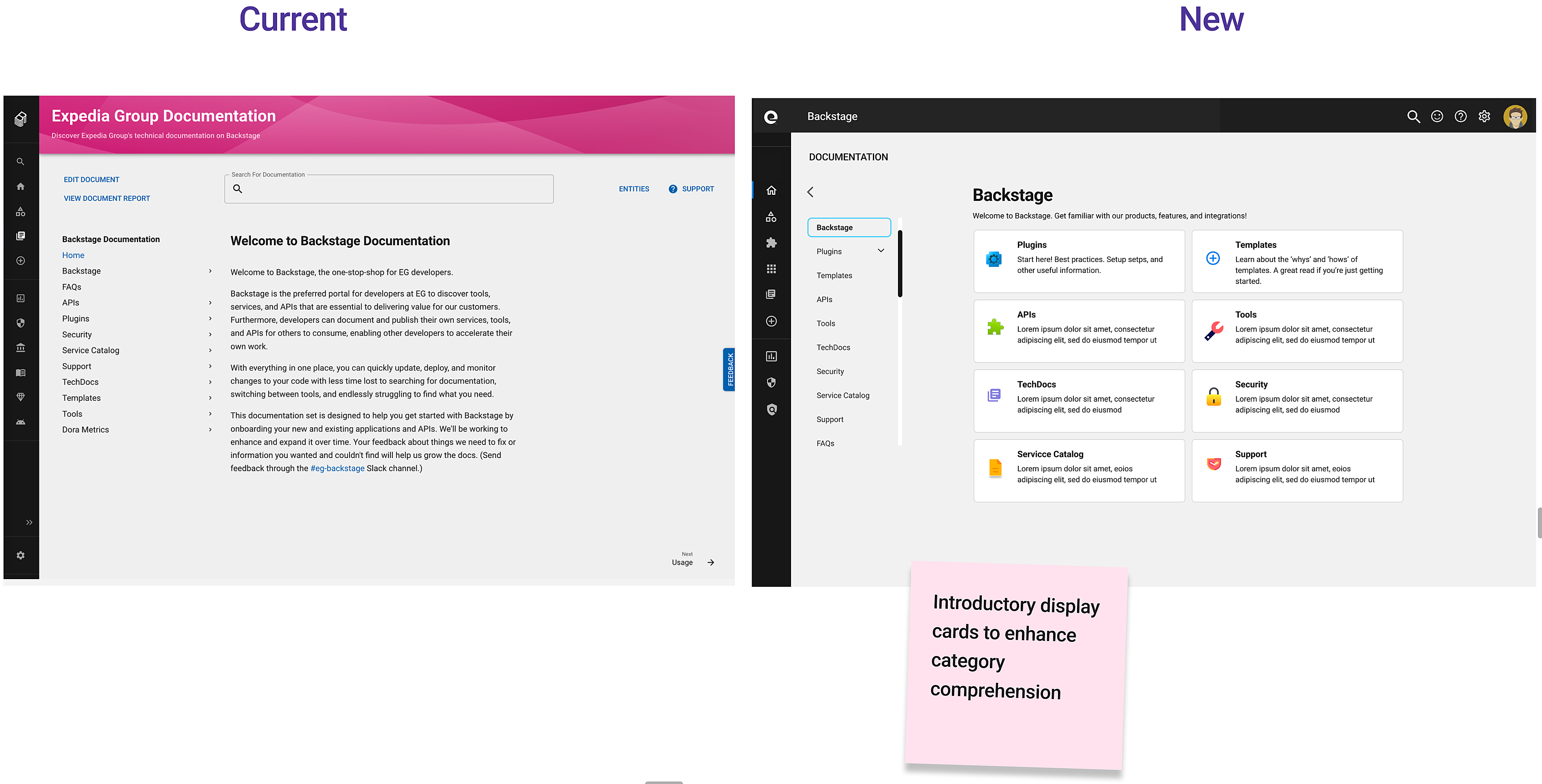
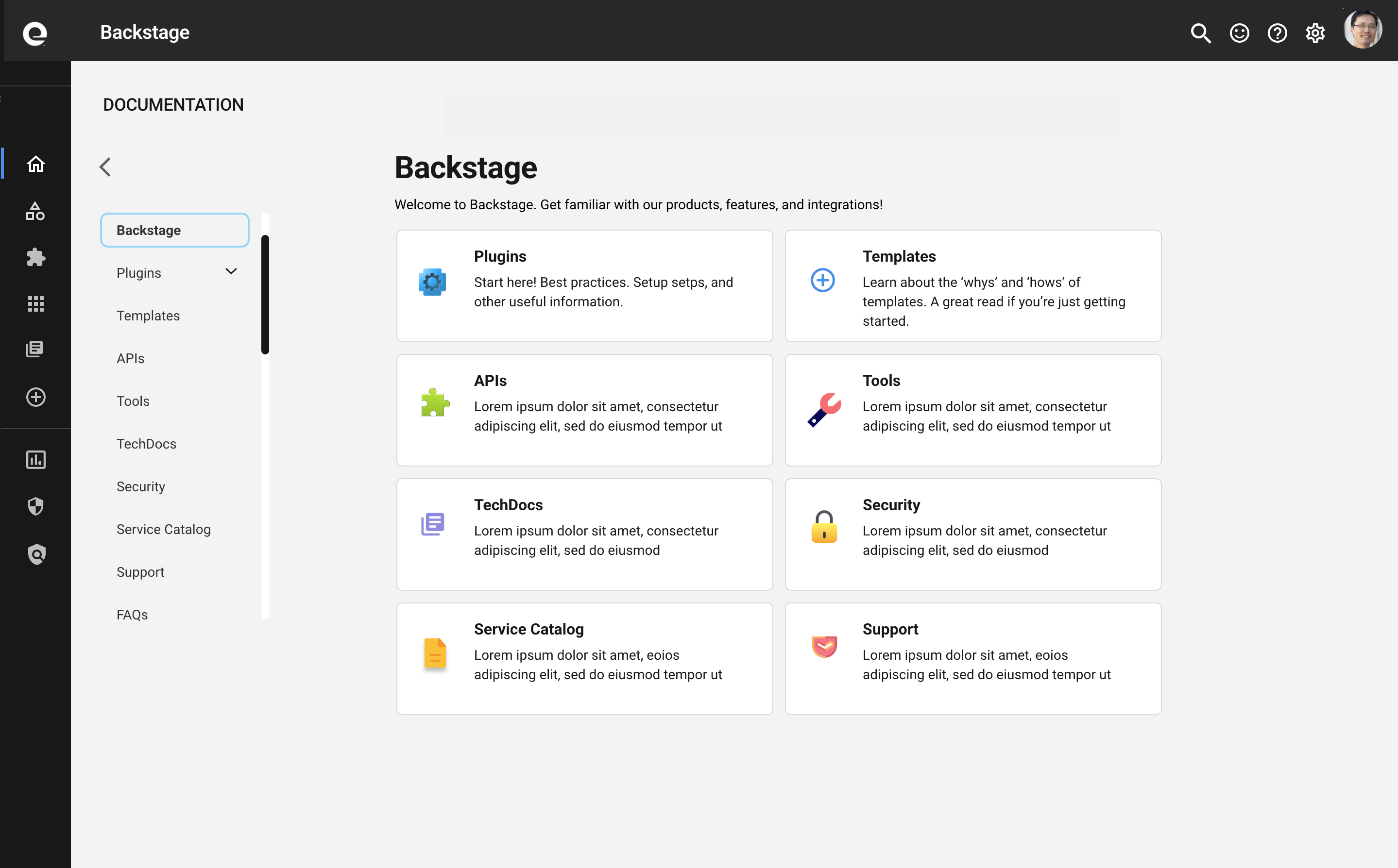
I simplified and improved the current landing page. It's more accessible.
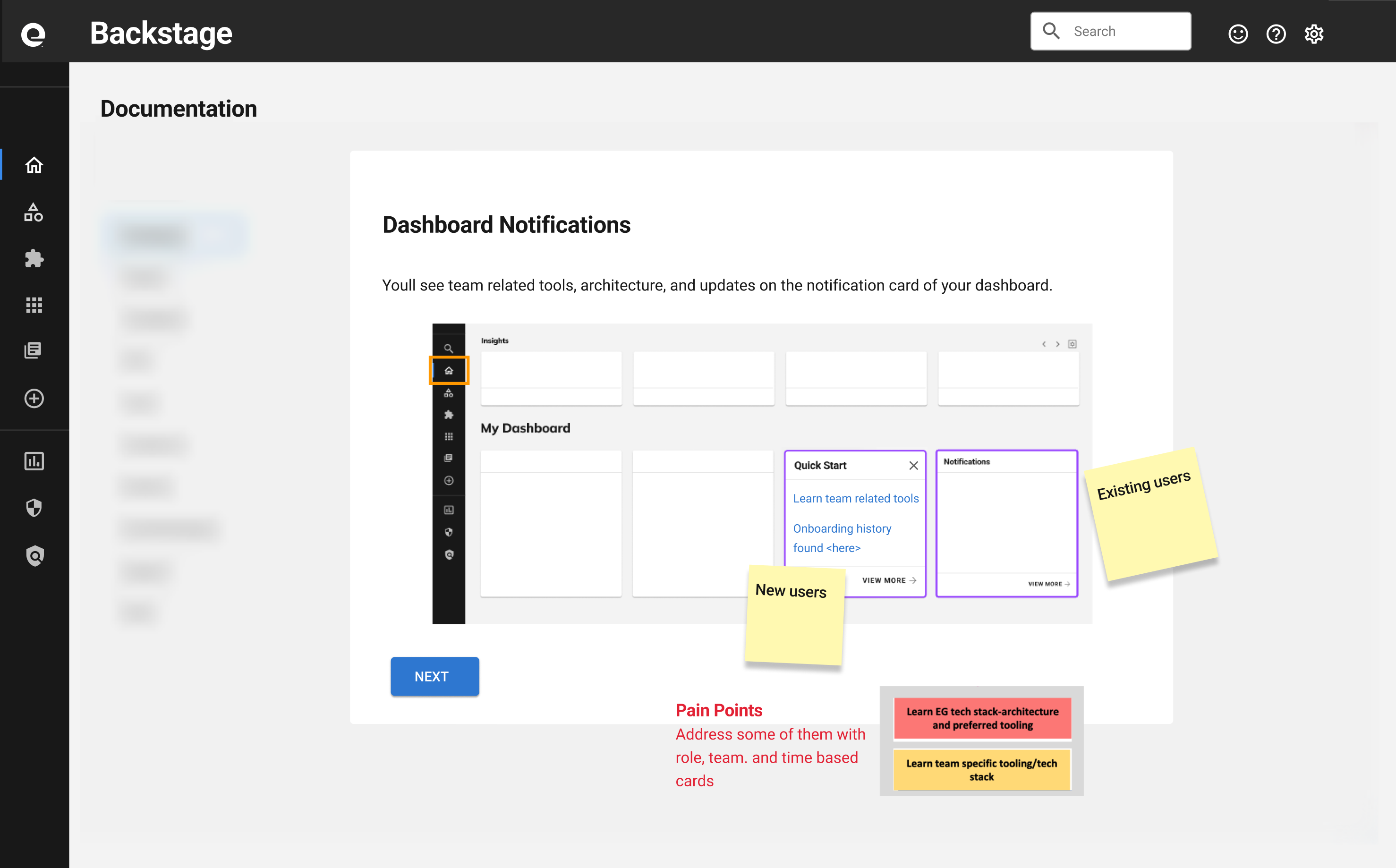
This addresses pain points of new members onboarding the dev community. Time based cards provide learning materials that are contextually relevant to specific users.
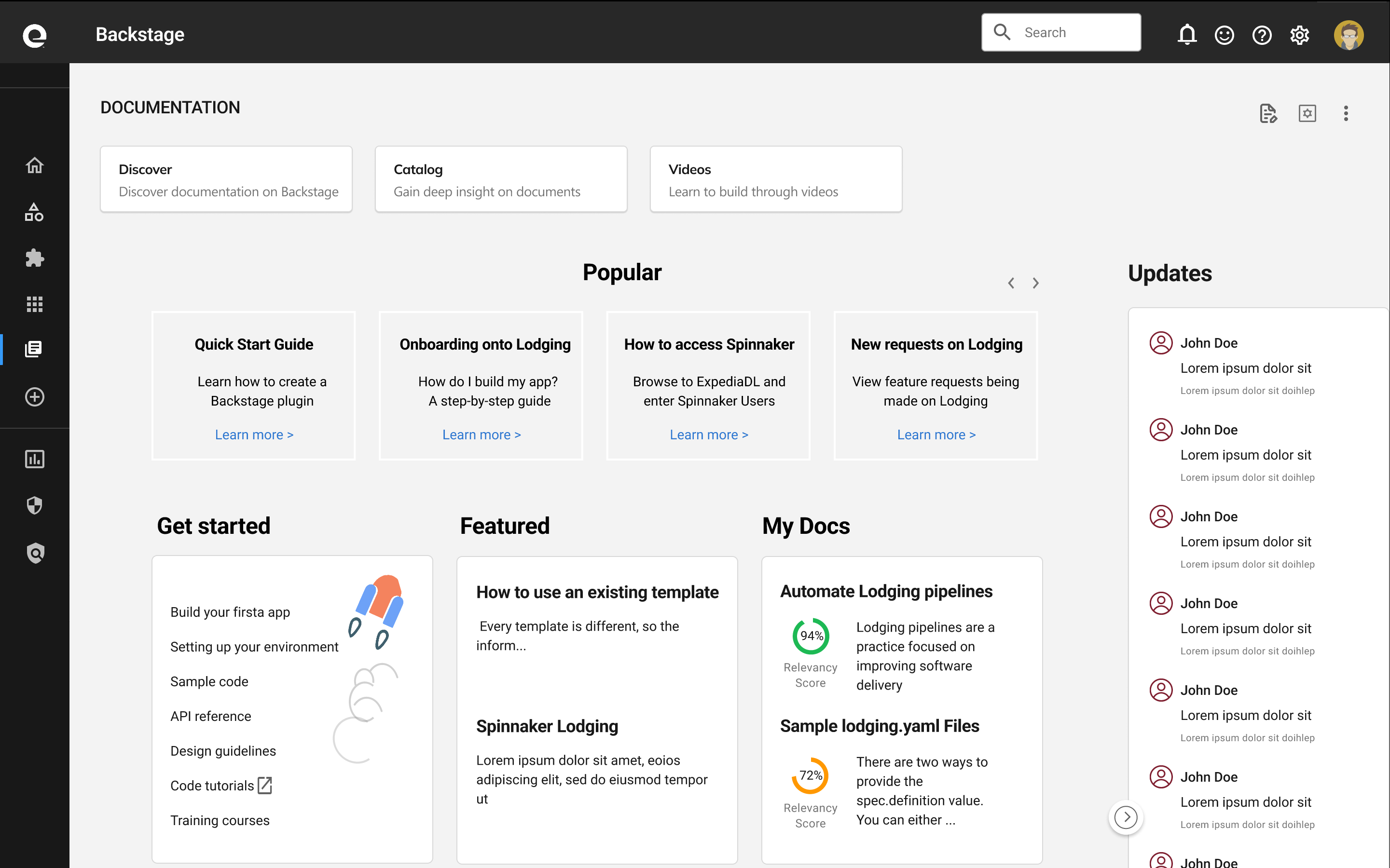
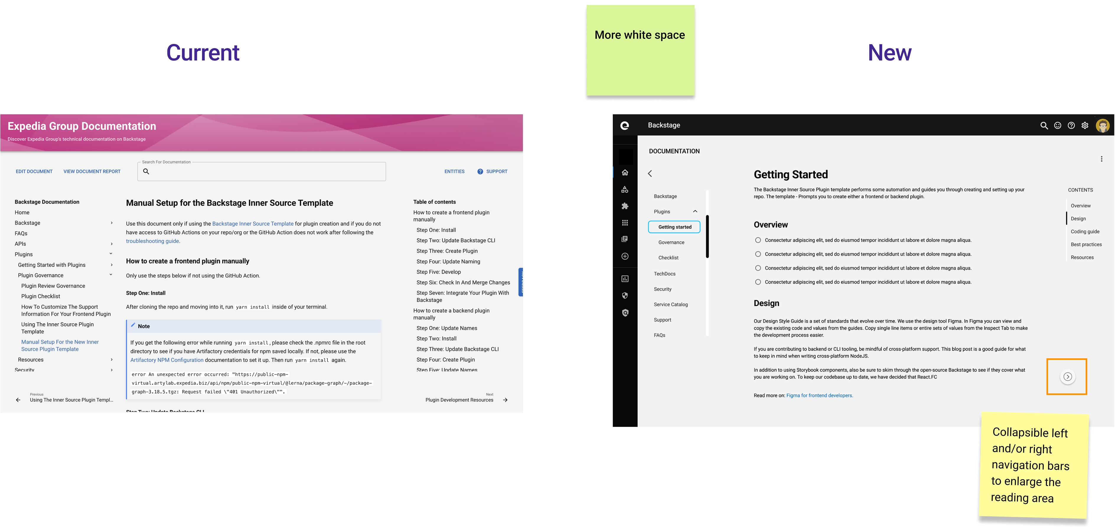
This is a new homepage for documentations. It’s designed to be highly customizable according to personas.

Document editing process was broken. Users were going through GitHub or editors such as MS Visual Studio. These methods meant codes had to be manually corrected. Another way was to use SSG (Static Site Generators) command line editors.
There were a handful of different ones developers used. These also posed problems because people didn't know about these tools, non developers had learning challenges, developers went with SSGs that were written in the language they were used to.
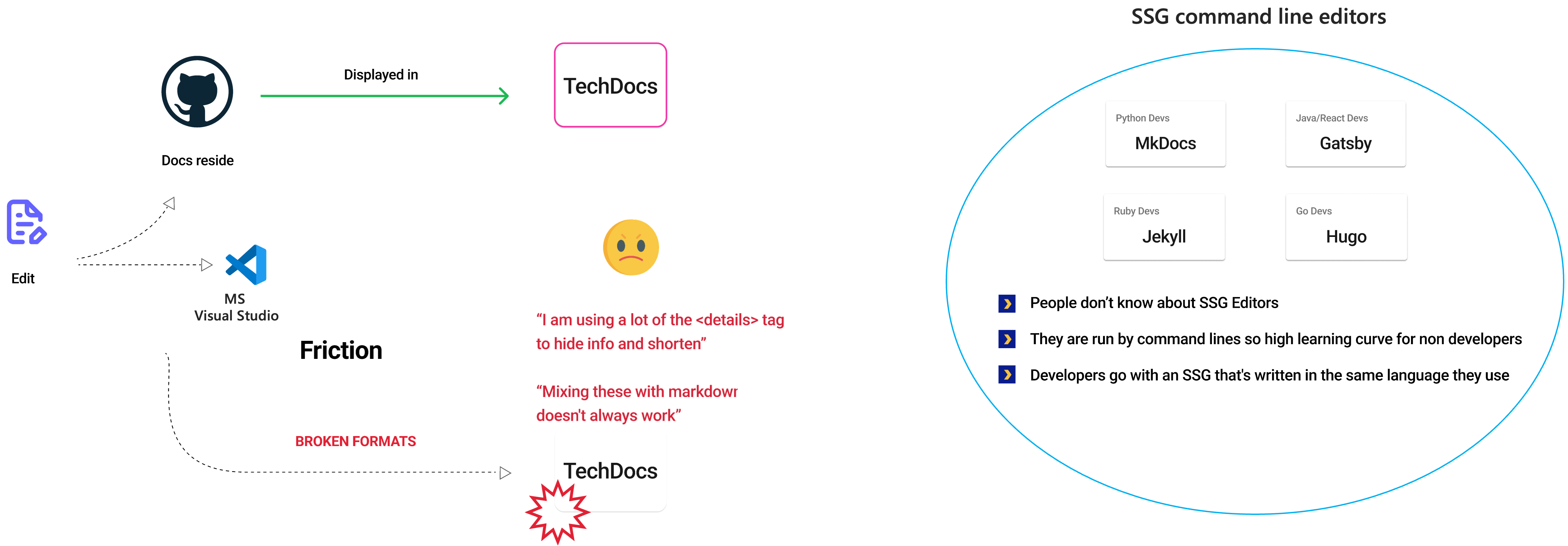
I proposed an editor with the following capabilities.
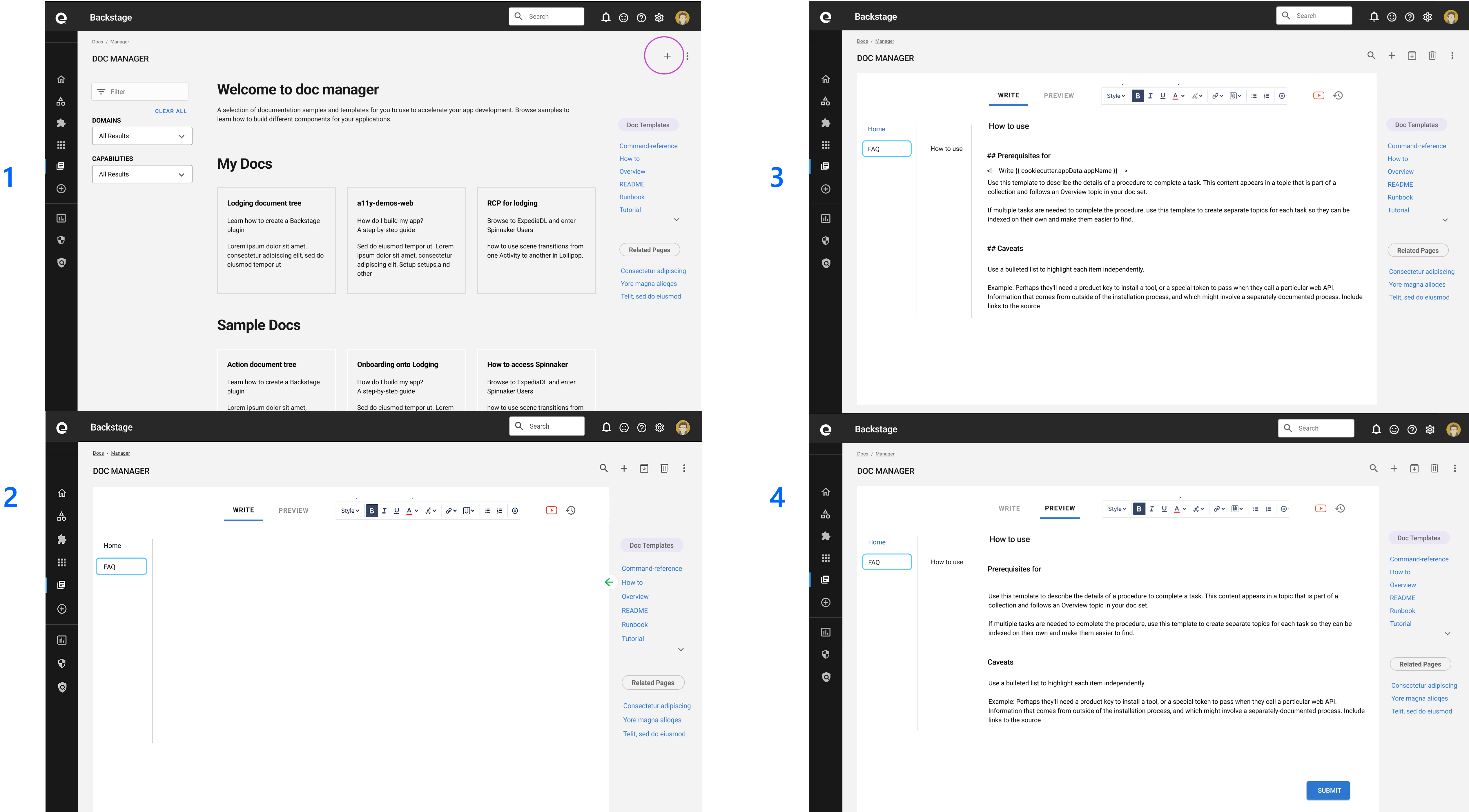
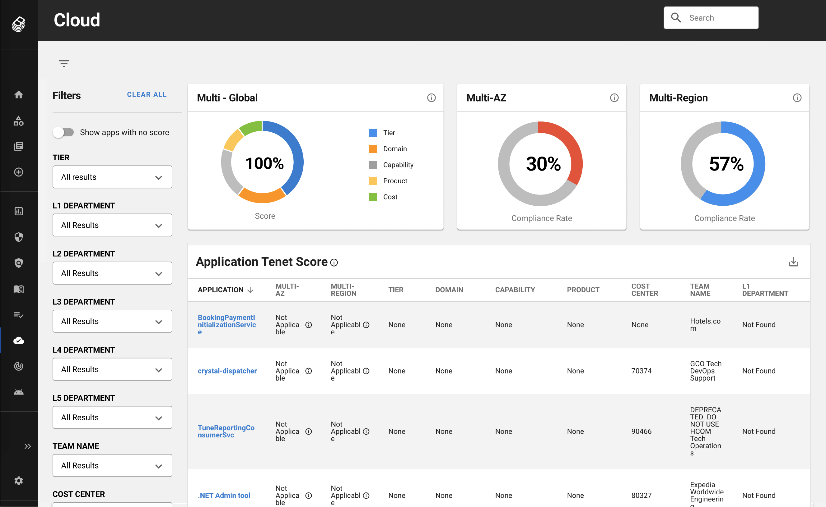
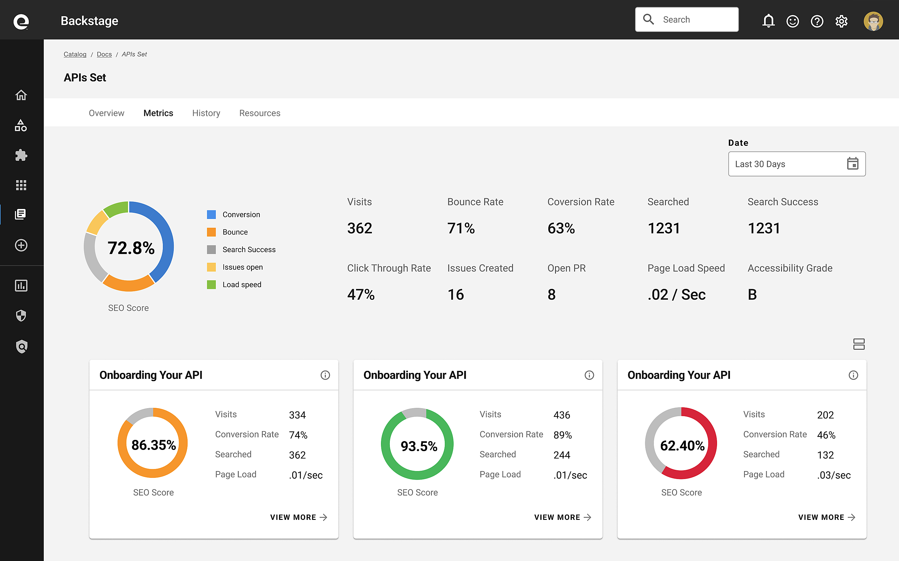
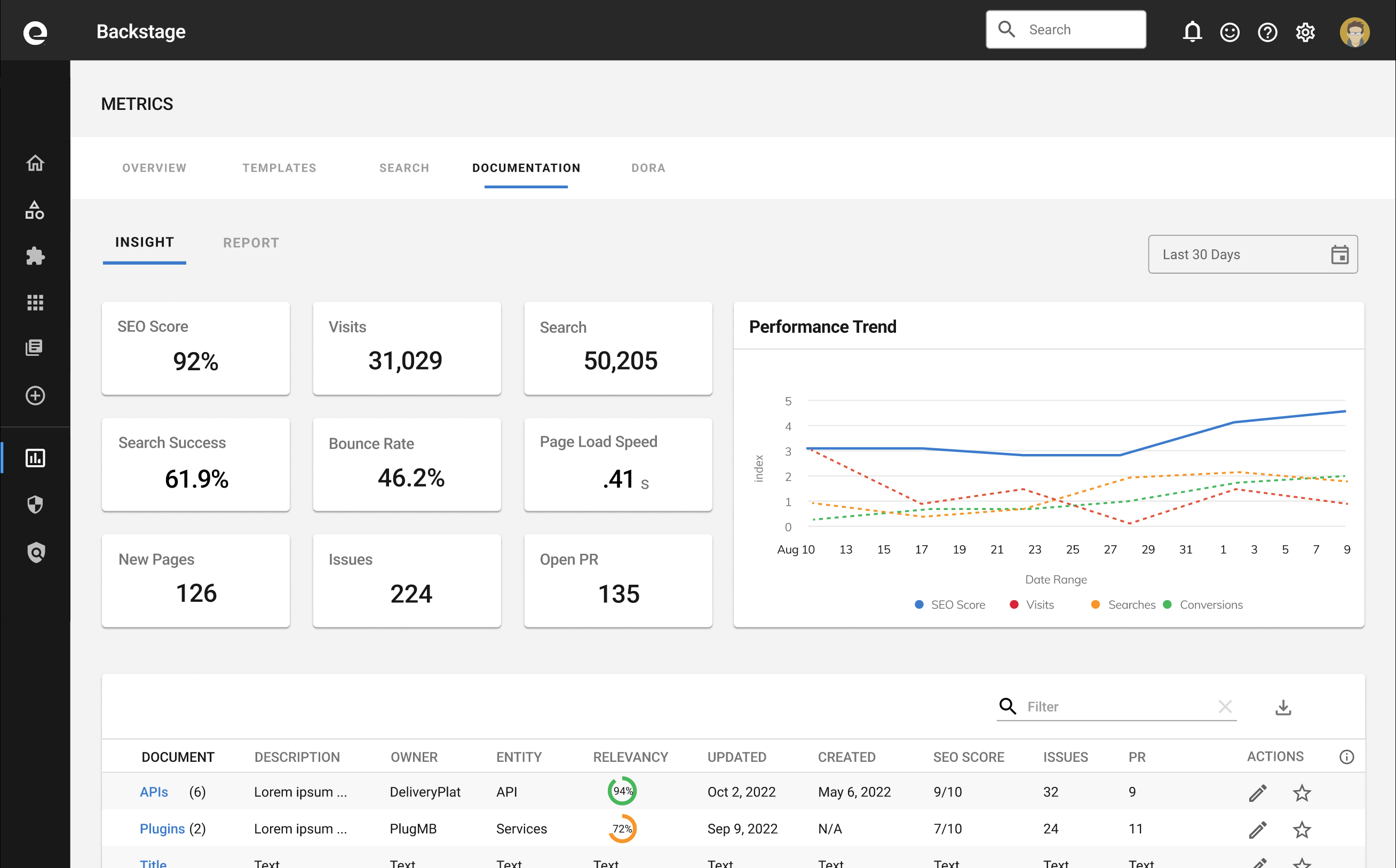
I ideated key metrics that’ll inform and empower users to glean insight on their apps and content. I also created this unique table design that allows the design to scale. Users can view data at a high level or drilldown to view details. It contributed to Spotify’s open source components and was an improvement to Spotify’s existing collapsible table design.
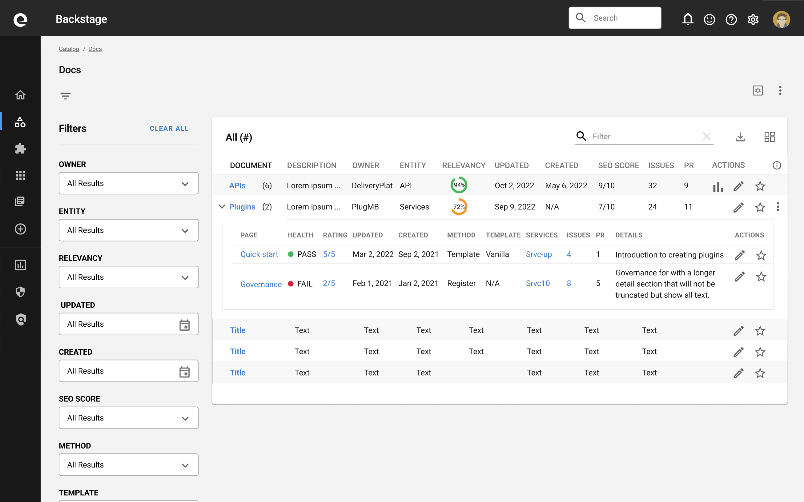
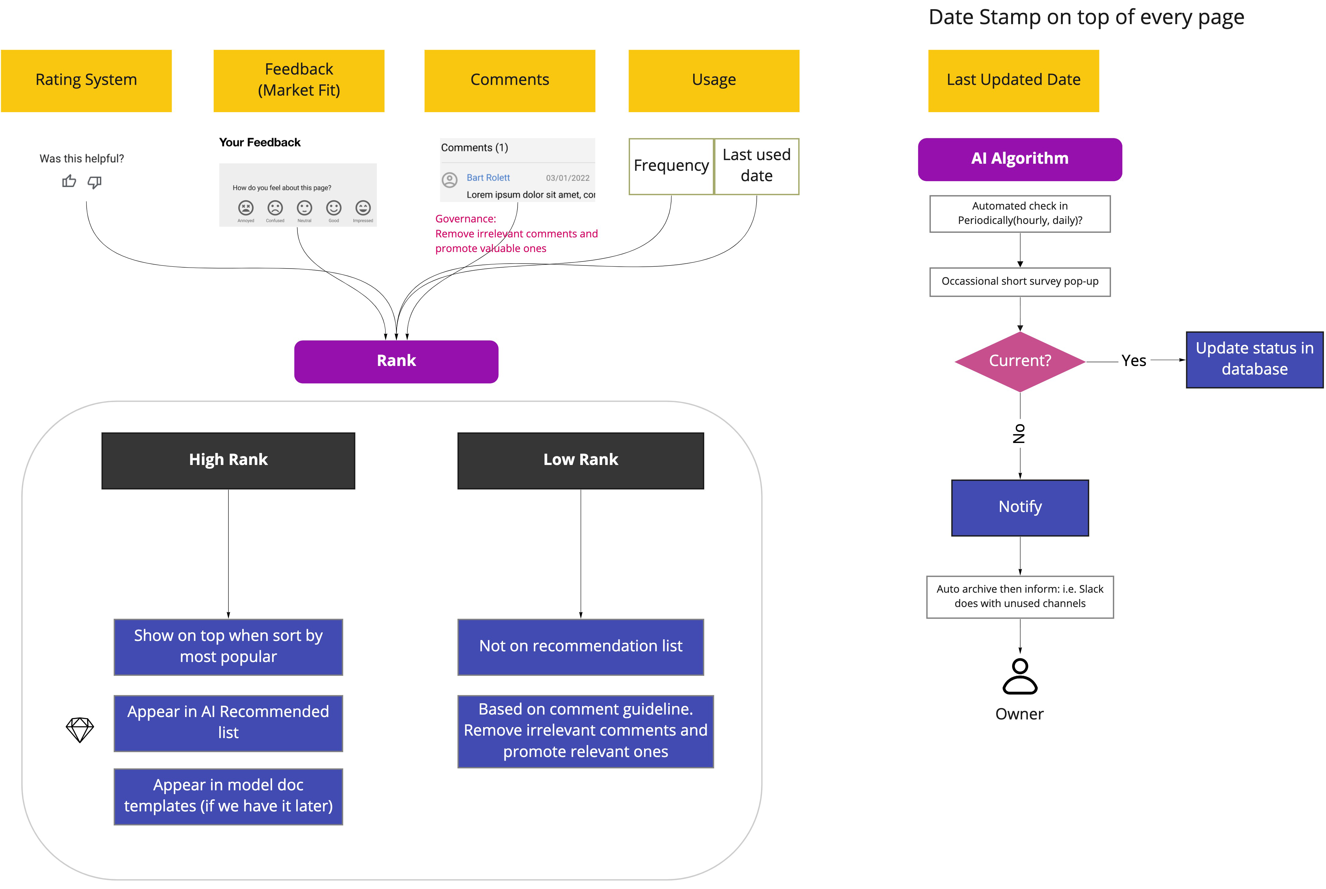
I created this process in Miro to improve the user adoption rate of Backstage and fail safe governance steps toward its success.
Users were going to other pages or portals to get information for various reasons. In doing so, they were wasting a lot of time. This process would reduce context switching and allow users to be able to find what they want from one location quicker with better outcome.
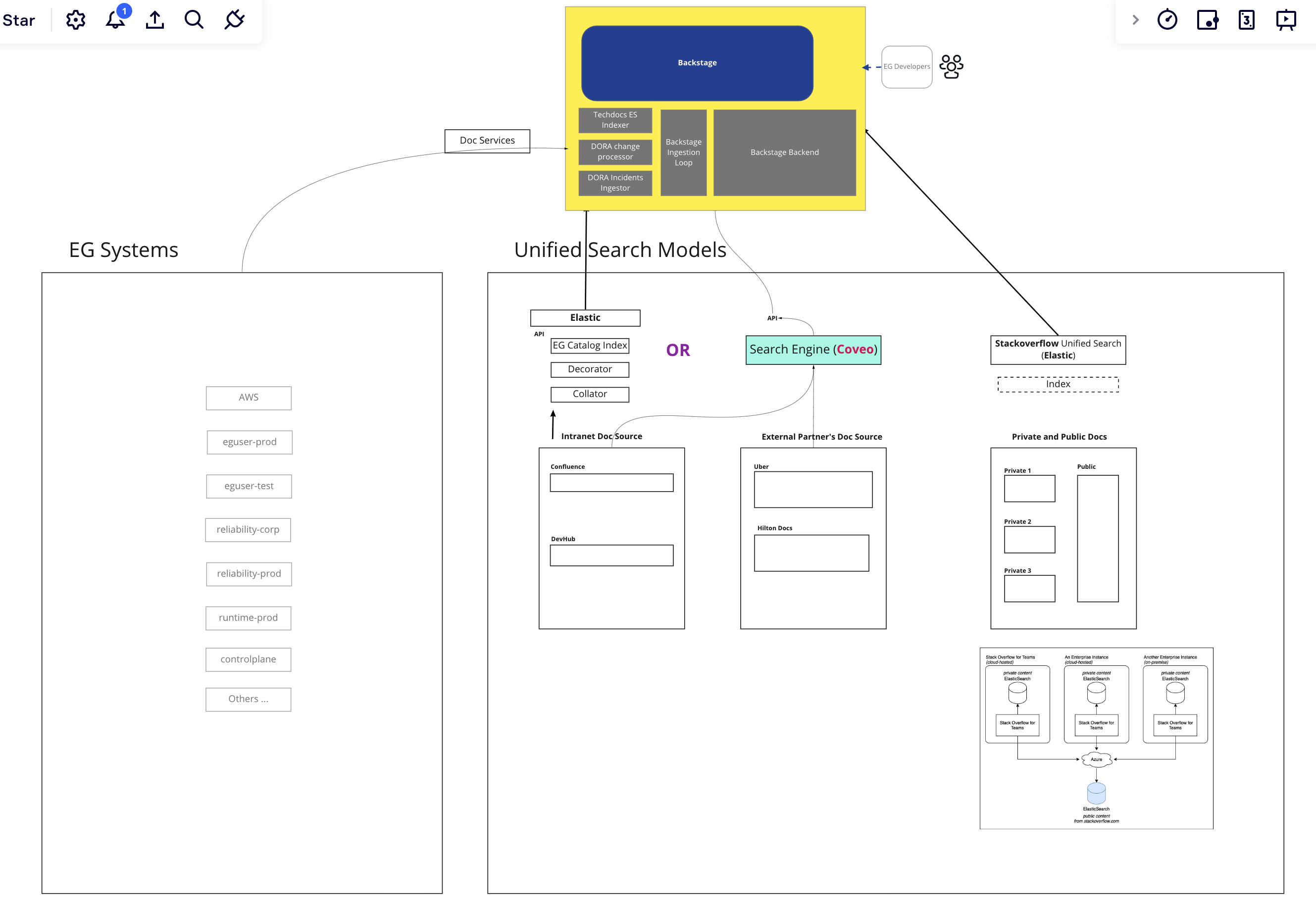
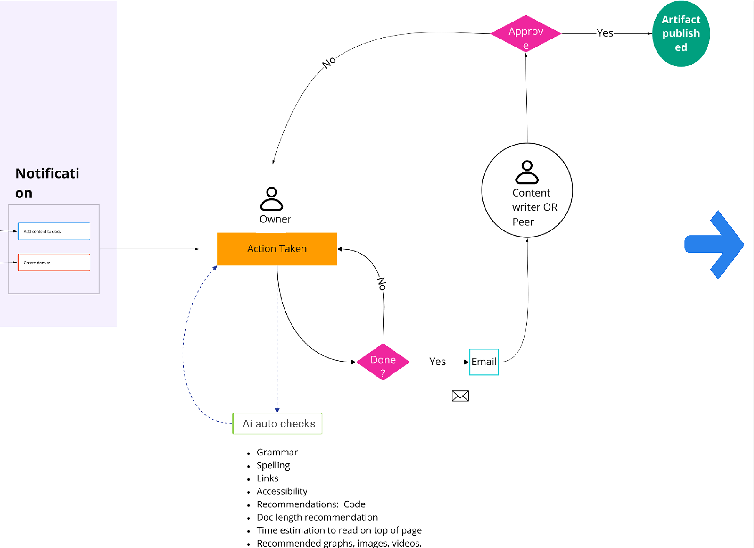
We wanted to raise the quality of documents and apps users were creating. I came up with this flow with key business metrics that’ll ensure that.

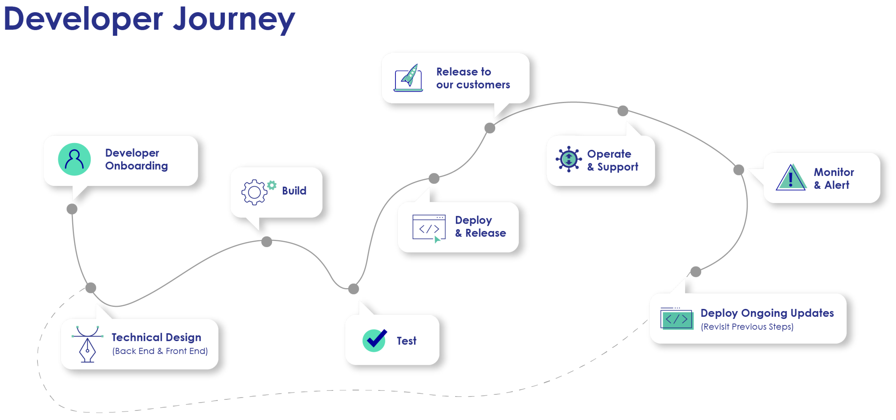
Over the last several years, product and engineering teams identified developer journey and friction. Expedia’s 20,000 services, APIs, and tools weighed heavily on cost, duplications, and complications. The company wanted to cut costs and quicker turnarounds. Developers wanted simpler experiences. This led to the adoption of Backstage.io - an open source platform originated from Spotify, which offered these advantages.
Backstage made Expedia’s applications more manageable. Among them, were 230 developer tools (i.e. AMS metadata, GitHub, Spinnaker, Jenkins, etc.). My job also included improving the developer journey by optimizing their capabilities through Backstage.
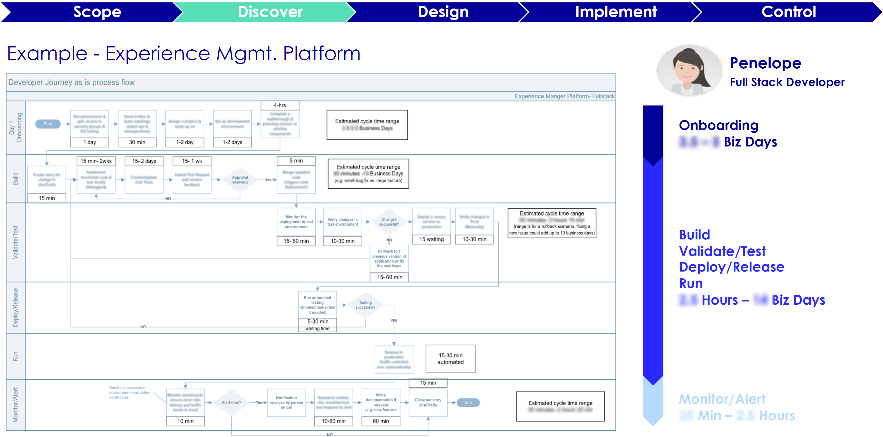
Developer Journey phases were as follows:
There were many personas among the developer community. For this work the focus was mainly on Full Stack developers - who filled about 55% of the developer pool. Out of these I created several groups.
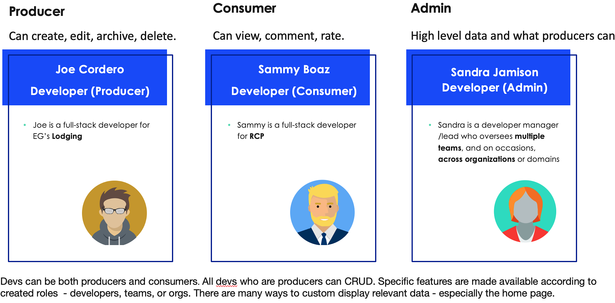
| Producer (Figma) | Consumer (Figma) | Admin (Figma) |
Producer (owner) could: view, create, edit, archive, delete; store, organize
Consumers could view the data, comment, and contribute toward quality scores. Majority of devs were consumers.
Admins had all of users capabilities plus ability to manage, halt, or delete applications. They could also oversee the quality and governance process.
During user research done by team members and myself the following pain points were identified. I took these and looked for opportunities to enhance user experience from all fronts.
* Bootcamp is a one day onboarding E2E flow development exercise which a newly joined developer goes through setting up environments, gaining access, as well as creating and deprecating a basic “hello world” app.
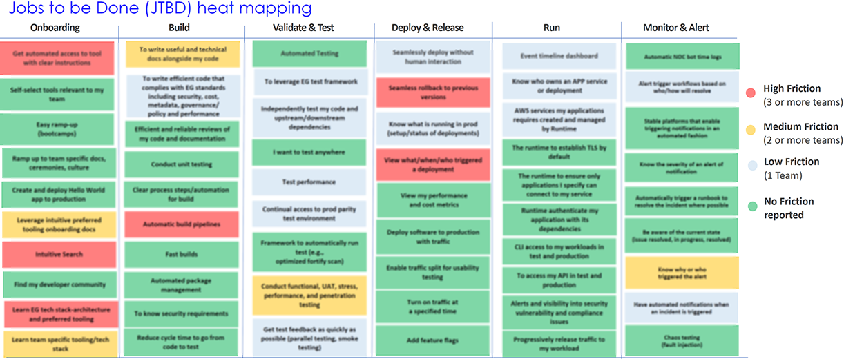
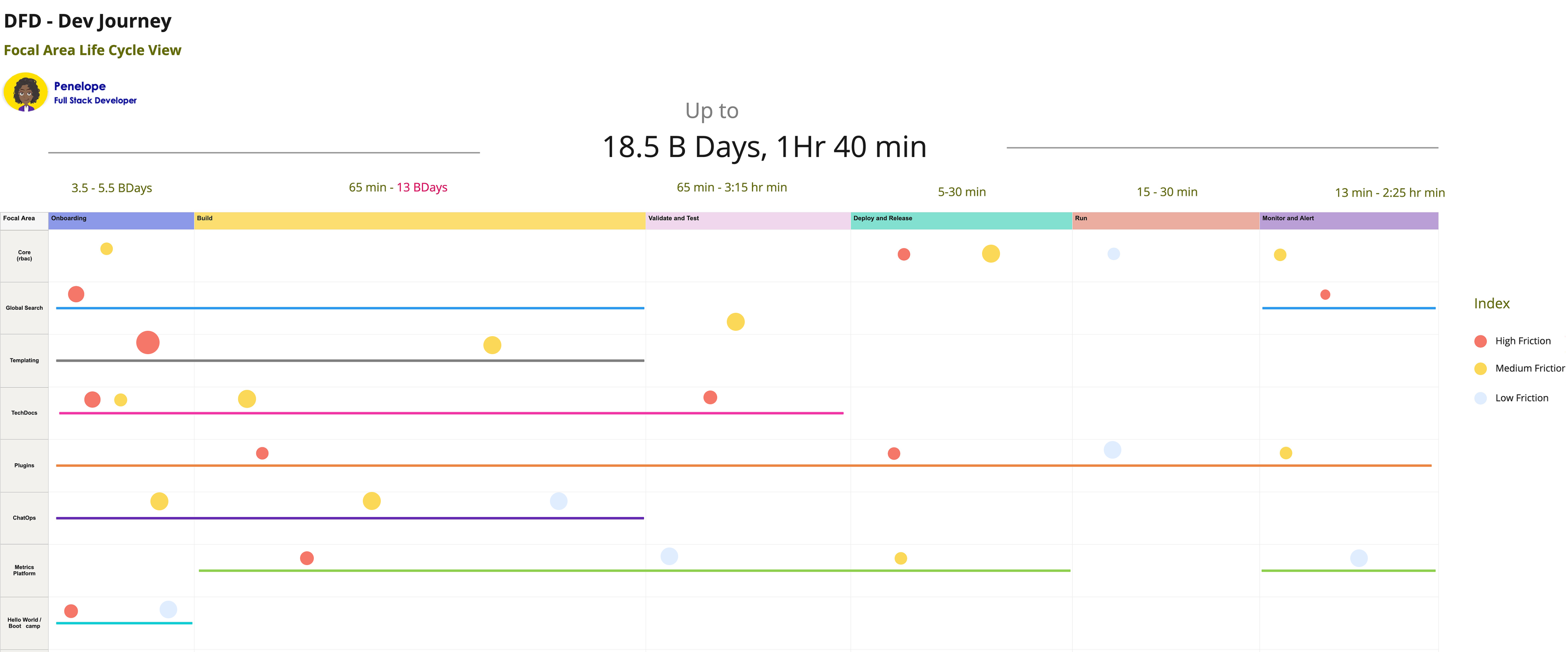
Developer Journey phases were viewed as follows: Onboard, Build, Validate & Test, Deploy & Release, Run, Monitor & Alert. This one immediately below (Example - Experience Mgmt. Platform) and the above heatmap were researched and created by other team members over a period of several years.
I took some of the identified friction and heatmap, then applied some numbers to create a new heat map below. User research showed developer’s build was taking 70% of the dev journey. As part of the North Star vision, I recommended investing in AI code generation that’s based on machine learning (ML) to our division head. It could boost productivity.
This summer of 2022. AI concepts were still relatively new. The AI frenzy didn’t occur until late 2023. My knowledge of the tech trend and intuition told me this was happening and would be good to start early. I was right.
There were a number of challenges.
User research was conducted. However I proposed for more. In some instances the new middle management didn’t quite grasp user experience design and the importance of user research. I was able to discuss the matter with an upper manager who was in the steering committee and got the support.
As I said previously, the future state envisioning I was involved in went in several spurts over a period of one year. When we started the last segment after the reorg, I proposed that we use the existing roadmap to envision one year ahead, then based on tests and iterations, proceed to plan toward three to five years. Along with that, a clear picture of how our product and platform would be five years later, so we can work backwards toward that ideal state.
To have a great impact, we need to think bigger and farther than how typical companies strategize. Yes, that involves taking greater risks. Technology changes fast and will continue to accelerate. That is why I keep up to date on emerging technologies and design changes in the market.
My recommendation was to focus on the greatest friction points and underserved segments. Next, identify least effort and maximum impact areas. So we broke down the key value adding elements of the design.

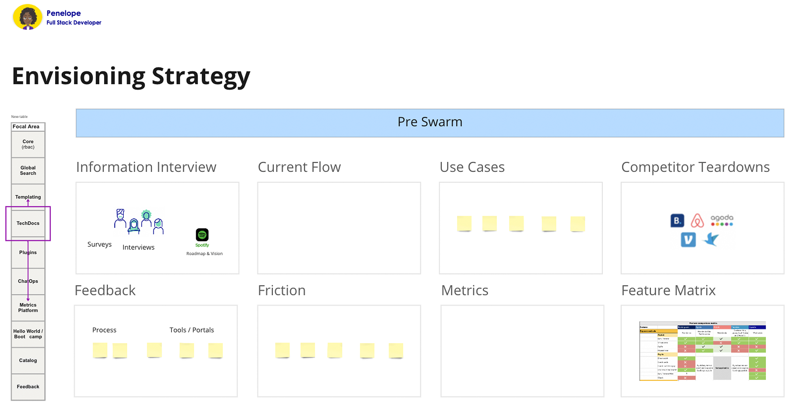
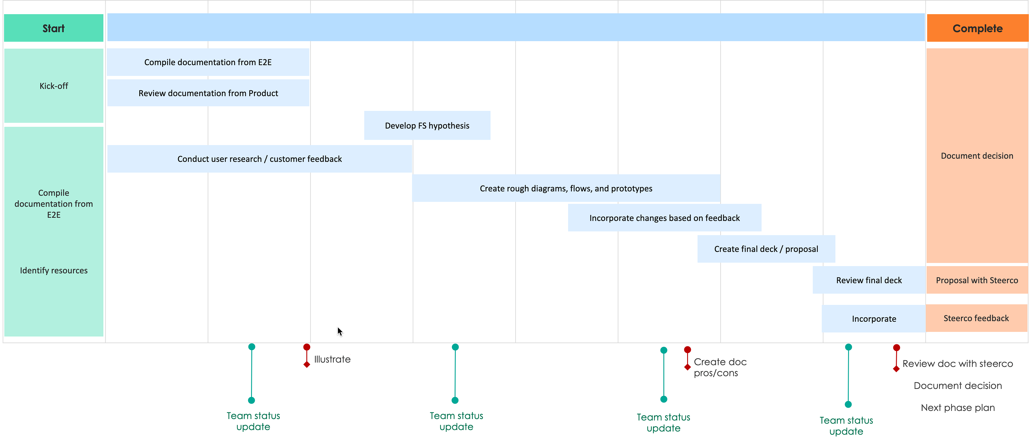
Research consisted of interviews, personas, diaries, journey maps, surveys, AB tests, card sorting, tree testing, swarm sessions, analytics tools, etc. I’ve learned that it’s better to conduct user research with a smaller core group of people than doing a shotgun approach to a large group. Shotgun approach is helpful at times, especially when starting out, but for a longer term, you want to stay with the smaller core.
The core user base was selected the following way. I sent out initial surveys to do AB tests starting with the larger group of backstage community. Out of these hundreds of people, about eighty responded. Among those, some responded not only with multiple choices, but also filling out comments.
I took those eager participants and continued to funnel down to find our core user test group. I was like a miner panning gold - after some effort and sifting, gold nuggets were found.

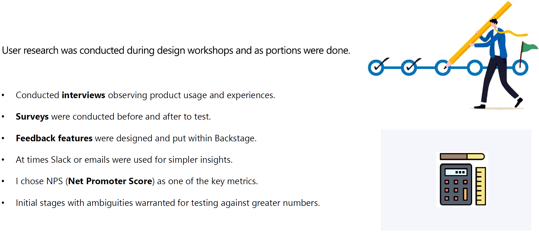
For qualitative measures I conducted interviews observing product usage and experiences, until I wasn’t learning anything particularly new. These methods were performed mostly with an audience of six to eight per segment.
Surveys were conducted before and after iterations to test my hypothesis and designs - on average about every three to four weeks. At times Slack or emails were used for simpler feedback. I chose NPS (Net Promoter Score) as one of the key metrics.
Initial stages with ambiguities warranted for testing against greater numbers. When I was more clear and certain, it made sense to send to a smaller pool.
Through competitive analysis, I found the approach industry setters and our competitors are taking to learn, improve, envision, and adopt. By leveraging existing and proven methods, I was able to cut through hypotheses and got us to reach our goals quicker.
I am a proponent of creative thinking and design. Radical solutions are needed at times. However, in most cases it’s best to utilize what design solutions users are already accustomed to and market leaders have established.
People like and easily adopt what they are used to. That’s the type of control wheel I like to put into our users’ hands. These are some of what was referenced and compared for inspiration.

These were some of the metrics I ideated and designed. I created prototypes to display at aggregated level with capability to drilldown to individual levels.
| Document Set | Aggregated Document | Search | ||
 |
 |
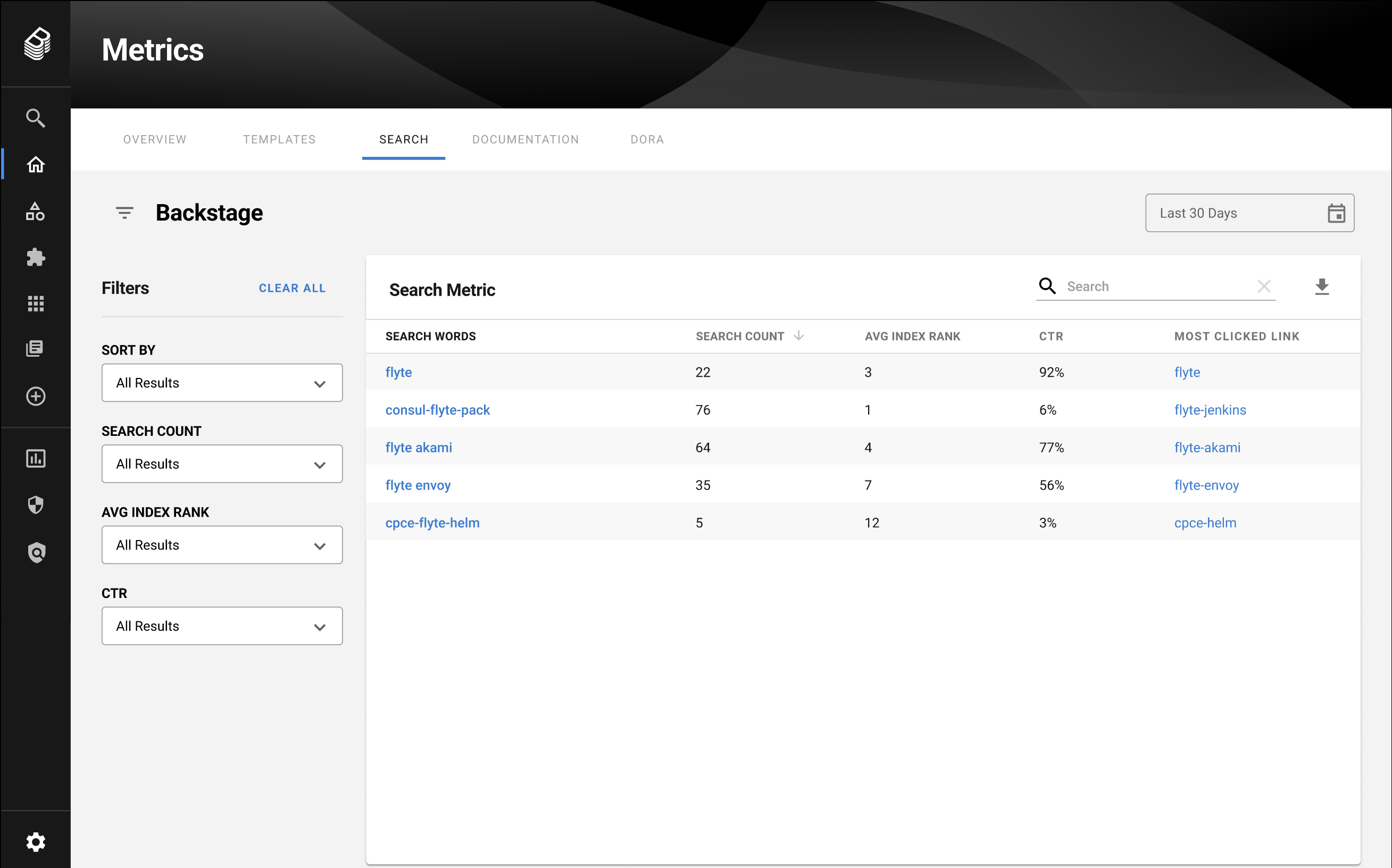 |
What is the E2E flow of a user in finding what’s needed? How do users go through search and navigation menus? I wanted answers to an individual contributor’s ability to go from being stuck to unstuck in just a few seconds or minutes. We found that it's extremely important for a growing engineering org to maintain a shared knowledge base that’s easy to navigate and explore with the help of search and navigation flows. Metrics like search success rates, click-through rates, and search results relevance were targeted.
Reducing context switching can help engineers stay in the "zone". We measured the number of different tools an engineer has to interact with in order to get a certain job done. I envisioned features that allowed users to get information they needed where they were on the platform, and keep their train of thought connected toward optimal outcome.
Ranking of relevant content developers is searching for out of all search results. I was asked to come up with what's most relevant with just a very general direction. When I inquired further, not much more was given. I utilized my experience and knowledge in this area and created fantastic metrics, which the team and users loved. Monitored by click throughs of search results.
These metrics included visits (monthly active users, daily active users, unique users, total users, etc.) and page views. I also introduced additionals where appropriate:
DORA metrics are used by DevOps teams to measure their performances: Dev Ops, Research and Assessment.
Mean Time to
Total Services in Backstage (~1261); Total services/apps tied to TechDocs - 639.
2023 Goal - Increase TechDocs onboarding for services by 15% (1350)
Features, codes, and UX contributions to the open source community initially improved the OSCI (Open Source Community Index) ranking from 167 to 107. The additional number of contributions improved it to the 90’s.
Prototypes have been demoed at the top of this page.
We received positive reviews when presenting our concepts to leadership. I faced new challenges during this project that I haven’t faced before - seamlessly integrating distant future scenarios into an existing design. Plus, getting asked to tread product and engineering space, which I wasn’t entirely familiar with.
Through this project, I learned the importance of really diving into studying the existing design and flow of the application to introduce new features that look and feel like existing design. Doing research on the background and how the app evolved was also key to identifying the best solutions for the problems at hand.