Toward the end of 2019 Expedia Group (EG) launched a company-wide initiative to streamline the developer ecosystem by consolidating EG’s developer tools. This led to adopting the Unified Developer Portal using Spotify’s Backstage.io, which provided a central marketplace for developers to discover, manage and contribute.
I had the opportunity to join Expedia Group in the beginning of 2021. As the Senior UX Design Lead, I oversaw two other designers, collaborated with product managers and engineers to create this highly sophisticated portal. The company-wide initiative that reduced the number of developer tools by 39%, created major engineering changes, and successful adoption of Backstage portal led to $42 million dollars in savings and productivity boost. Dev and UX contributions to the source community improved Expedia's Open Source Contributions ranking from 167 to 98.
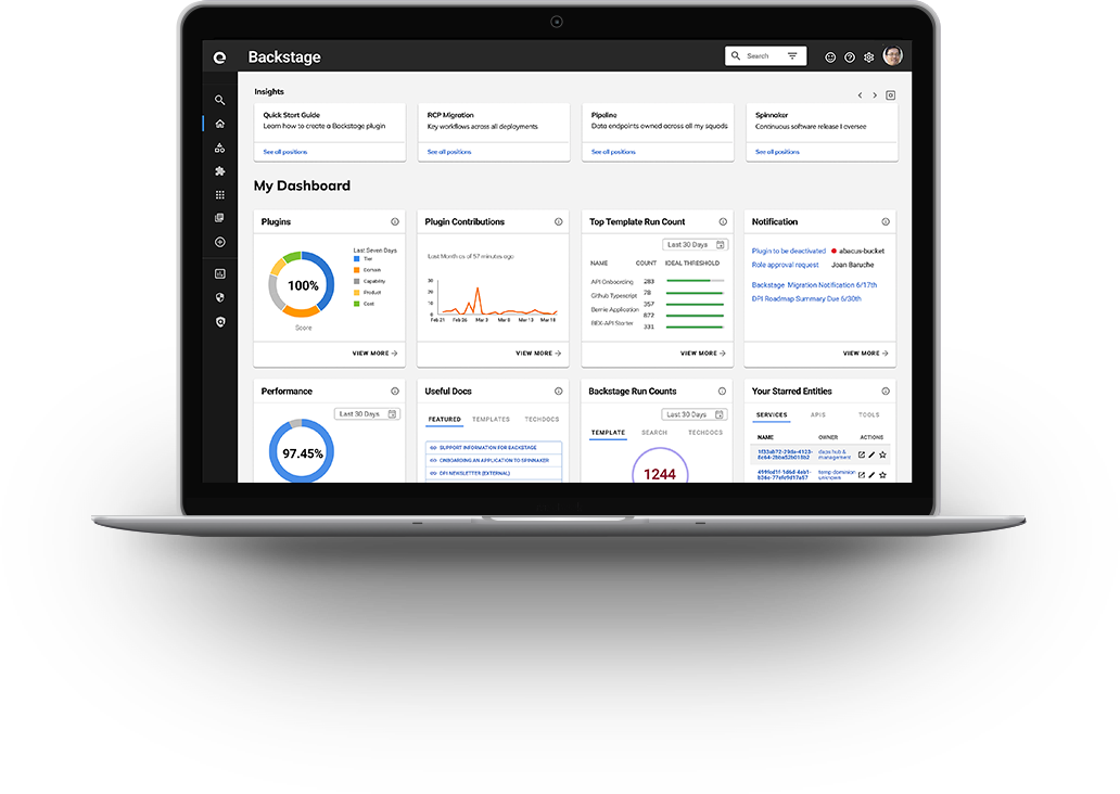

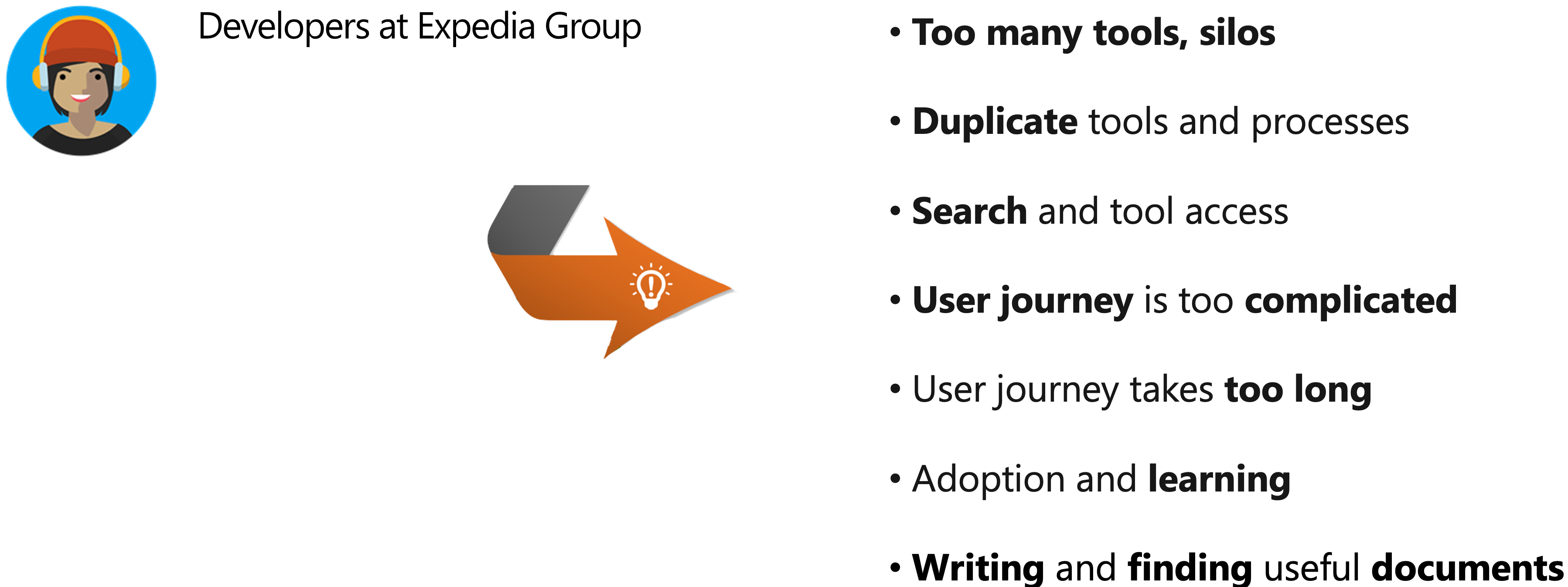
Developers wanted simpler experiences. This led to the adoption of Backstage.io - an open source platform originated from Spotify, which offered these advantages.
Creating new services, APIs, data pipeline, or other software assets, is made easier. Within a few clicks a developer can go from nothing to having a fleshed out component which is already connected to the developer's favorite tools. |
Backstage plugins come together to pull information into one place so it becomes easier for teams to manage a number of microservices, and for an organization to manage hundreds of them. Instead of switching between tools a user can do everything in one place. |
Since everything can live in or accessed through Backstage, tools, software and teams all become more discoverable and approachable. This improves collaboration and engineering effectiveness. |
I started by clearly defining goals to understand what we’re trying to achieve. Backstage was still at its early phase with amazing potential to shape the future strategy of the developer platform, and make Expedia a premier destination for developers to follow their inspiration and ship great apps. My goal was to improve its user experience to impact the entire development community toward the following:
For my design approach see Alex's design process.
|
Consolidation of tools, major engineering changes, and successful adoption of Backstage led to $42 million dollars in savings and productivity boost. Proposed appropriate data metrics, displays, and created interactive Figma prototypes that provided high level insights with capabilities to drill down to details. Some of these covered the areas of onboarding, reliability, performance, runtime, documentation, security, and many more. I ideated metrics and design. The VP of our division praised it. As a result, the department's effort was redirected to build a whole metrics section. Backstage design system I created promoted self-service model. Its successful creation and my collaborative persuasion toward its adoption helped lower designer resource usage by 30-35%. Established the design team process, checklists, culture, and resource allocations. Led meetings and weekly reviews. Features, codes, and UX contributions to the open source community improved the OSCI (Open Source Community Index) ranking from 167 to the 98. | 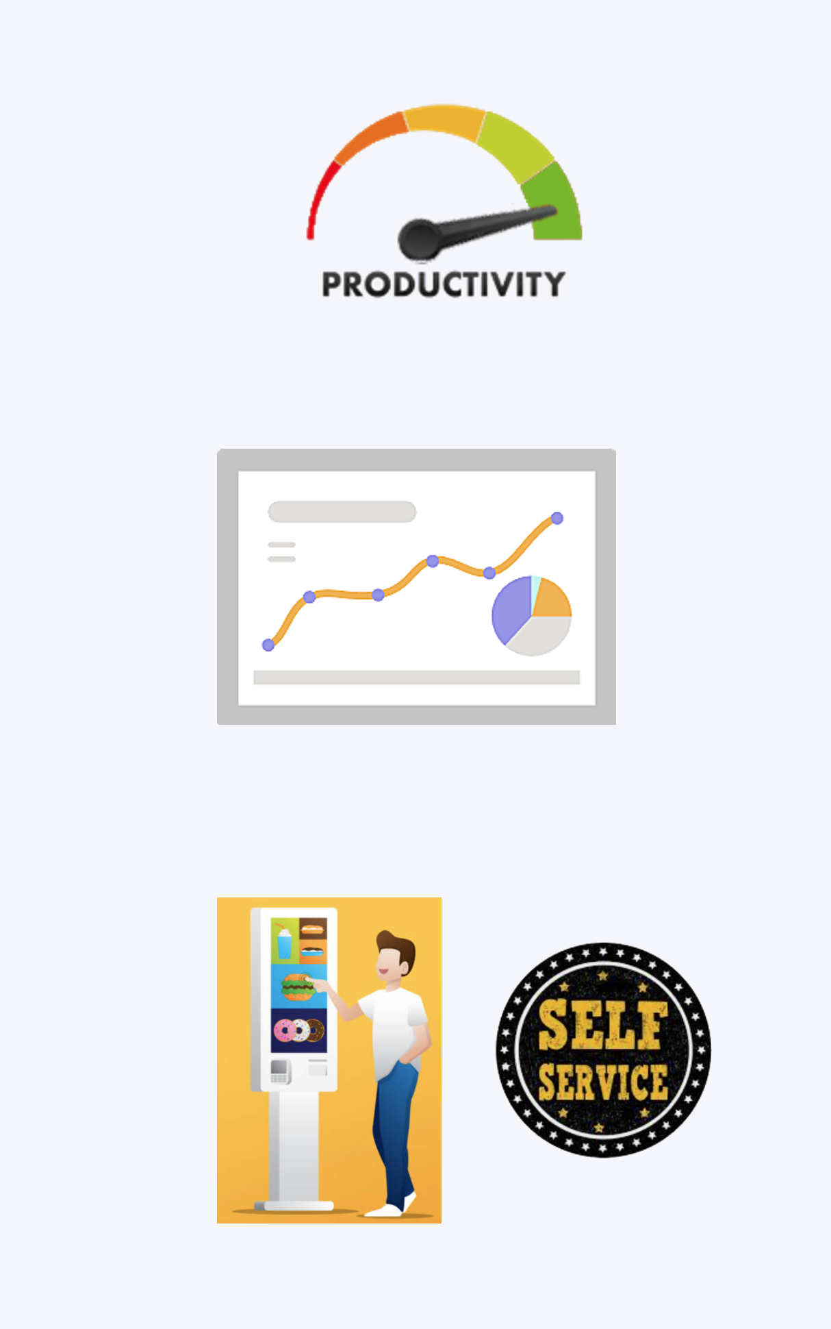 |
SET STRATEGIES
- Became an influencing voice in roadmap discussions at program level.
- Created frameworks and prototypes to share the vision, design principles and content strategy. This helped to evangelize ideas, gain alignment and drive decision making.
- Defined the product with my project manager partners. I evangelized customer goals and balanced business goals. I prioritized and negotiated features for launch and
beyond.
DEMONSTRATED LEADERSHIP
- Promoted collaboration with customers and partners around varied perspectives to set shared goals and ideas.
- Led efforts to evolve the portal and address customer pain‐points related to the browse and discovery experience.
- I designed across and collaborated with designers and PM partners to translate product features for each platform context.
Along the journey of a lead, I was promoted to the role of an acting manager. I also hired a designer to join my charter of innovative UX design. My strength in relationship building with customers, partners, and teams encouraged others to join the journey and reach thresholds we had set. I utilized my expertise in bringing the best out of people to motivate and tapped data to build trust and measure success.
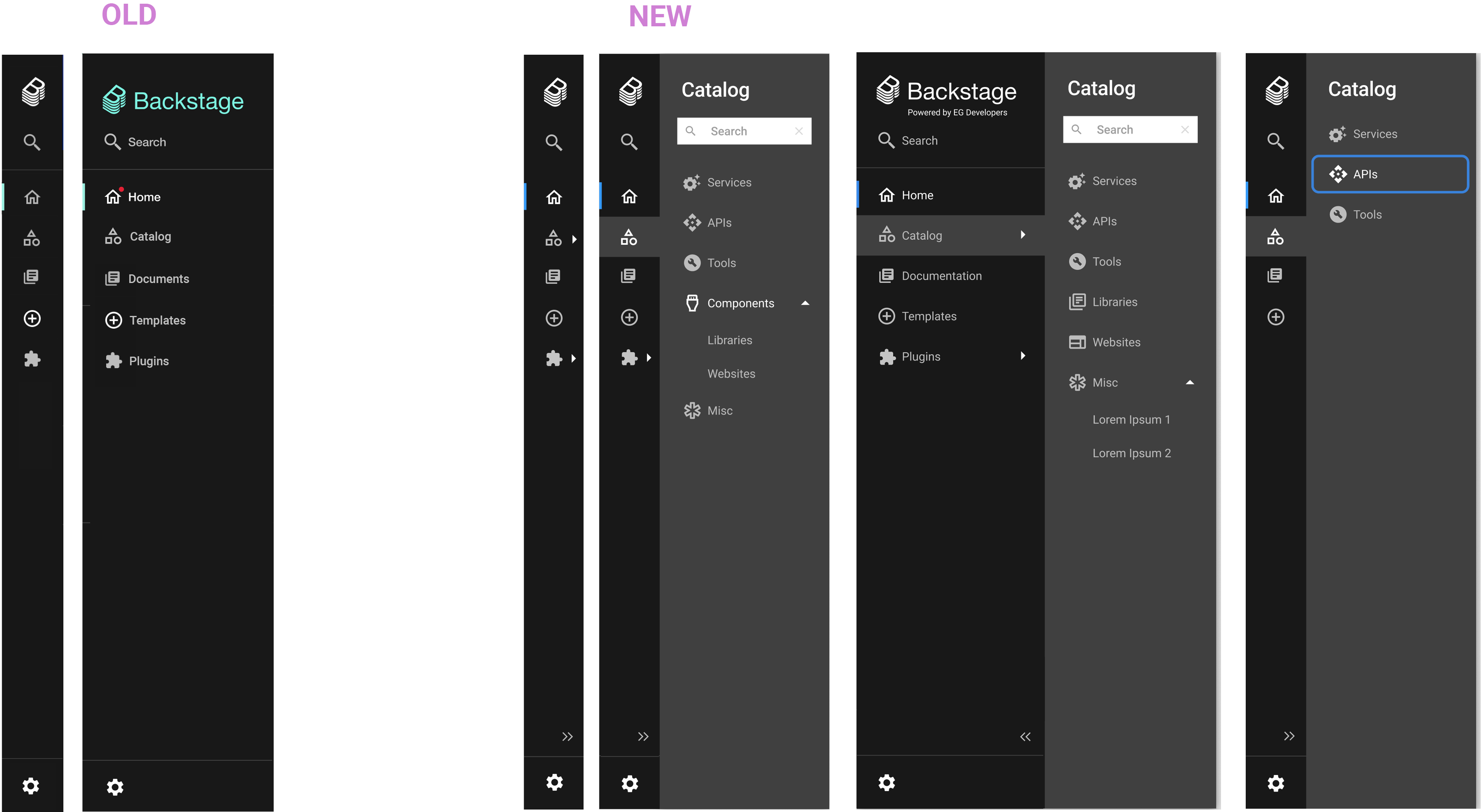
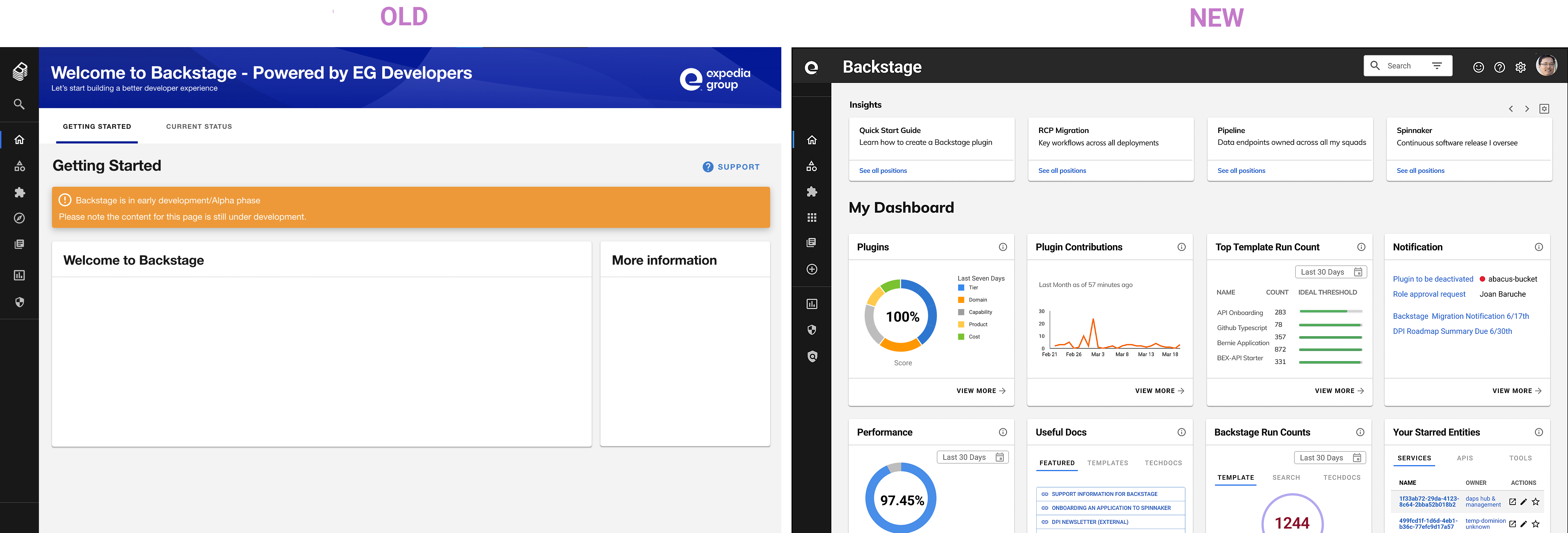
Side navigation that was developed by Spotify reached its limit. It had accessibility problems. By default it collapsed to show icons only. The entire left side menu bar slid out everytime mouse went over covering content on the left side of the page. Users couldn't see what the menu was about without hovering their mouse over the bar. Everytime users went to make a selection the entire menu bar slid open. Plus, it wasn't designed to scale accommodating subcategories. I initiated a new design and proposed to our team, then to Spotify. The design was a total success and became one of main open source contributions Expedia made to Backstage.io.
Side Navigation (Figma)
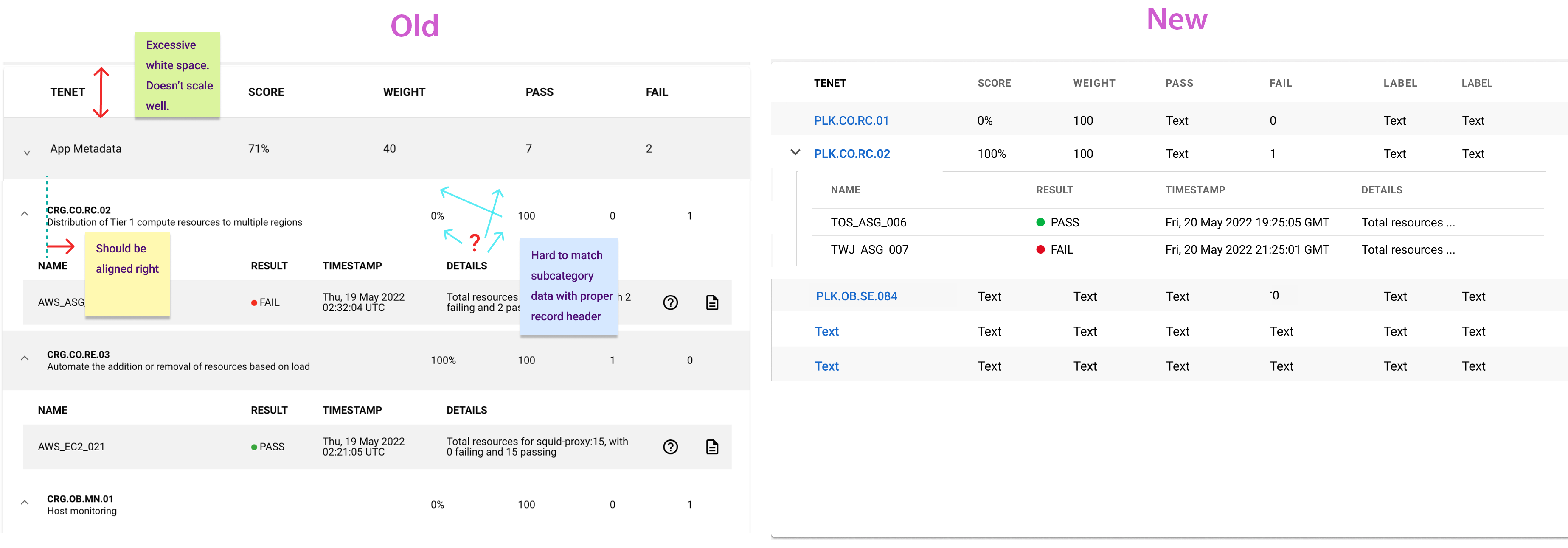
Here is an improvement I made to a collapsible table design. Not only is the table easier to view and more precise, it also saves vertical space so users can view more data at a single glance and scroll less. Unlike what's on the left, the right one is made to scale more easily. This is an example of designs I contributed to Spotify's Backstage open source system.
I depicted this as the future state dashboard we could have.
Metrics that didn't exist were were ideated and designs created. DORA metrics are used by DevOps teams to measure their performances: Dev Ops, Research and Assessment. The four metrics we used most is MTTR: Mean Time to Resolve.
DORA Metrics (Figma)
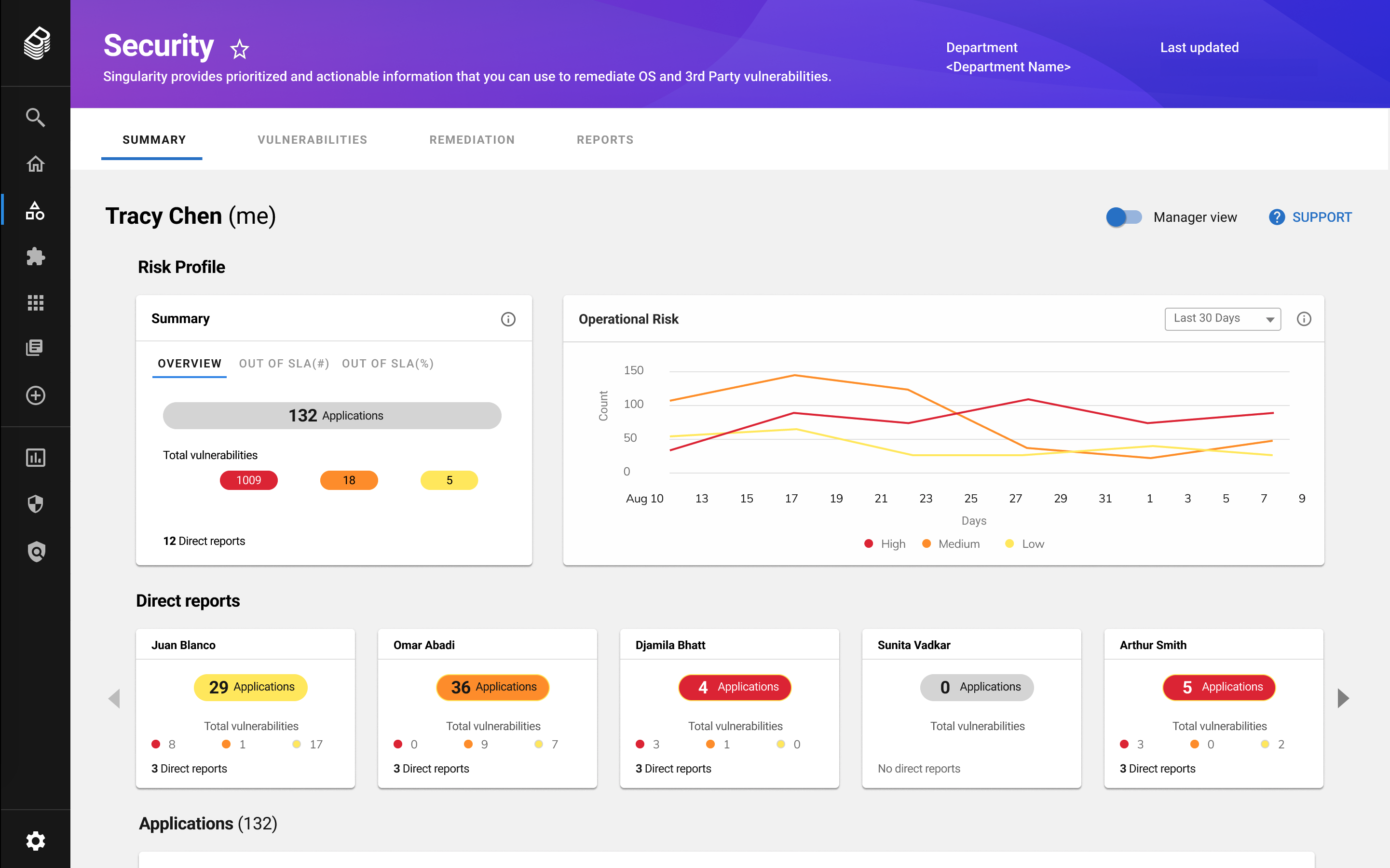
Security division wanted prototypes with security metrics and ways to govern them. There were capabilities to view exposure scores, policy violations, vulnerability levels, SLA breakdowns, operational risks, alerts, mean time to remedy, owners, groups, contacts, etc., and ability to manage them.
One of the main features requested was for metrics assigned by roles to be not only viewable, but also navigated according to hierarchies of the organization. The prototype allowed managers to easily view direct reports’ app security vulnerabilities and take proper actions.
Security Metrics (Figma)
The developer community consists primarily of Full Stack, Data Engineering, Site Reliability, Mobile, Front End, Back End, Dev Managers, but also Security, Network, Machine Learning, Architect, AI, Data Scientist, etc. Full Stack developers make up a bulk of developers. Therefore, this persona became our primary focus.
To validate who the real users are and learn about their personal experiences with Backstage, I conducted user interviews. I interviewed ten people, asking open-ended questions to learn as much as possible about their roles, processes, and experiences.
The Full Stack developer is the most prominent developer persona and goes through the following steps:
When I joined this project, little was done on identifying personas and their journey. There was one very basic user journey diagram and several personas defined in crude state. That was it. I proposed to work on them, but leadership (LTs) higher up asked the design team to create prototypes and build out portal features - that became the team's priority for a while. Gradually more artifacts were created during the team's workshops.

There were many pain points. Among the top were:
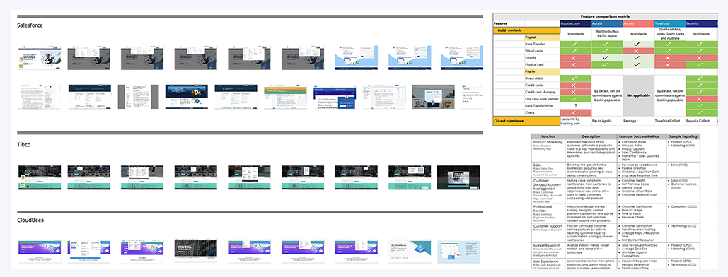
Through competitive market analysis, I found the approach industry setters and our competitors are taking to learn, improve, envision, and adopt. By leveraging existing and proven methods, I was able to cut through hypotheses and reach our goals quicker. I am a proponent of creative thinking and design. Radical solutions are needed at times. However, in most cases it’s best to utilize what design solutions users are already accustomed to and market leaders have established.
Jumping into a project started by others with crudely defined personas, process, and journey map wasn't ideal.
“The combination of having to design around fixed open source guidelines and aggressive scope created an intense environment with many coordination and time challenges.”
As mentioned, the user process, pain points, and journey map came together gradually rather than at the beginning of the project. We were almost working backwards, which meant that design was subsumed into an engineering‐driven process. Perhaps one of the greatest challenges was working around Spotify's open source guidelines. Although open source allowed the portal to be developed fast, it limited what user experience designs we could come up with.
I lead a team of UX designers, who delivered amazing products and made valuable contributions to Spotify's open source design libraries. I set values, processes, and culture of the design team.
There was not much of a process between designers, product managers, and developers. So I created one to productively move along an agile method on how the designers will go from initial design to sign-off.

Here are a few of the artifact examples from the developer journey workshops where all of us designers, product managers, and developers came together to ideate.


Research consisted of interviews, personas, diaries, journey maps, surveys, AB tests, card sorting, tree testing, analytics tools, etc. I’ve learned that it’s better to conduct user research with a smaller core group of people than doing a shotgun approach to a large group. Shotgun approach is helpful at times, especially when starting out, but for a longer term, you want to stay with the smaller core.
The core user base was selected the following way. I sent out initial surveys to do AB tests starting with the larger group of backstage community. Out of these hundreds of people, about eighty responded. Among those, some responded not only with multiple choices, but also filling out comments.
I took those eager participants and continued to funnel down to find our core user test group. I was like a miner panning gold - after some effort and sifting, gold nuggets were found.
To measure the success of my product envisioning and to validate my designs, user research was conducted by my team and I during design sprints and as portions were done.
Performance goal was met overall and exceeded in some of the areas. Resourcefulness, acute planning, communication, and collaborative spirit attributed to these achievements.
For qualitative measures I conducted interviews observing product usage and experiences, until I wasn’t learning anything particularly new. These methods were performed mostly with an audience of six to eight per segment.
Surveys were conducted before and after iterations to test my hypothesis and designs. Initial stages with ambiguities warranted for testing against greater numbers. When I was more clear and certain, it made sense to send to a smaller pool. These were some of the methods used with an audience of 20-45.
When I joined the project, there was no user research process. I initiated creating the AB Test framework to regularly receive feedback and create user centered designs. The framework was refined with team members.
Survey forms along with Figma prototypes were sent out to Slack channels. The test method was a great success. The framework was especially helpful where ideas tied. We were able to have more objective results and based not on our thoughts, but those of users’.
In this example I tested placing filter menu on the left side versus right side.


I used Glassbox analytics tool to measure user behaviors. After the set up, the tool tracked and recorded user behavior 24/7. In this example I was able to locate sources of dead clicks and improve designs.
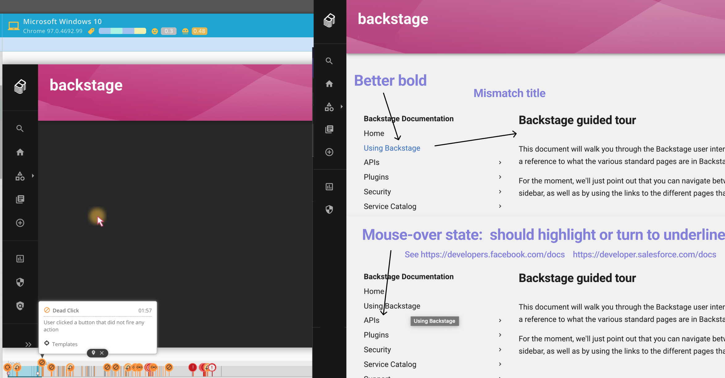
Based on data and observations I created spreadsheets for Analysis. Some of the criterias were struggle score, date, time, etc. I set up weight scores to prioritize our efforts toward LEMI (Least Effort Maximum Impact).

The Backstage Design System I created allowed designers, product managers, and developers to envision and create designs themselves. Some of the work previously done by designers in 2021 became self-served and significantly lowered the designer resource usage. 30% of the plugin design work, which was done 100% by designers in 2021 became self-served (now 90% autonomous, 10% UX designer assisted).
Overall, the designer resource usage was lowered by 35% compared to similar work that was done the year prior. The surplus allowed us to expand the portal even further with great new features.
“The Design System I created allowed designers, product managers, and developers to envision and create designs themselves. Its successful creation and my collaborative persuasion toward its adoption, helped lower designer resource usage by 35%”
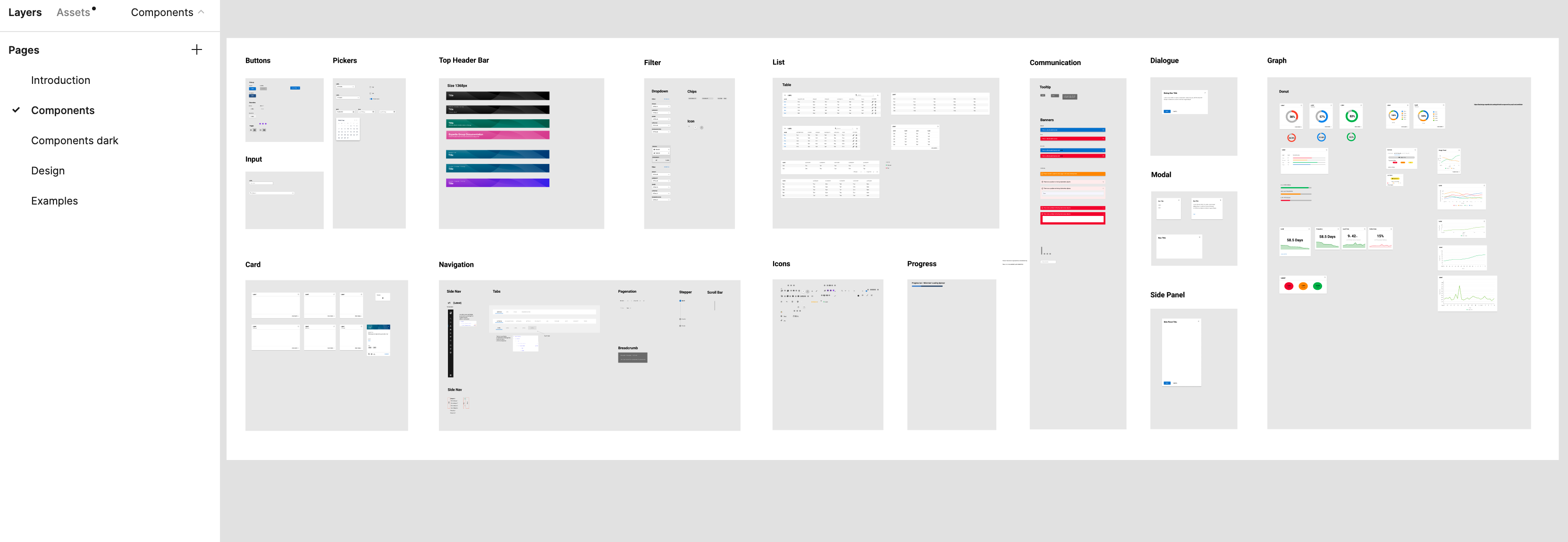
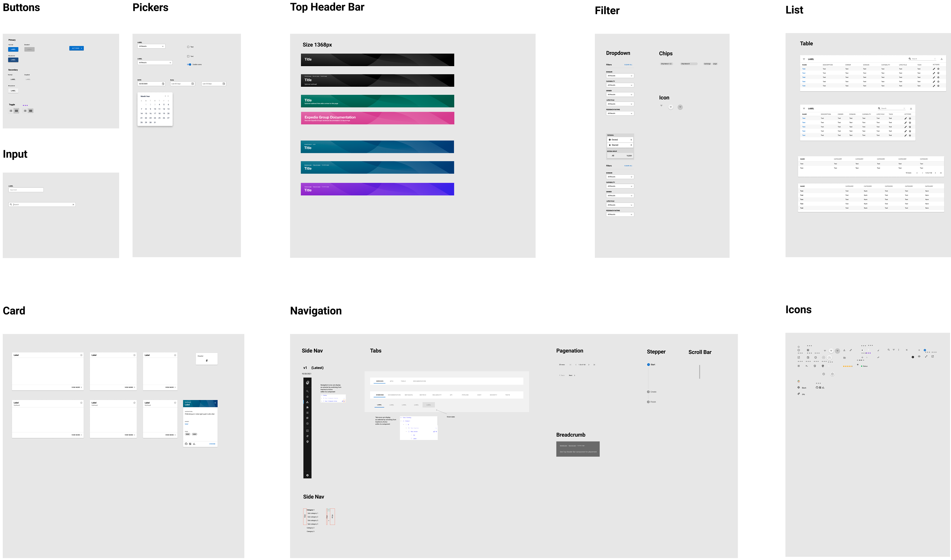
Here are some examples of what was created. It's still in its beginning phase - version 1.0.
Spotify had their own design system that was based on Google's Material UI. However, it needed a lot of improvement in consistency, visual appeal, accessibility, and was not designed to scale. Utilizing Material UI, I worked on what I could around limitations imposed by Spotify's open source.
I categorized the system into introduction, components, components dark, design, and examples. Expedia’s developers commonly design in dark mode so I created dark mode components.
Spotify chose Helvetica Neue as their font type. This conflicted with Expedia’s font type, which was Century Gothic Pro. These raised questions on the type direction and problem with licenses.
One of the designers used the Windows operating system. As a result, designs he created had different fonts in Figma. To keep things simple, I decided to adopt Roboto. Roboto is Material UI’s primary font and free. That worked out well. Developers followed our choice and used Roboto on production. Type sizes and styles were limited, so I added variations.
Spotify had basic color schemes: primary and brand, which seemed less than ideal. Due to time constraints and priorities of the engineering team, I used what was given and added custom colors. Design team used these and decided to sort out details with engineers in chunks at the right time.

For consistency and clarity, I set layout and spacing guidance for other designers to follow. Product managers and developers referenced them in their mockups as well.

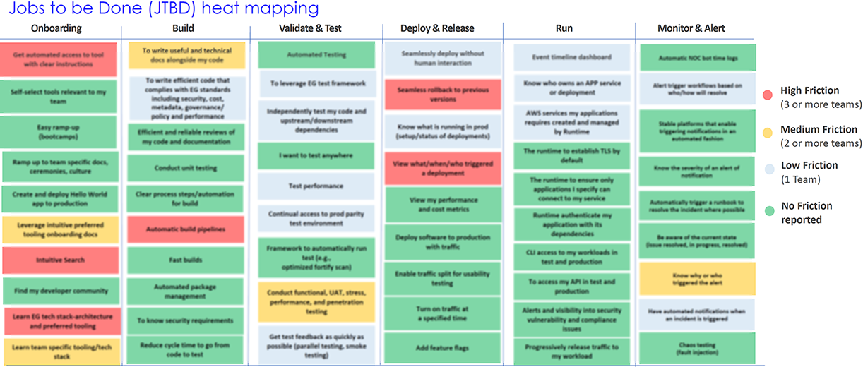
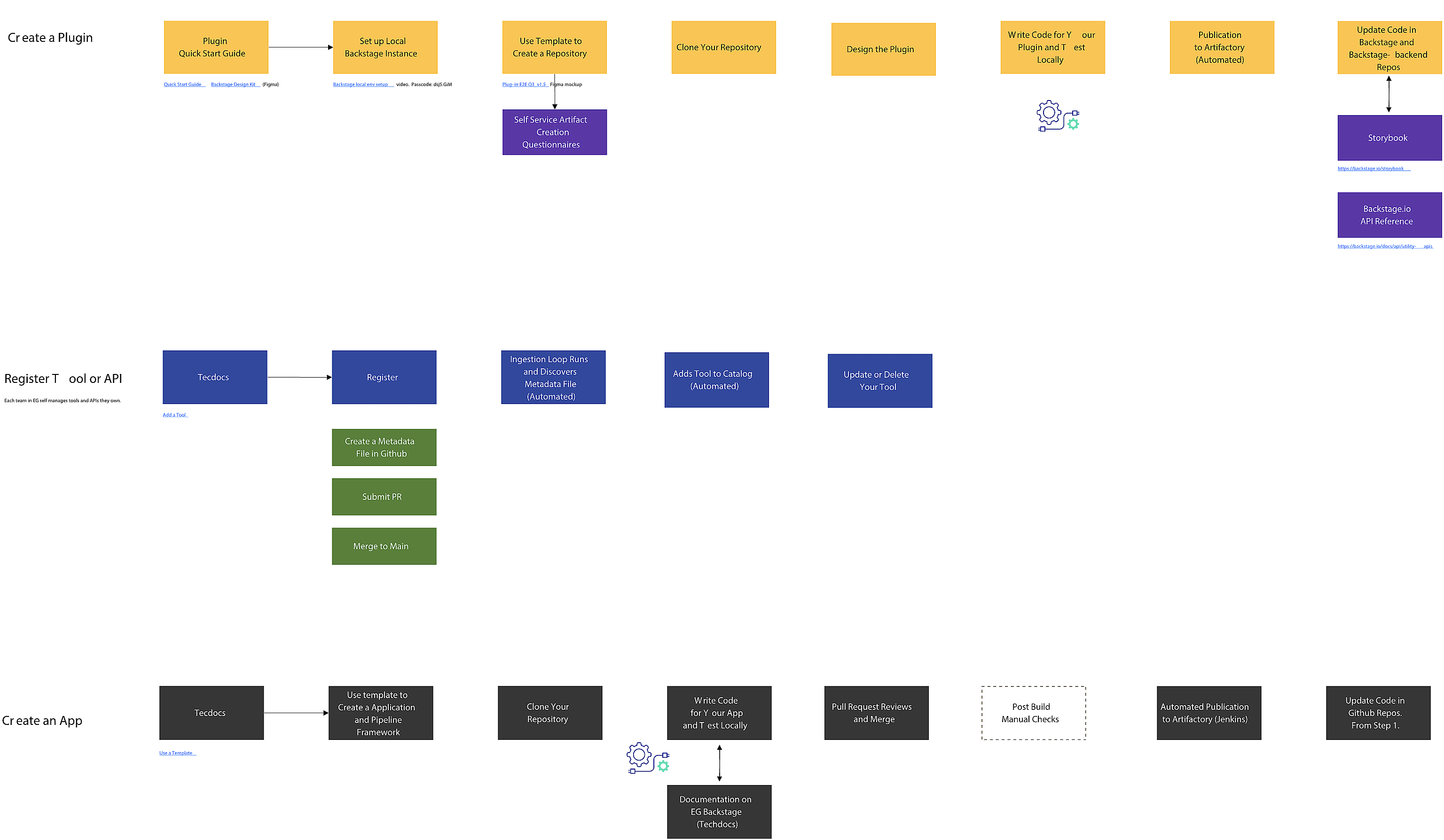
After user research, I organized and created developer artifact creation diagrams in Miro. This helped pain points and areas for improvement along the user journey. It also helped spark discussions to help close knowledge gaps and acted as a catalyst for idea sharing and generation between team and stakeholders.
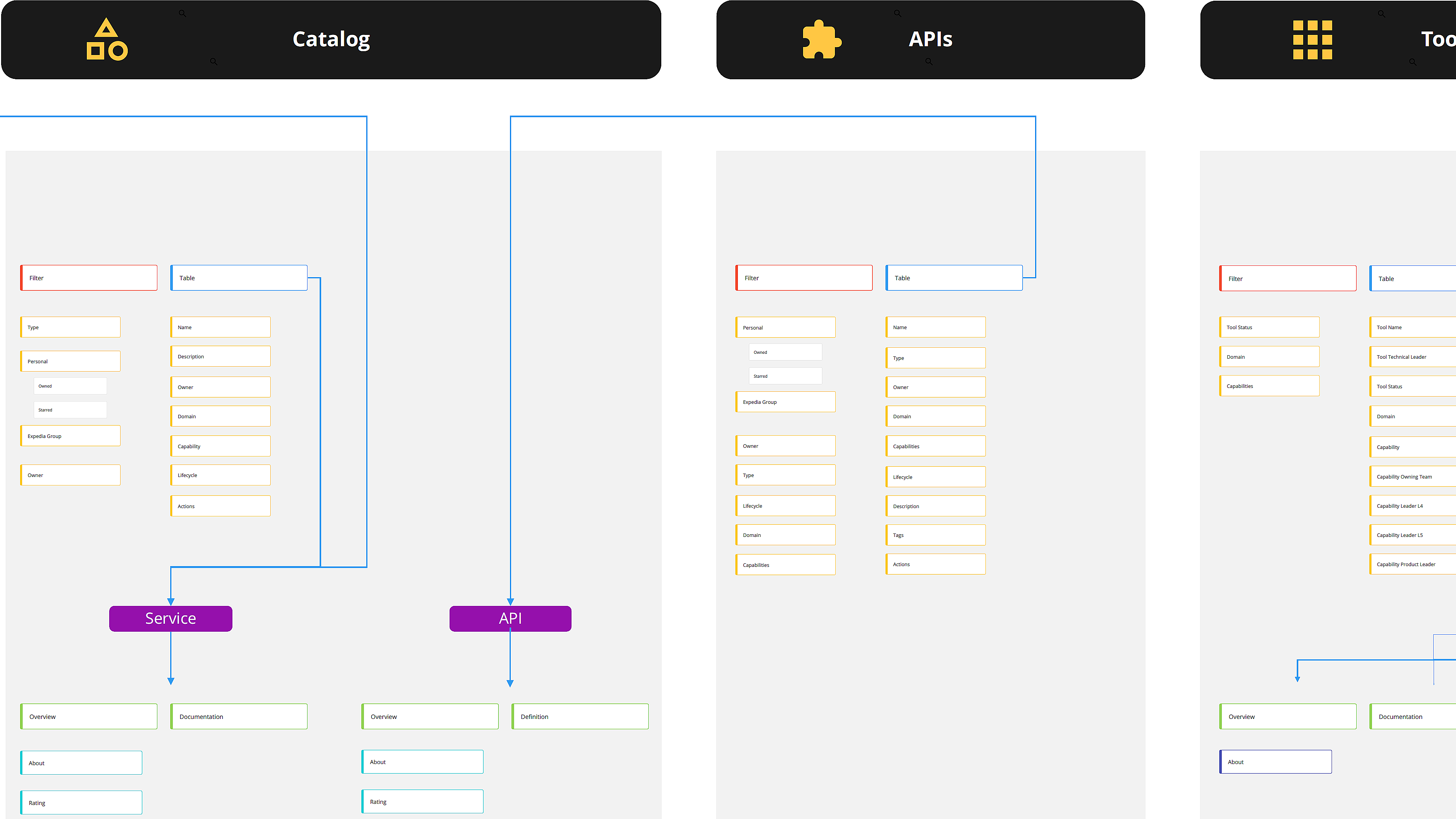
To help clarify the existing structure and how users explore how the user’s would be interacting with these features to complete tasks, I added this sitemap in addition to the above flow diagram. This helped in decision making and improving the architecture of Backstage. For example, the services and tools page took users to their own individual details page, but APIs took users to another Catalog page, which brought confusion. Proper grouping and simpler design resulted in better user experience.
I faced new challenges during this project that I haven’t faced before - seamlessly integrating new features into an existing design and designing for technically deep applications that I wasn’t entirely familiar with. Working with an open source platform was also new and brought its unique challenges. Through this project, I learned the importance of really diving into studying the existing design and flow of the application to introduce a new feature that looks and feels consistent. Doing research on the background and how the app evolved was also key to identifying the best solutions for the problems at hand.