The case study was to design for a service called Eat Well. Unlike many other cooking and recipe apps, this service takes a more scientific approach. The challenge was to work in the following way.
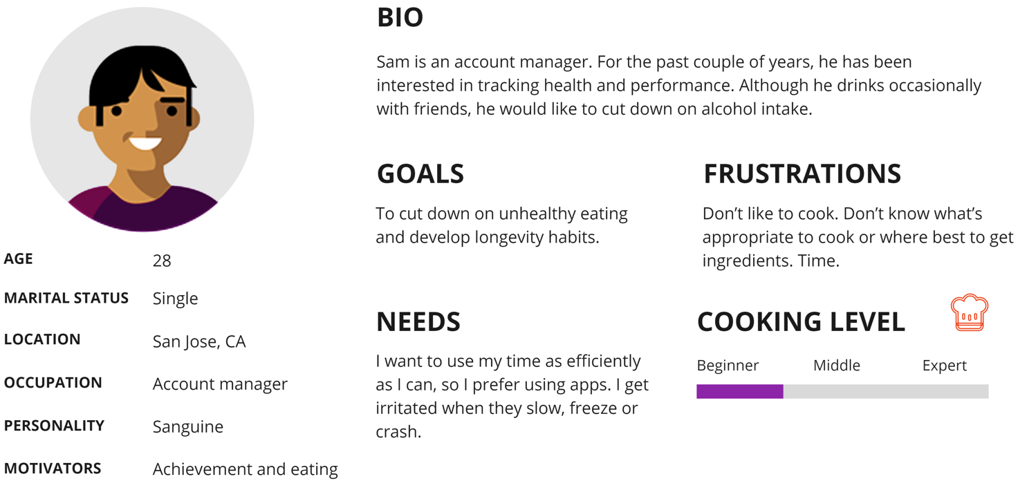
After talking to five people along the interview process, I looked for patterns and organized them using post-it notes and analyzed them. I then consolidated them into one main persona - Sam Olson. A single professional who is interested in a new way of eating to take better care of himself with a longevity mindset.
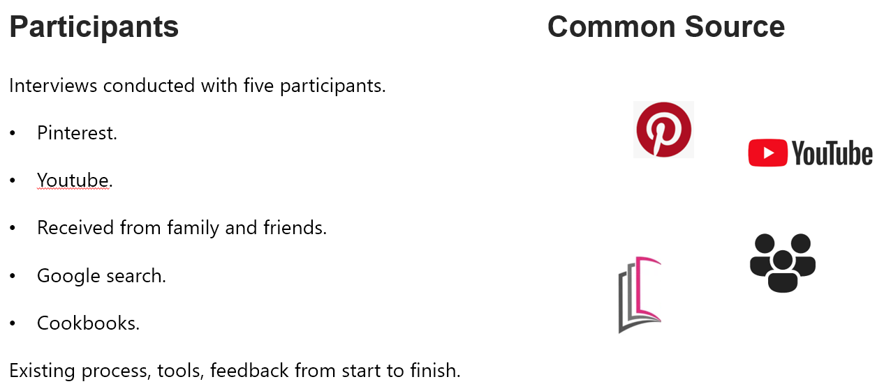
My research showed some of their common paths of finding recipes for their day-to-day meals with the objective of cooking and eating healthy.
As a part of my research I perform competitive analysis to learn about the products and systems already available in the market first to learn about their products and their features.
I went through review sites and app stores to understand the market. Although there are many on the subject of cooking and recipes, very few exist that utilizes biological samples and take a scientific approach towards customizing one's diet.
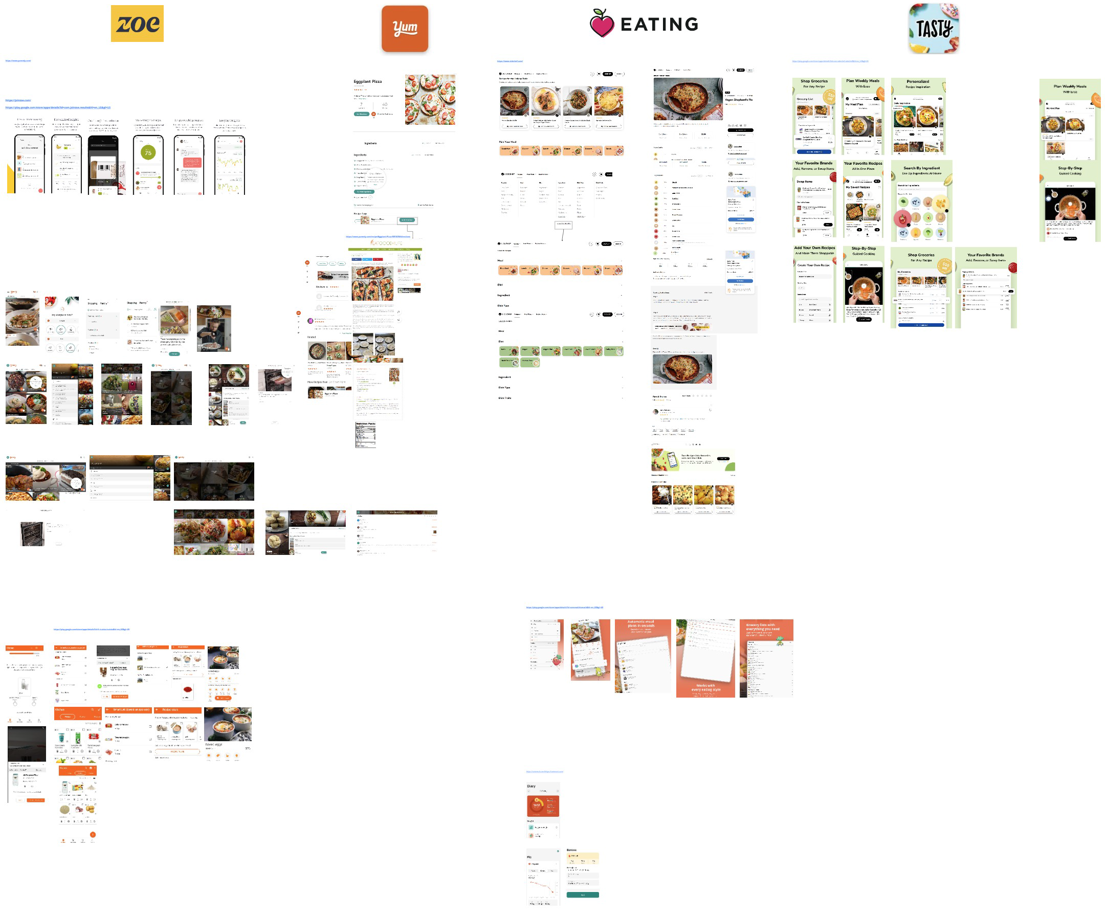
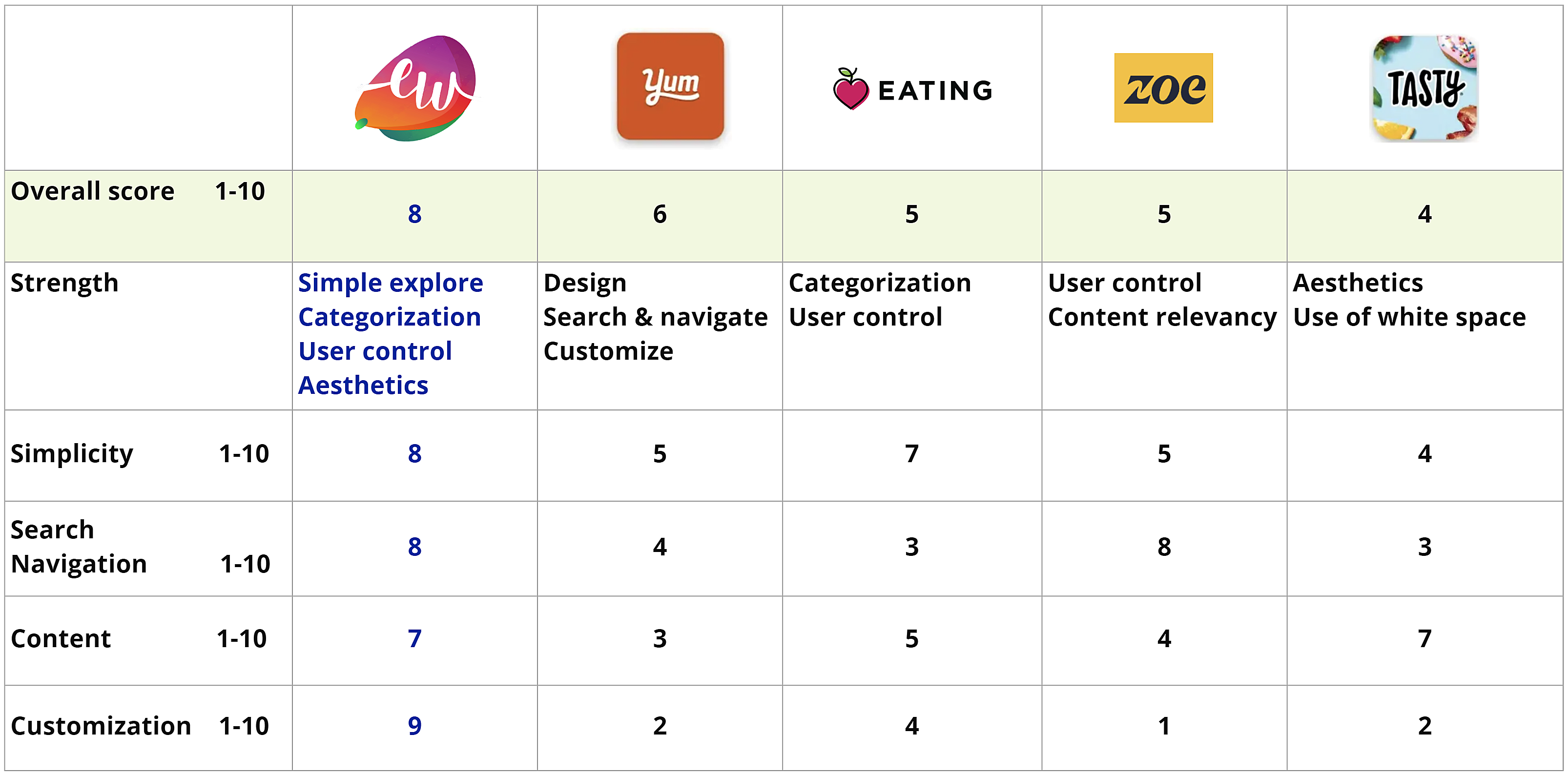
After gathering 15 different apps I narrowed down to 10, then to four. I highlighted the most important information I learned, strengths and weaknesses as well as unique features they might be using. Findings sparked improvement ideas toward process flows and prototypes. Here is a comparison map with numbers to evaluate their merit.
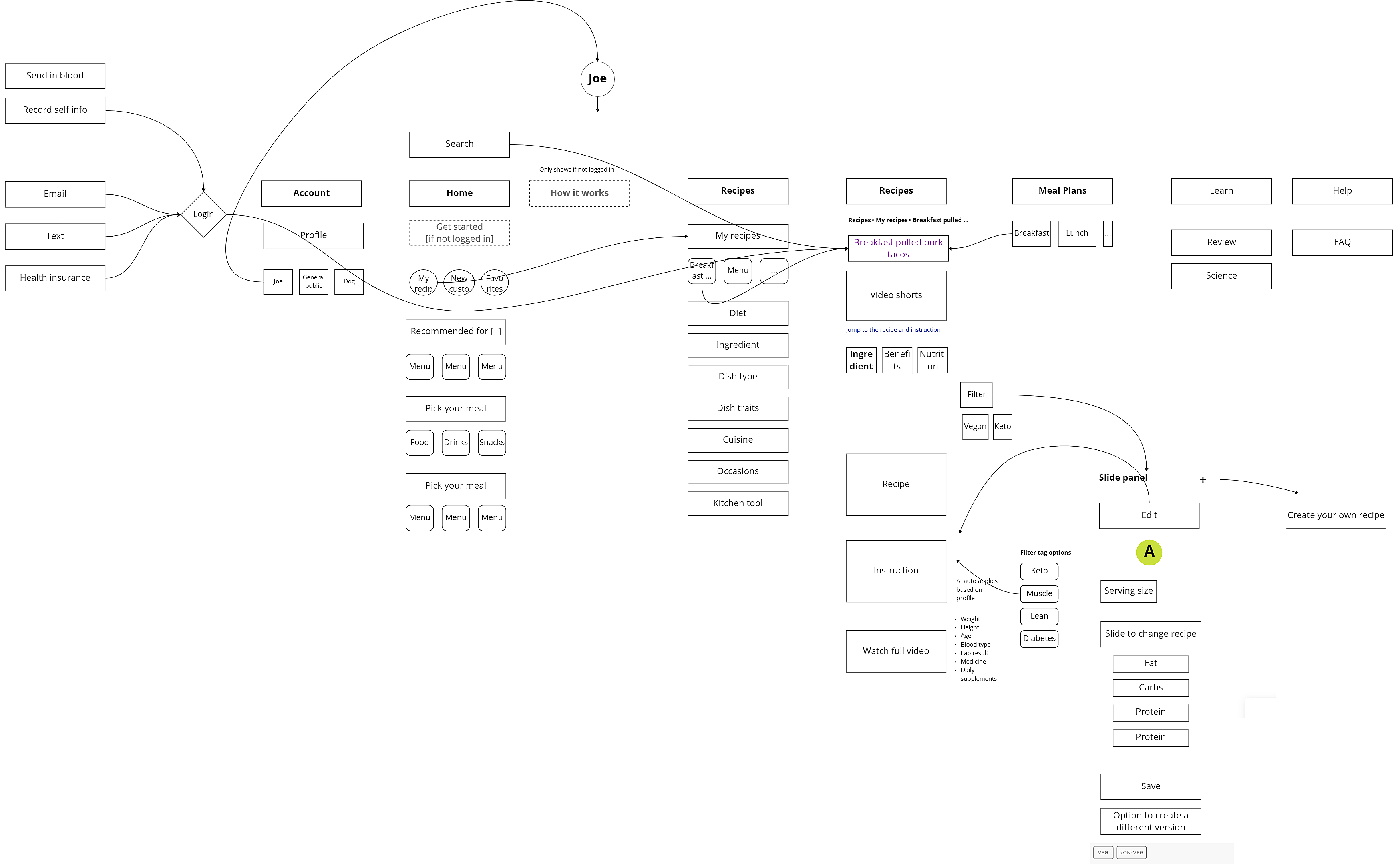
I started the brainstorming process by creating high level flows. I then began refinding the flow based on the HMW questions, generated many different ideas, then continued down that path until there were lots of branch ideas to choose from.
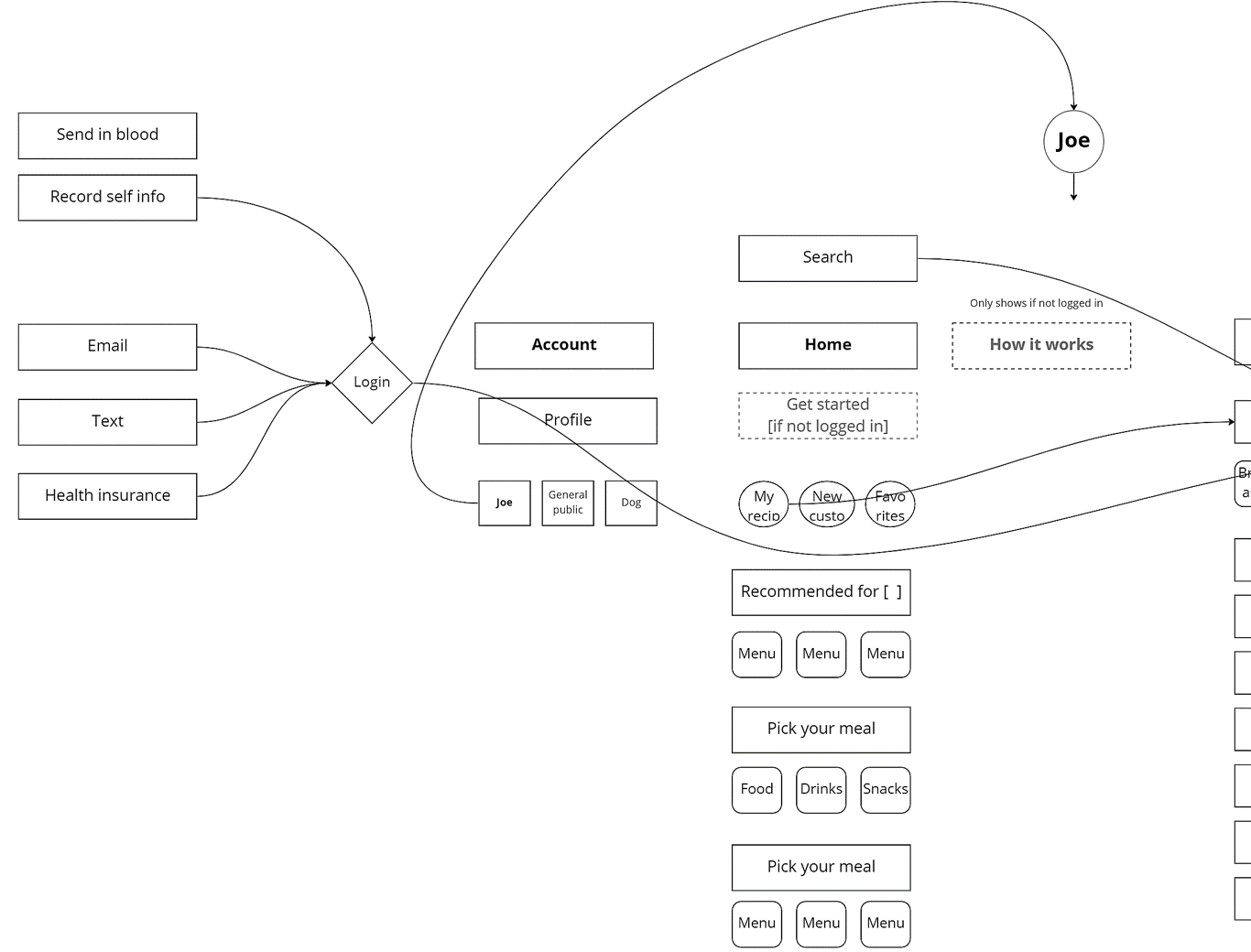
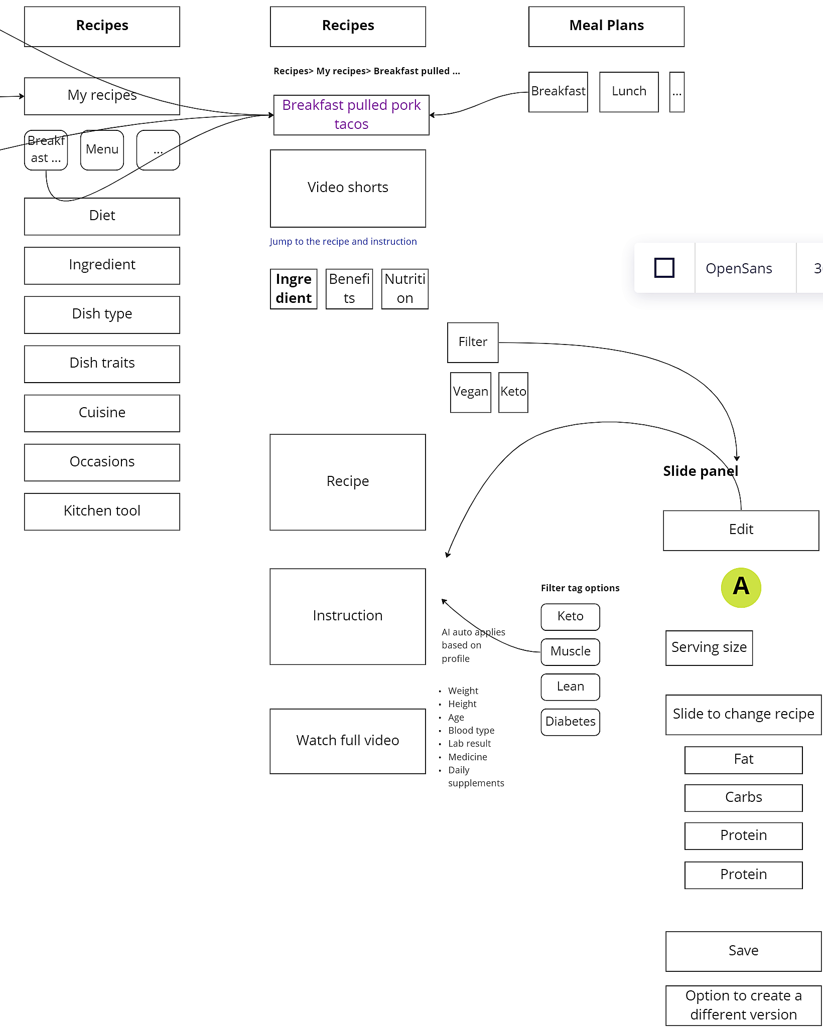
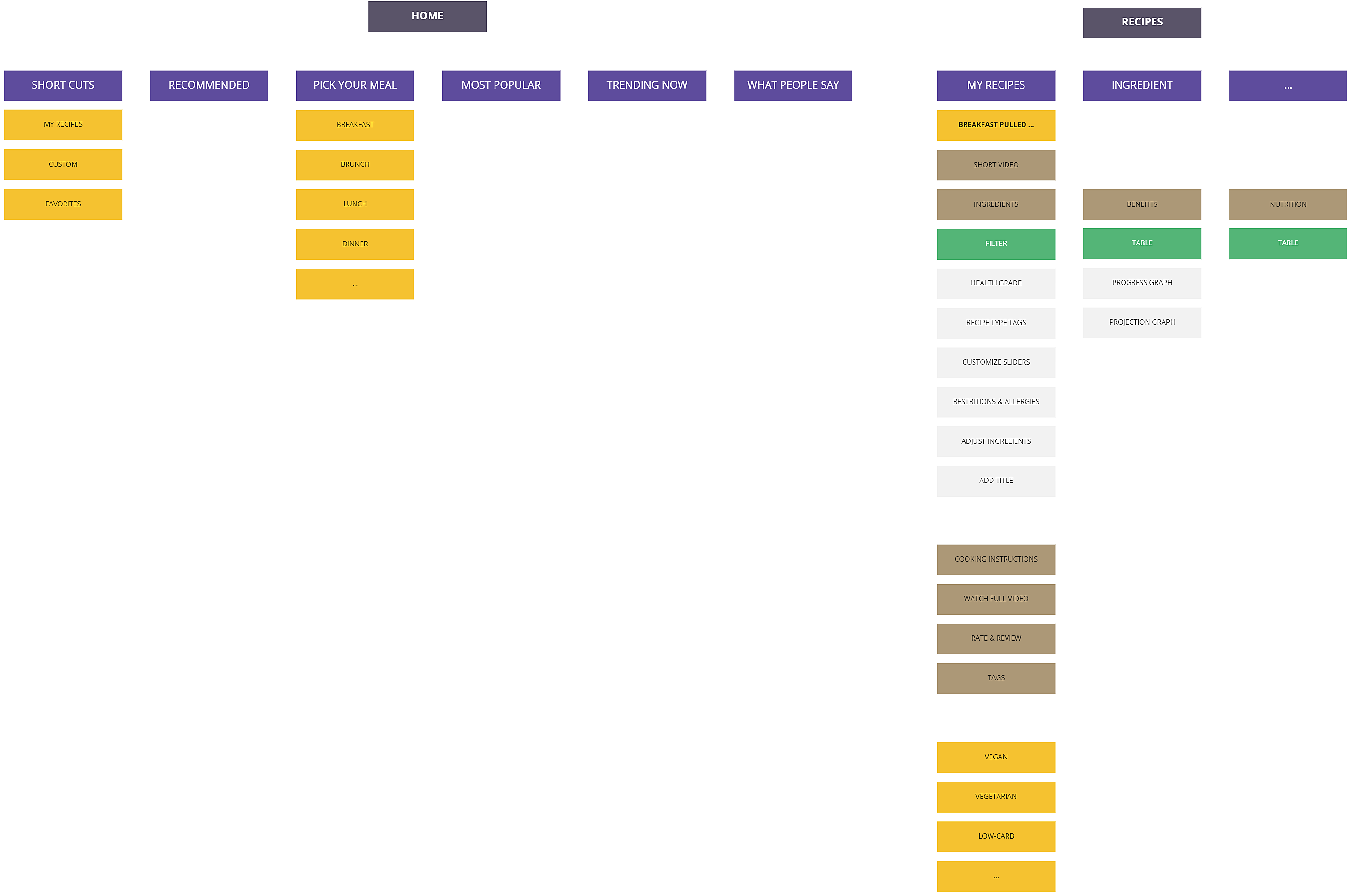
The diagram shows different entryways to the main custom “Breakfast pulled pork tacos” page. If a health insurance company was affiliated to Eat Well service, users could be notified there and land on the custom menu page directly. Email or text could be other ways by which the user will be notified of this custom menu being available and lead Sam Olson to the page.
If the user does not have an account created and is not logged in, marketing materials could be displayed on the home page as well as other pages. Upon logging in with an account the entire app could be customized.

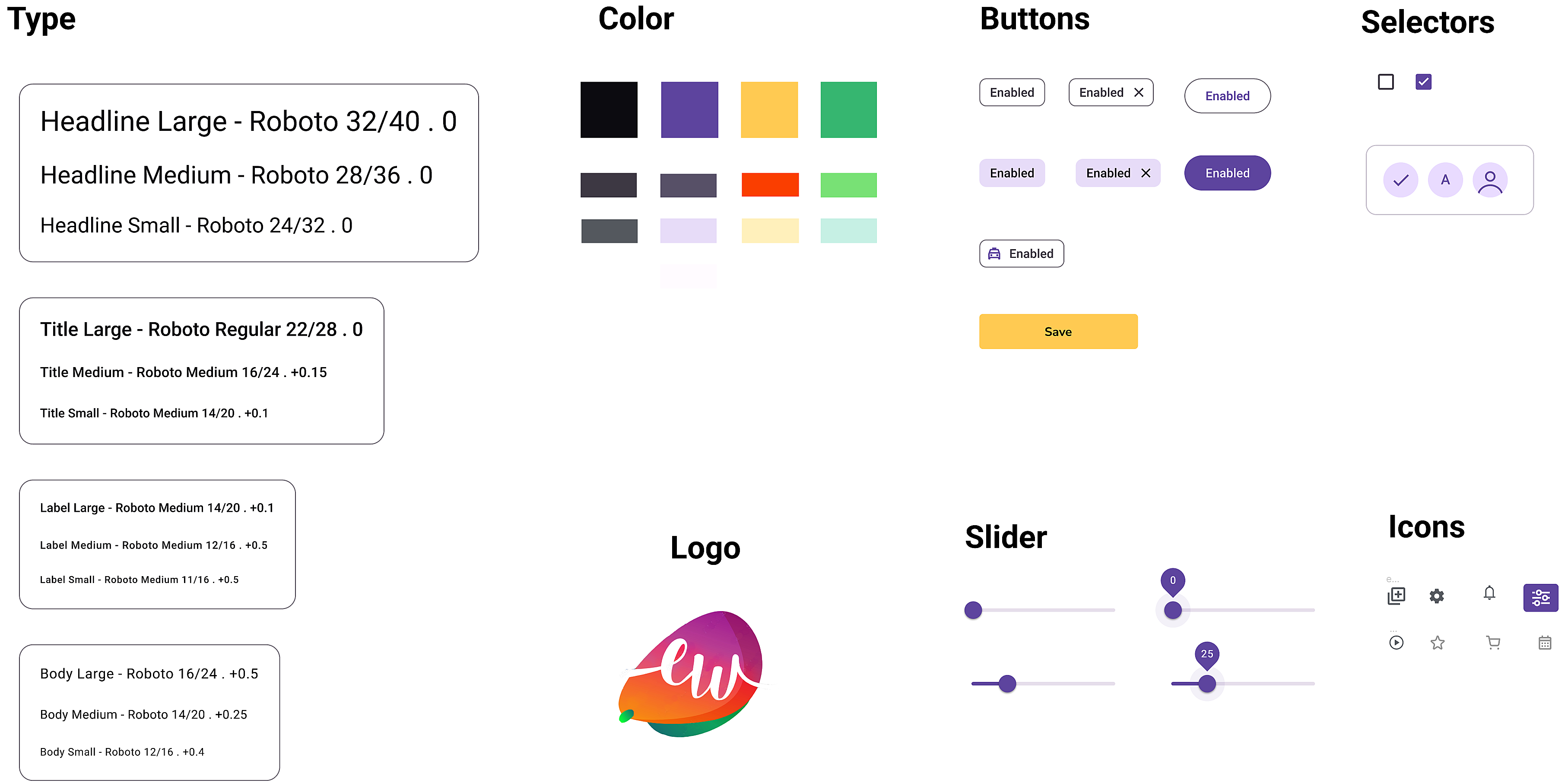
This design kit has design elements used for consistency and appropriate themes when building the app. It successfully demonstrates the vibrant and clean look I was striving for. It took a little time to set up but saved a lot of the prototyping time.
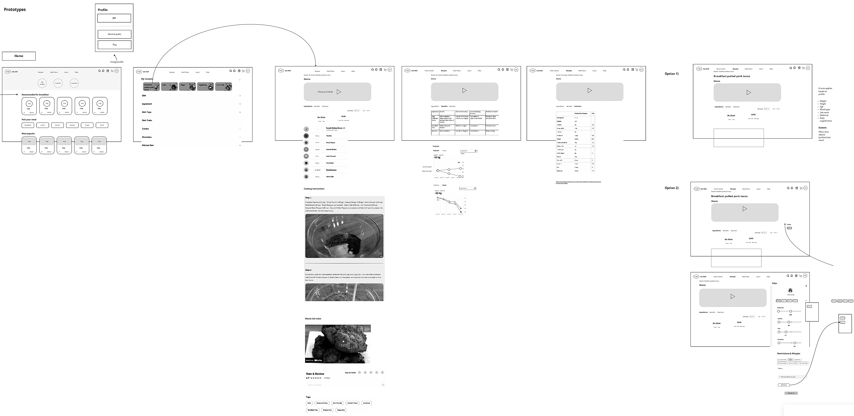
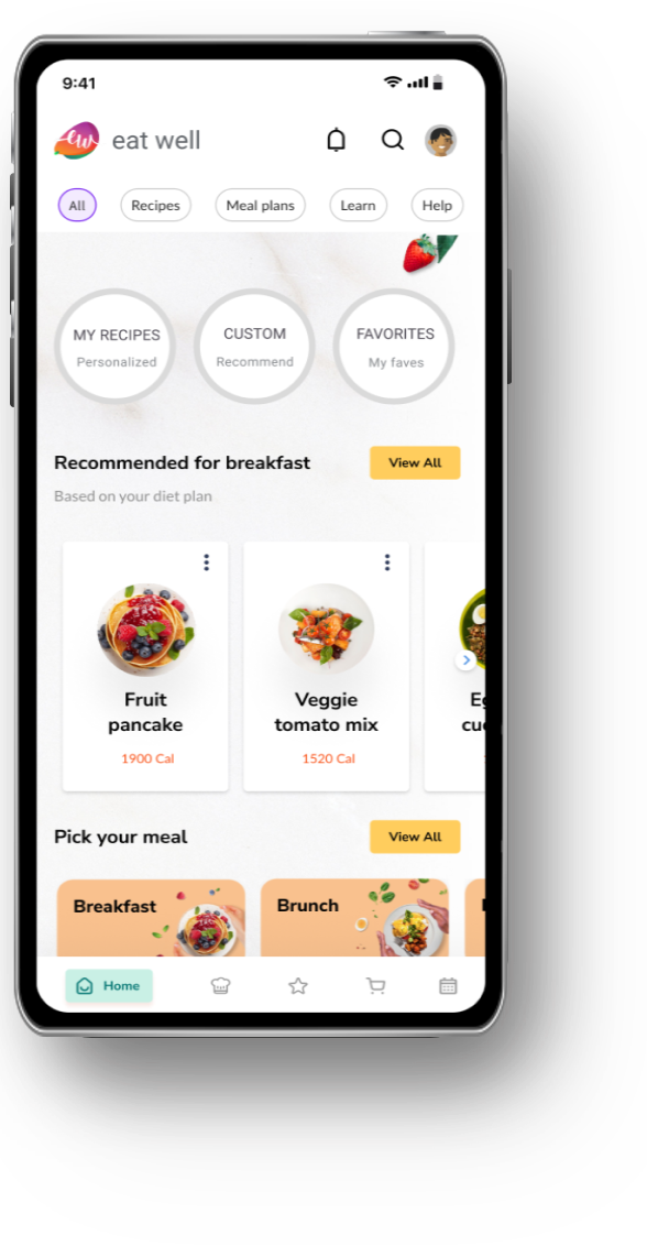
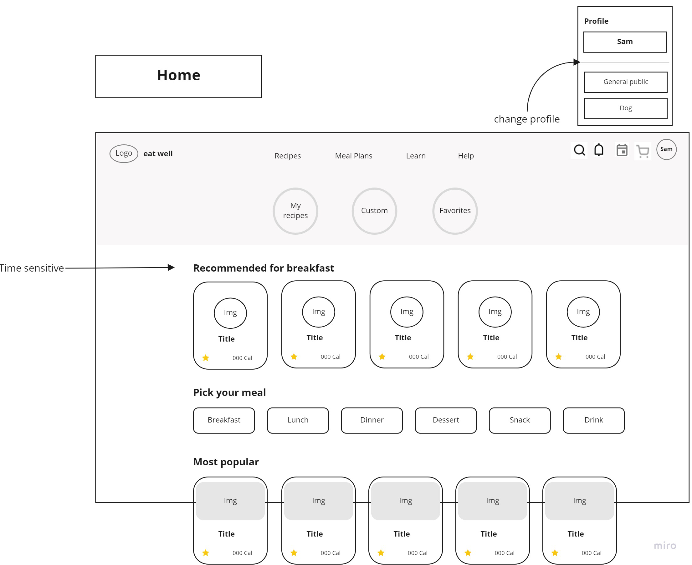
I strove for a clean look and simple experience. To do that, AI would need to understand what Sam would be wanting and aptly present them. For example, on the home page we want to study his search behavior and recommend an appropriate breakfast menu during the morning time, or dinner during the evening time, so Sam can just get on the app and find what he is looking for at a whim.
This was a quick design case study that served the purpose of envisioning what a scientific approach to healthy eating apps might look like. Here are the takeaways.