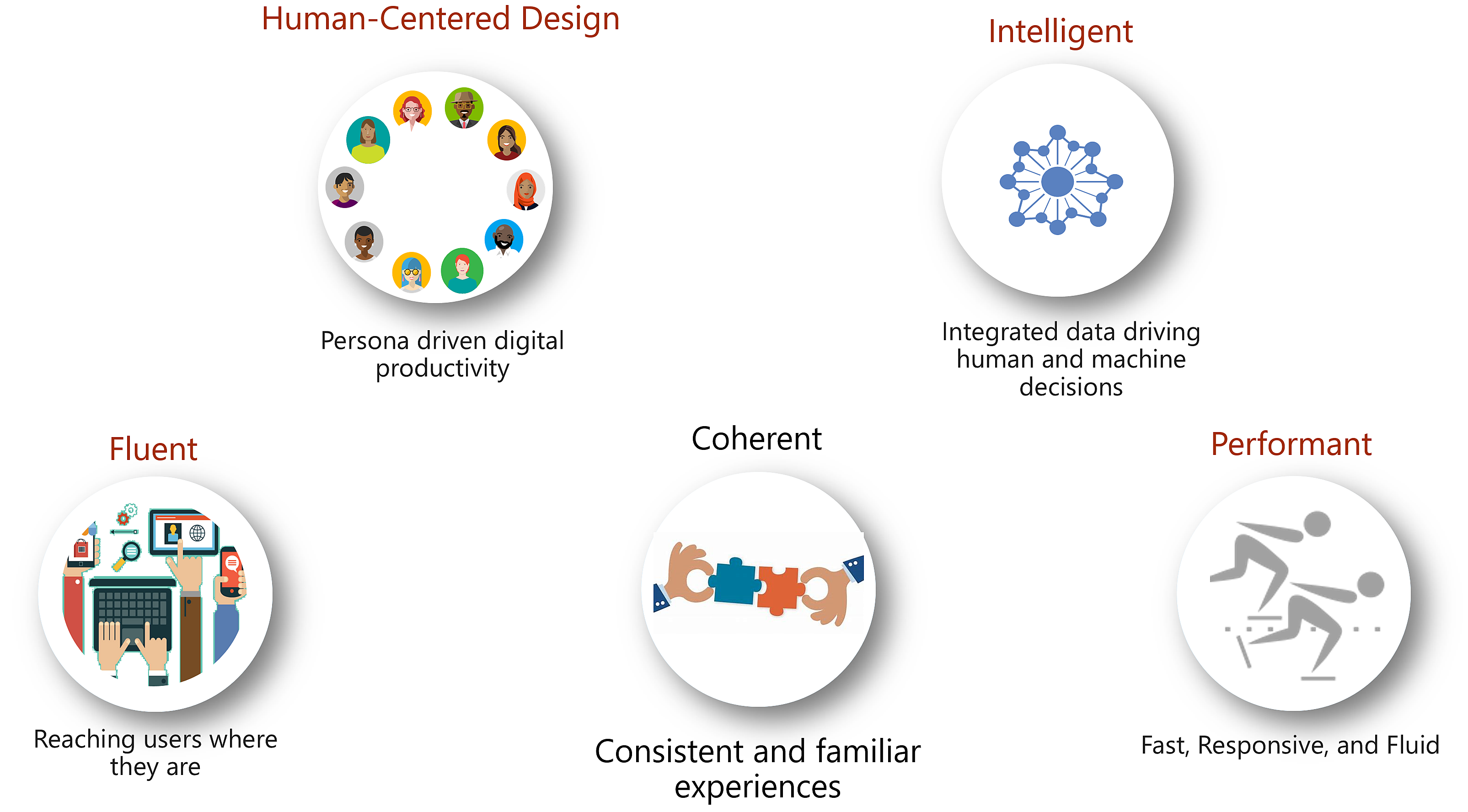
From 2017, Microsoft started revamping their user interface design across the entire company. They invented Fluent and Coherent standards, which made designs to look uniform, and development codes to be easily shareable between all departments.
2020 has been a year of significant transition for Microsoft's Sales. Many of their tools needed automation and AI technologies incorporated. They also had to be simpler, more elegant, and conform to their new design standards. This is the story of how I made a positive difference to everyday life of the sales force at Microsoft.
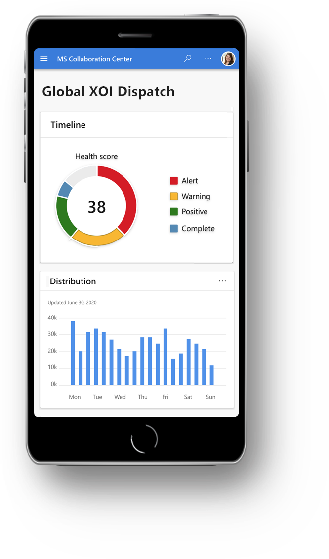
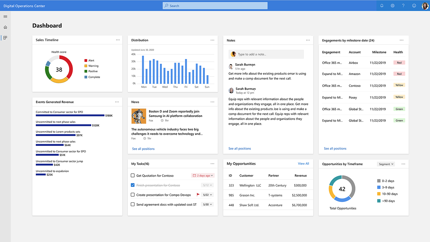
As the Senior UX Design Lead, I owned and drove improvements to multiple teams across a complex organization. Dashboard such as this above has been laborious, but delightful to create toward such a purpose.
By performing in-person interviews, in depth research on existing tools and processes, I learnt user behaviors. I sifted through hundreds of pages of documents, Power Points, surveys, and comments - as well as over eleven hours of videos. The outcome of these actions met user and business goals - including key engagements, user retentions, and personalizations.
After a careful analysis, I categorized them according to their importance. All these, plus some crucial feedback from my team and partners helped me identify various pain points, areas of improvements, and power features for the new portal that will integrate with other existing Microsoft Sales platforms. The picture below gives a little glimpse of the scale of Microsoft's Sales process and support.

Designs had to conform to these following standards. Fluent was the code base, and Coherent was UI aspect of consistency and familiarity of the new guidelines. Library of these components were available for use - along with regular communication channels on Microsoft Teams, on which Q&A were conducted with the Coherence support team and community on a regular basis.
The project ran along the Agile process method. Each iteration lasted a month and each sprint went for two weeks. For the duration of the project I played the part of the following roles 1) UX designer 2) UI visualizer 3) UX researcher 4) Project manager 5) Data analyst and interacted with with our Sales community.

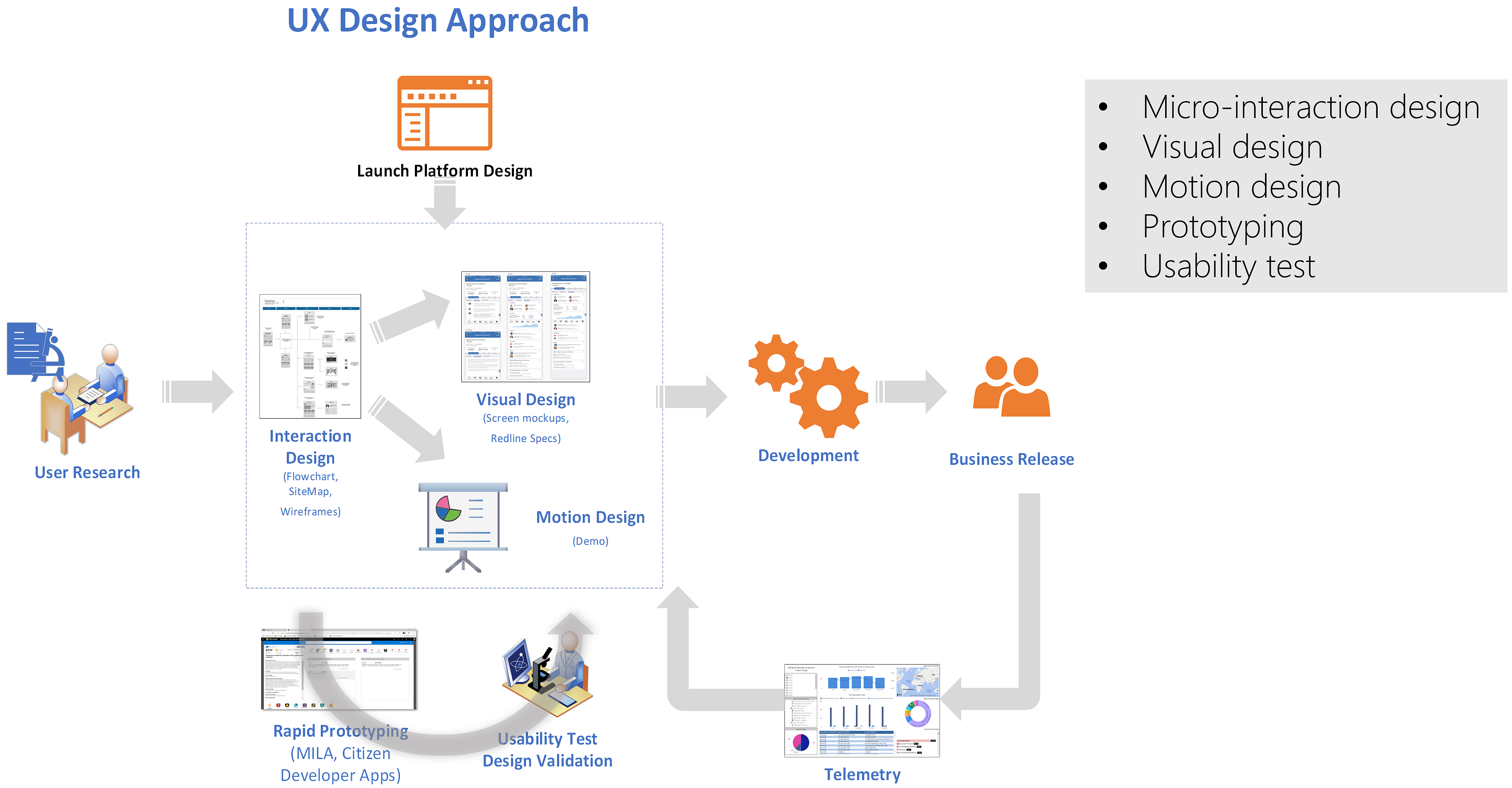
The design process flowed in the following order. Based on my interaction with clients and research, I created designs one sprint ahead of the development team. I held meetings where design specs were discussed, and upon their initial creation, following discussions were conducted to ensure the product was according to client's needs and engineering teams' ability to deliver. After the development they went through the UAT process.
Whenever I design, I go through a series of questions to ensure a thorough and successful research. I call it "My Magnificent 7."


I collaborated with Sales Project Managers and Developers to understand users, existing tools, and existing processes so we can create, refine, and build the new platform toward Microsoft’s long-term business and sales strategies.
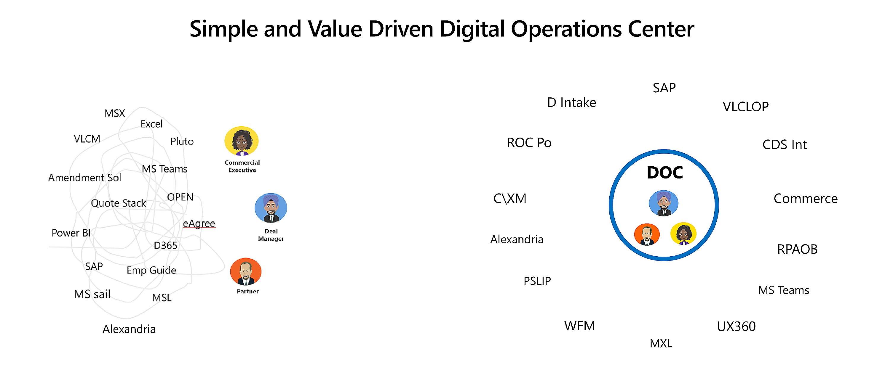
The sales community consists of about seven different personas, such as, Deal Managers, Commercial Executives, L2S, etc. After the research and assessment, it made sense to start building a simple and value driven platform around the most impacting persona - the Deal Managers.
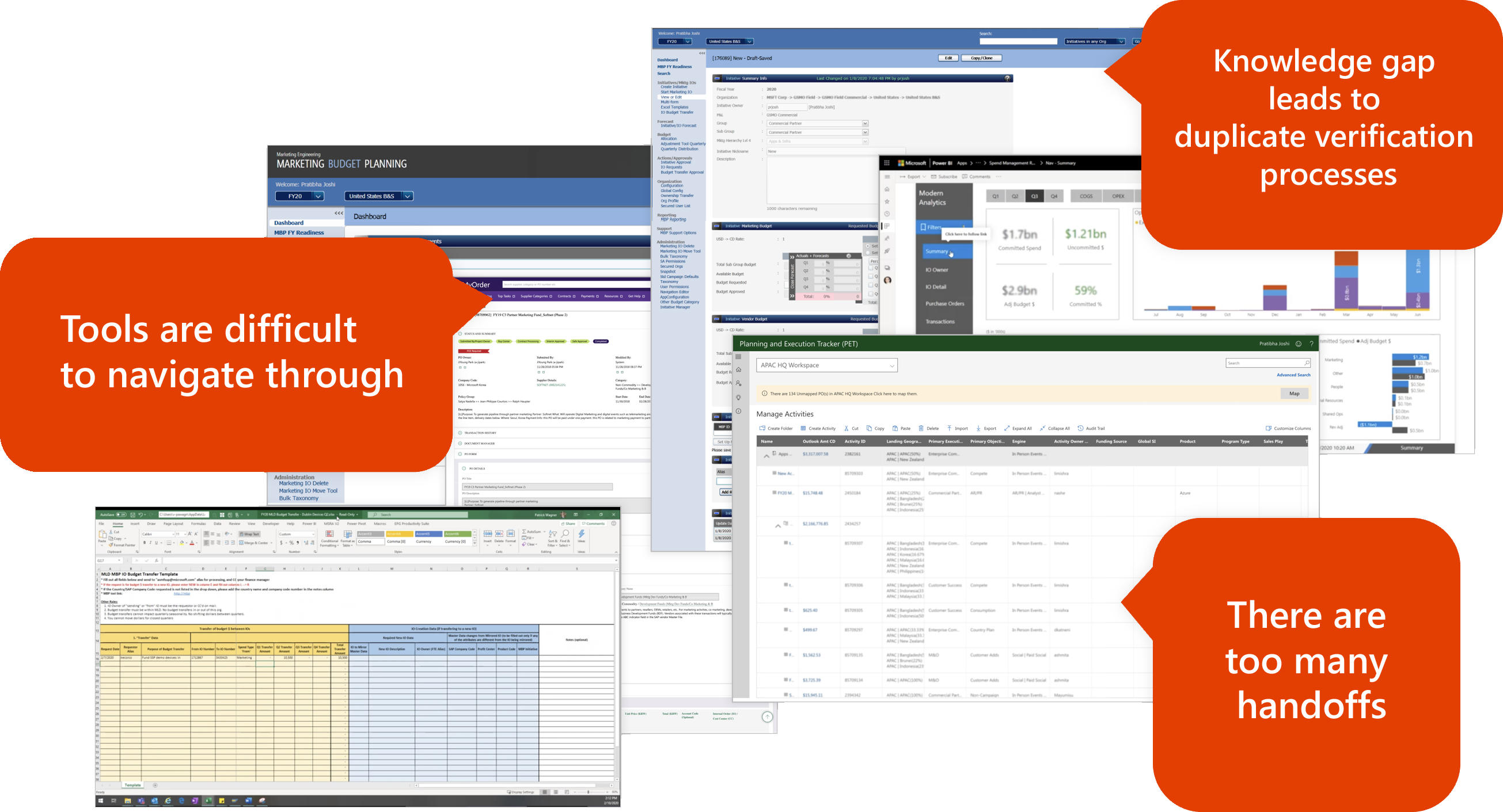
Deal Managers use eleven different tools in line of their daily work. Those tools are difficult to navigate through and share information with other team members. Existing processes go through unnecessary verification steps and cause delays. I successfully collaborated with stake holders and team members, to streamline processes and consolidate tools to a platform that would provide an end-to-end solution for our clients.
Research, surveys, and customer feedback revealed the following pain points with the existing process and tools. Some of them are listed here.
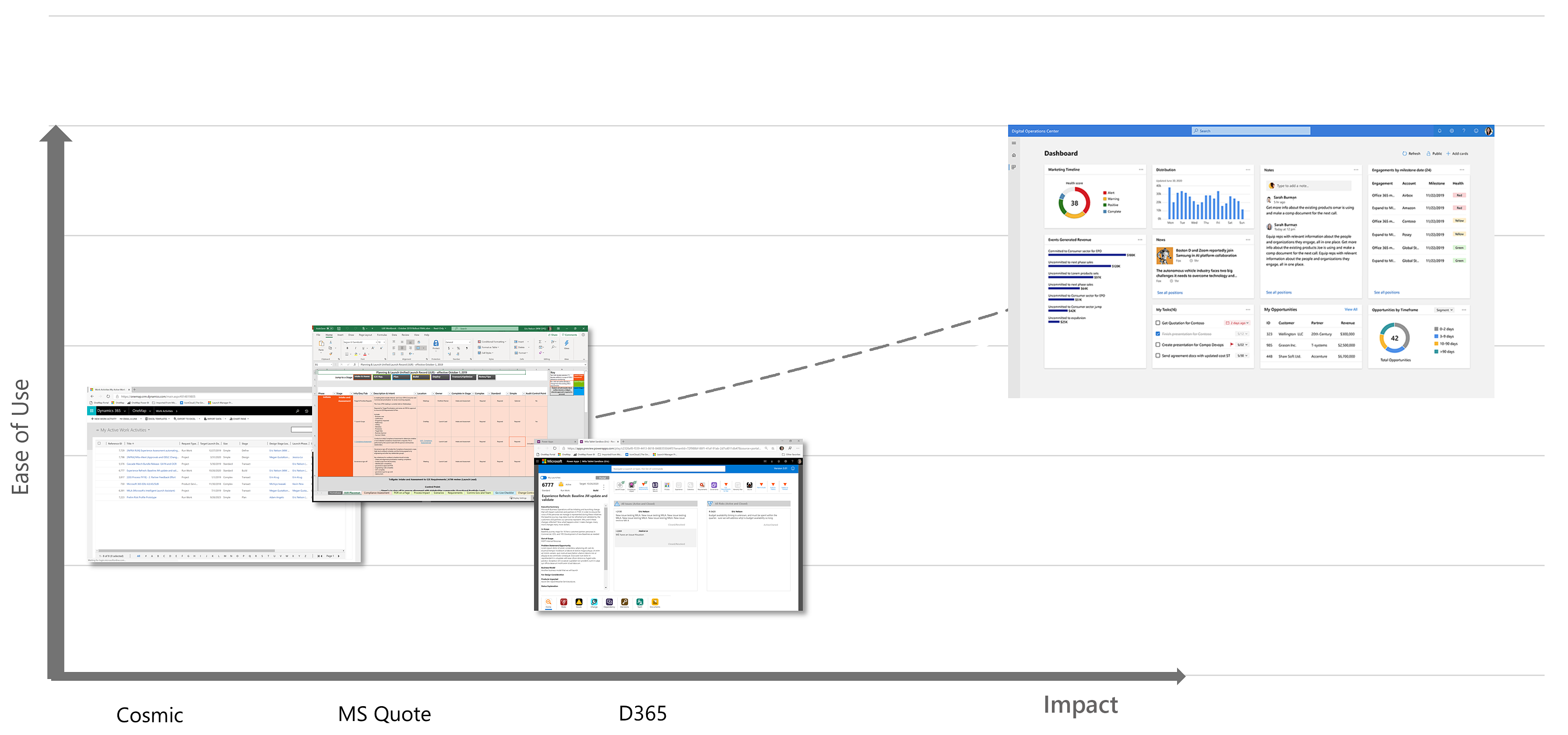
I am passionate about solving real problems for real people through research, design, and iteration. I initiated to create this process flow for the purpose of helping our team understand the existing tools, processes, and personas related to deal managers. Our team was thrilled about its outcome and value.
To disseminate the research learnings, I created a customer journey map. Based on the process diagram I had created, documentations, and interviews - I was able to shed some light to users' emotions and day to day work experiences here. This allowed me to communicate the severity of the pain‐points and facilitate conversations about the areas we wanted to fix.
The map highlighted how broken the current deal opportunity model was, created a deeper empathy toward our clients, and sparked creative solutions amongst the team. This research allowed us to focus our energy on creating the right user experience.
Once the product went to UAT, further user research was done along with Telemetry. One of the testing methodology applied was the HEART metrics.
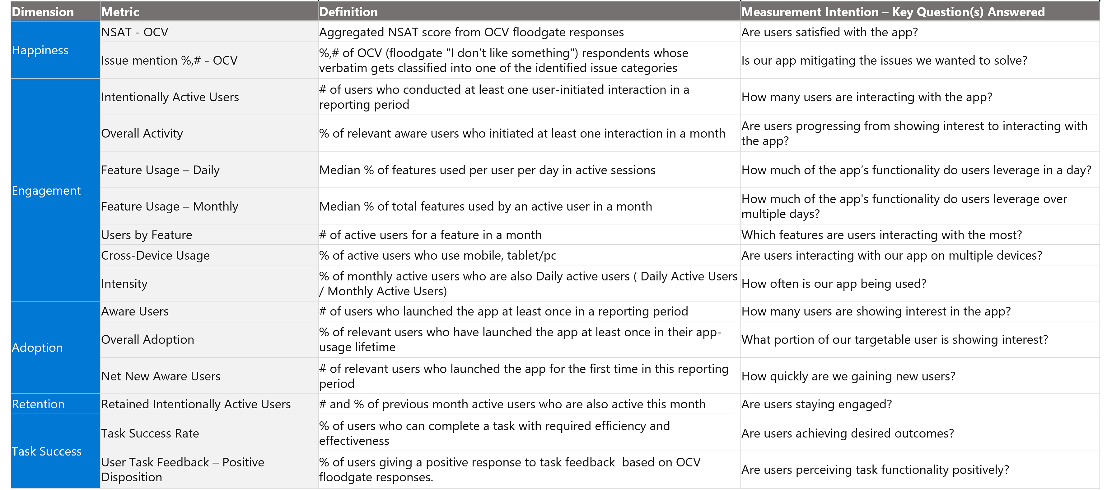
There were many other measurements as well. Some of those were:
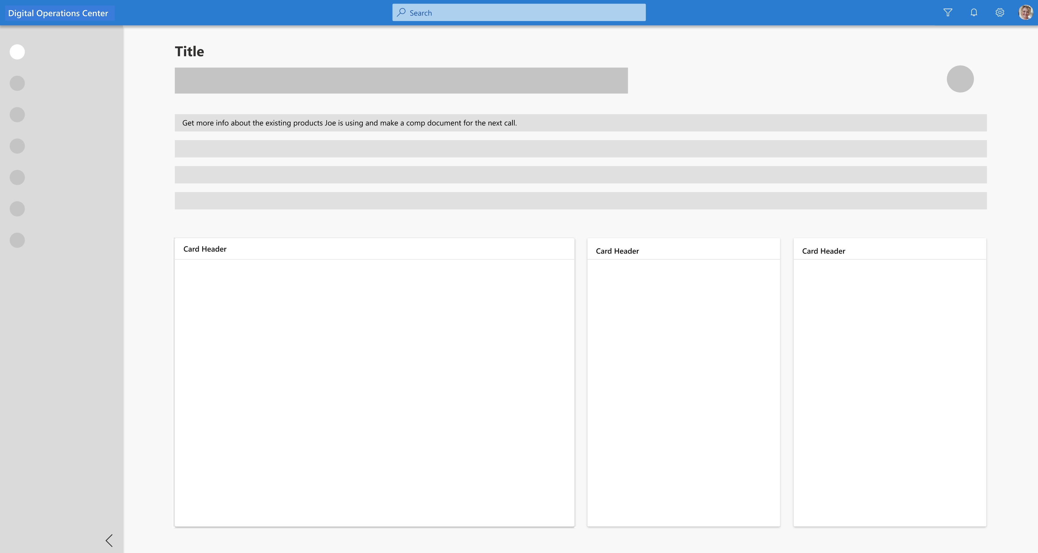
There were many other wireframing and low fidelity mockups I created. Here are some of the examples.
I refined the concept with research outcomes in-line with our business goals and went through a few rounds of iterations using Photoshop, Adobe XD, and Figma.
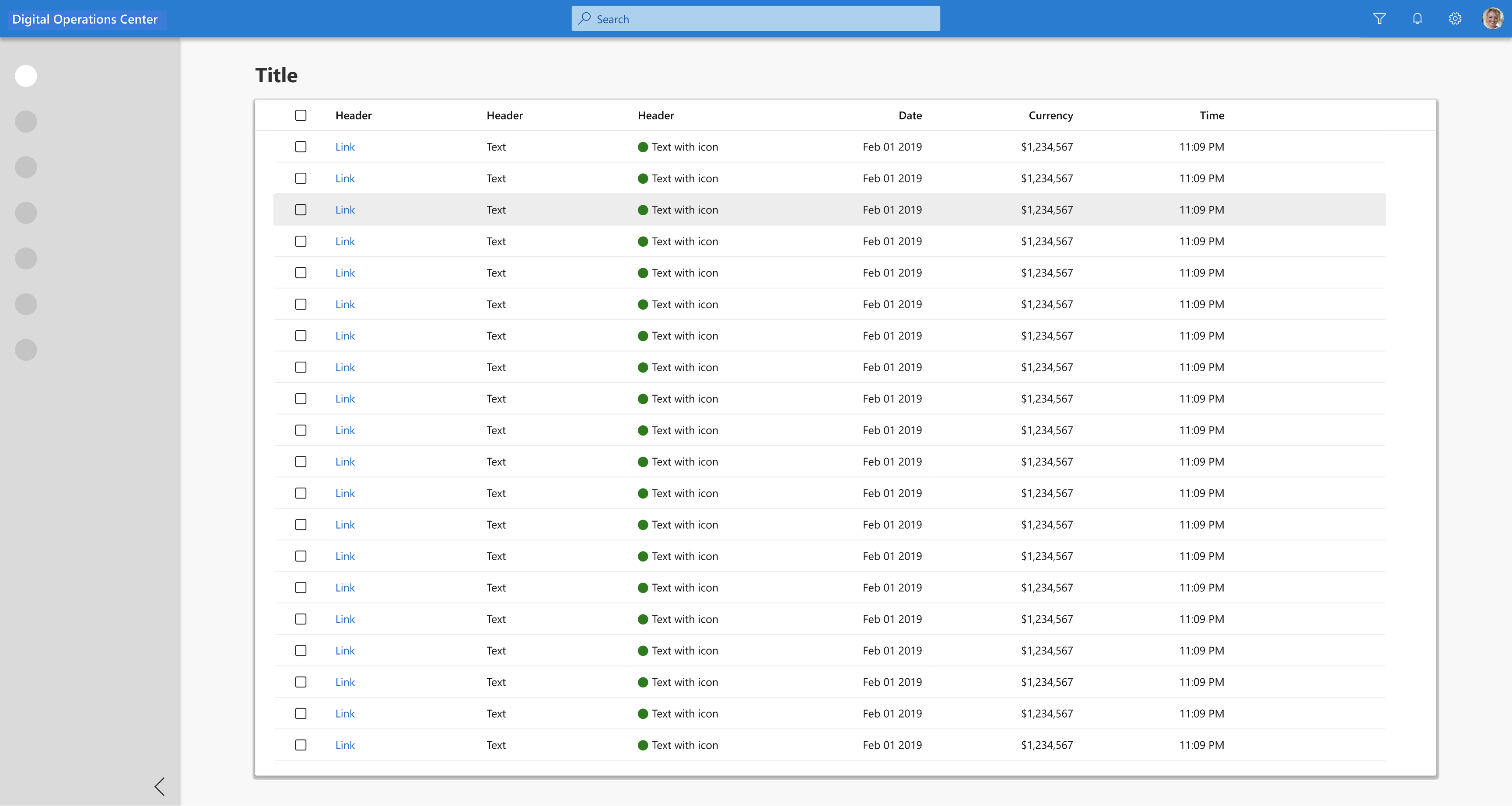
The launch platform was heavily data driven. I created grid pages like this, which allowed the launch community to get the metric data they needed for analysis and processing. I ran queries to retrive appropriate metrics from the database to create real life mockups.
Our challenge was to evolve with customers, and provide scalable products that will work with the rest of Microsoft's Sales Experience (MSX) platforms. Working backwards from a fixed completion date meant that design was subsumed into an engineering‐driven process. Sign‐off milestones were driven by engineering estimates and time to create the right design was the time left over. The combination of a fixed launch date and aggressive scope created an intense environment with many coordination and time challenges. I created many high fidelity prototypes for the Digital Operations platform. Here are some examples.
The dashboard provided users with key metrics, widgets with actionable items, and filters, which empowered them to drill down deeper for indepth understandings of deals.
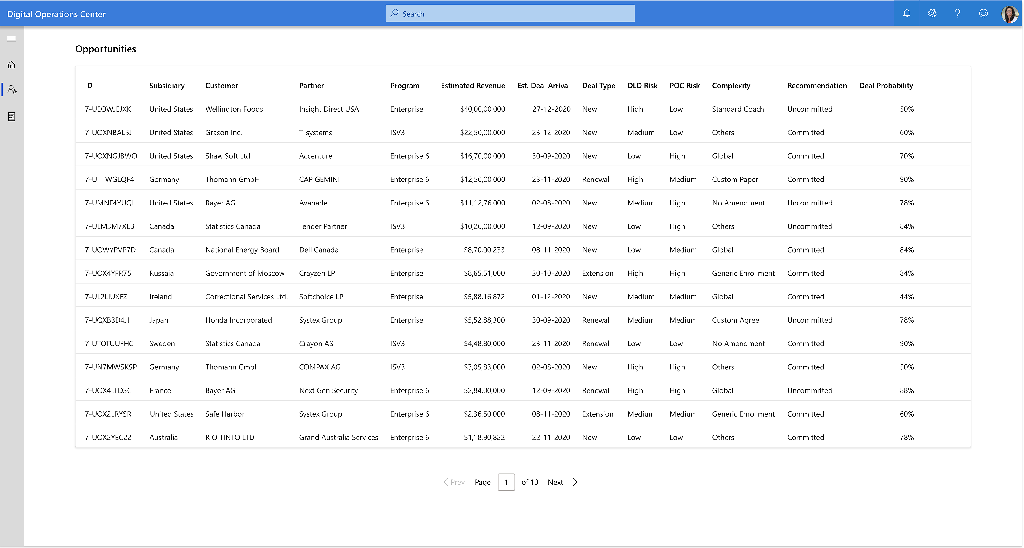
ODM (Opportunity Deal Manager) was the first persona we wanted to support. For that reason, an opportunity was the main driving record level. This Opportunities page was designed as a starting place for ODMs to explore deals.
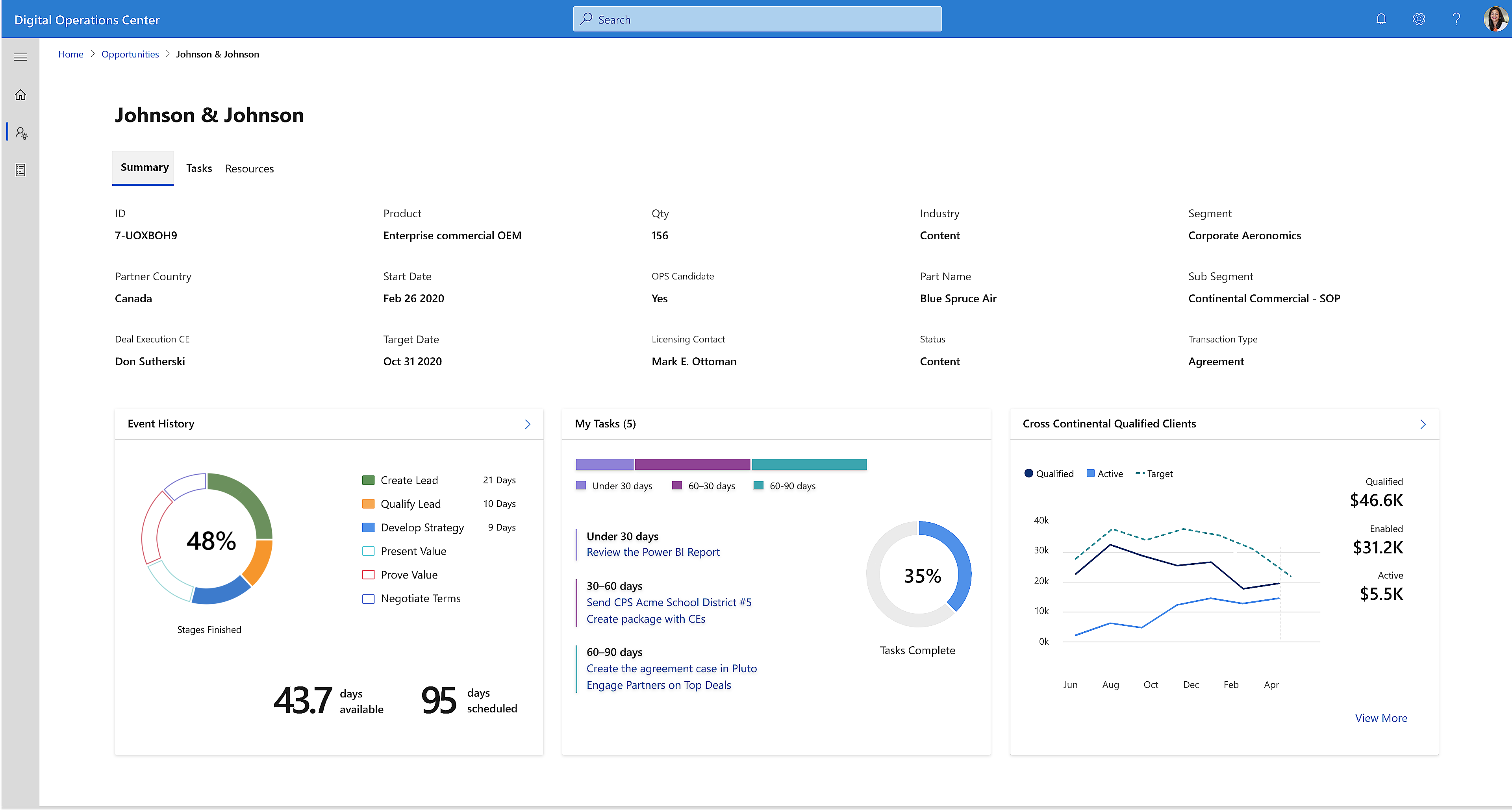
When a user clicks on an opportunity from the Opportunities page above, the user is taken to this Opportunity Details page that gives summary information, metrics, and widgets with actionable items for an opportunity. The time and energy spent going through many different tools, duplicate data, and manual checking process has been excruciating for sales deal managers. Sales opportunity details page I designed like the one below, is giving them an edge. Deals can now be processed more efficiently and accurately - resulting in more satisfied customers and higher customer retention rate. As the portal evolves to support additional features, we will be seeing deal review times reduced by 50%, and deal quality measures improve by 30%.
Tabs such as "Tasks" on the Opportunity Details page takes deal managers to data grids such as this, which empowers them with their deal analysis. Sliding panels simplified the user experience. With panels such as this, users were able edit and perform tasks at a deeper level.
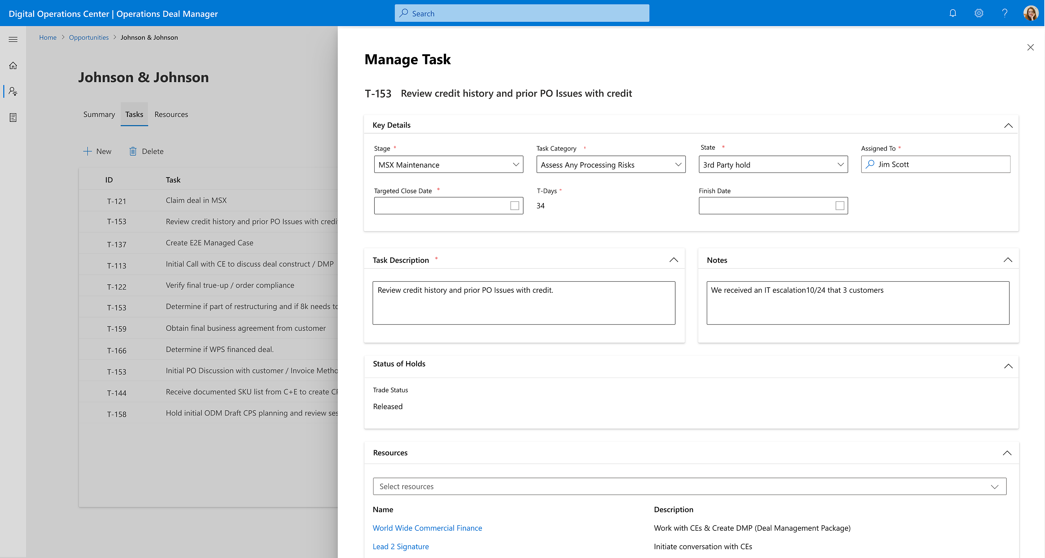
Various navigations, grid displays, and usage of sliding panels had been entertained during the brainstorming phases.
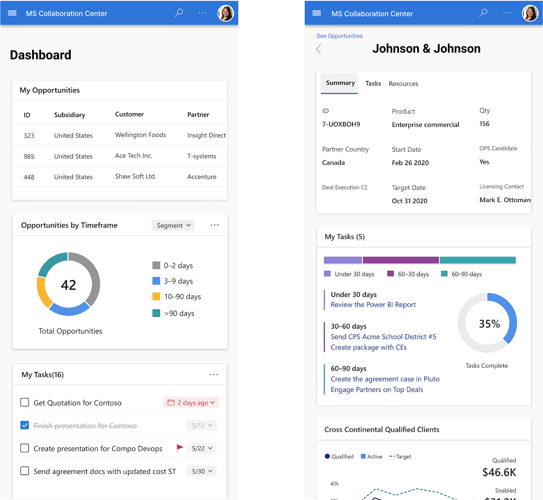
Due to the number of features and complexity of the platform, we started with the web version first, then went on to mobile solutions. All of our designs were made for web, mobile, and tablet.
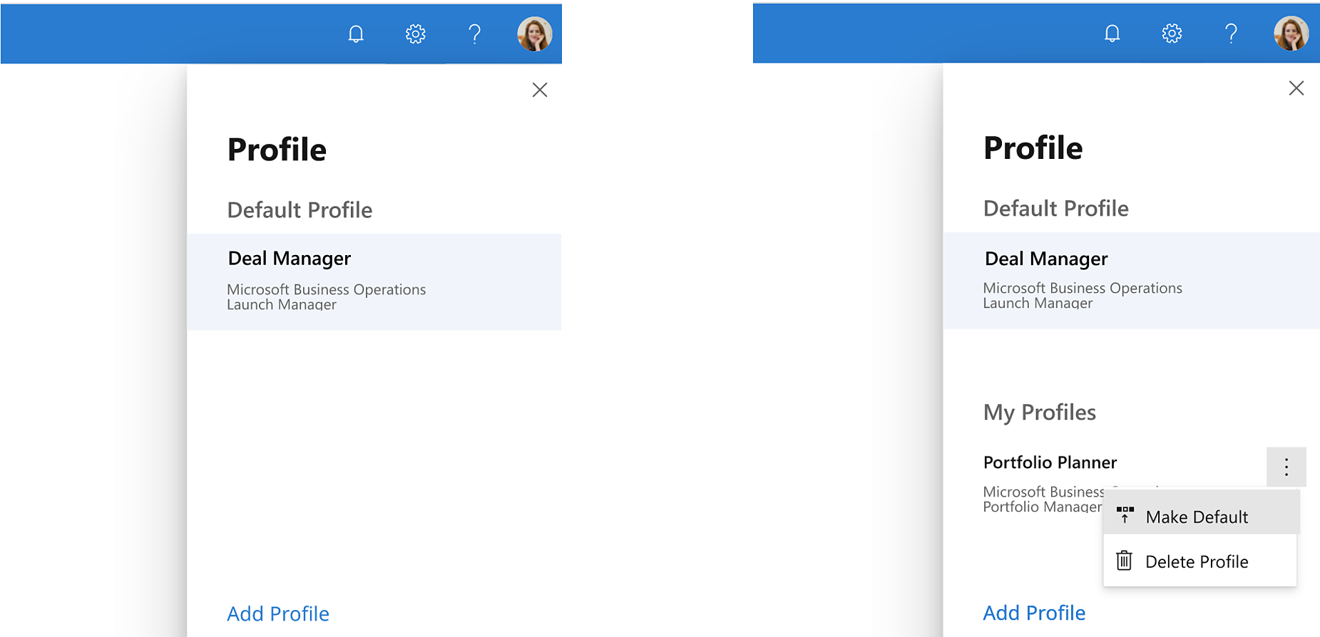
The Sales team has eight different personas. Some users have multiple persona and needed to switch between them. I suggested creating a single location where this can be done and created the following design.
Made deals faster, easier, and raised their quality.
A large number of tasks have been reduced.
Became centralized and standardized, with steps to ensure compliance in all areas.
It was automated with processes that use AI and ML.
Sales review and approval times were reduced by 45%+ for high value and highly complex deals, which made ~80% of revenue or $50 billion annually, and continued to grow.
This project provided another lesson of being mindful of scalability. I've worked on design and system integration but creating this platform to integrate with the entire Sales department at Microsoft was a scale bigger than I had anticipated. From this project I gained further insight on large scale architecture creation and integration.
Some of the components we designed in our team from LMP was reused on this project, which saved us resources. What I develop can be impacting many other users, projects - both inside and outside what's immediate at hand.
In the book "Hit Refresh", when Satiya Nadella became the CEO of Microsoft in 2014, he consulted Dr. Gervais who helped Seahawks win the super bowl. Dr. Gervais put emphasis on winning as a team, rather than by individuals, and rewarded individuals discreetly. Satiya says, if a team member has potential and will be with the team long term, but fails, get him another chance immediately to boost his confidence.
How will the customers win? Team win? How will I win? That's the winning order and formula. More than ever, I realized the benefits of this order. During this project I've repeatedly seen how by honoring this sequence, much can be accomplished - and nothing is more thrilling than a team that works together in harmony. When a team comes together, mountains can be moved. However, this is only possible if the entire team is in a position with an accompanying mindset to learn.
What I've done with this project will stay with our customers and this company. What I will carry with me are, what I've learned, experiences, and stretch marks toward my next project and onward. I am thrilled and look forward to creating more fun designs, innovative features, and WOWing my customers more than ever.