Over the period of its establishment, Microsoft had accumulated many products. By 2019, their launch process involved many diverse tools and processes that made the launch experience slow and complex to use for the internal team. Launch is the delivery process that happens mainly after a sale. A delivery planning and execution can take on average, six months to two years. It was time to make their myriads of product launches more streamlined and productive. I was part of this ambitious project to create an all-encompassing launch portal for one of the most notable companies in history.
I've been responsible for driving design deliverables such as interaction models, scenarios, sketches, story boards, wireframes, user interface designs, and prototypes. I am an expert at using Adobe CC (i.e. Photoshop, Illustrator) and Figma. I am also familiar with Sketch, InVision, Adobe XD, and other prototyping tools like HTML/CSS. I know how to balance qualitative and quantitative data to help make the best user-centered design decisions as I successfully have on this project.
I collaborated with the Business Project Managers and Developers to understand users, existing tools, and existing processes so we can create, refine, and build the new platform toward Microsoft’s long-term business and product strategies.
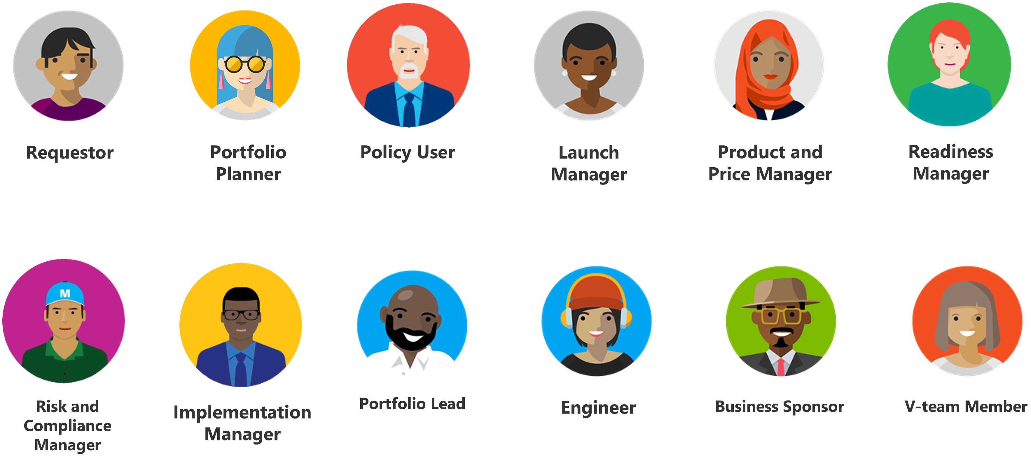
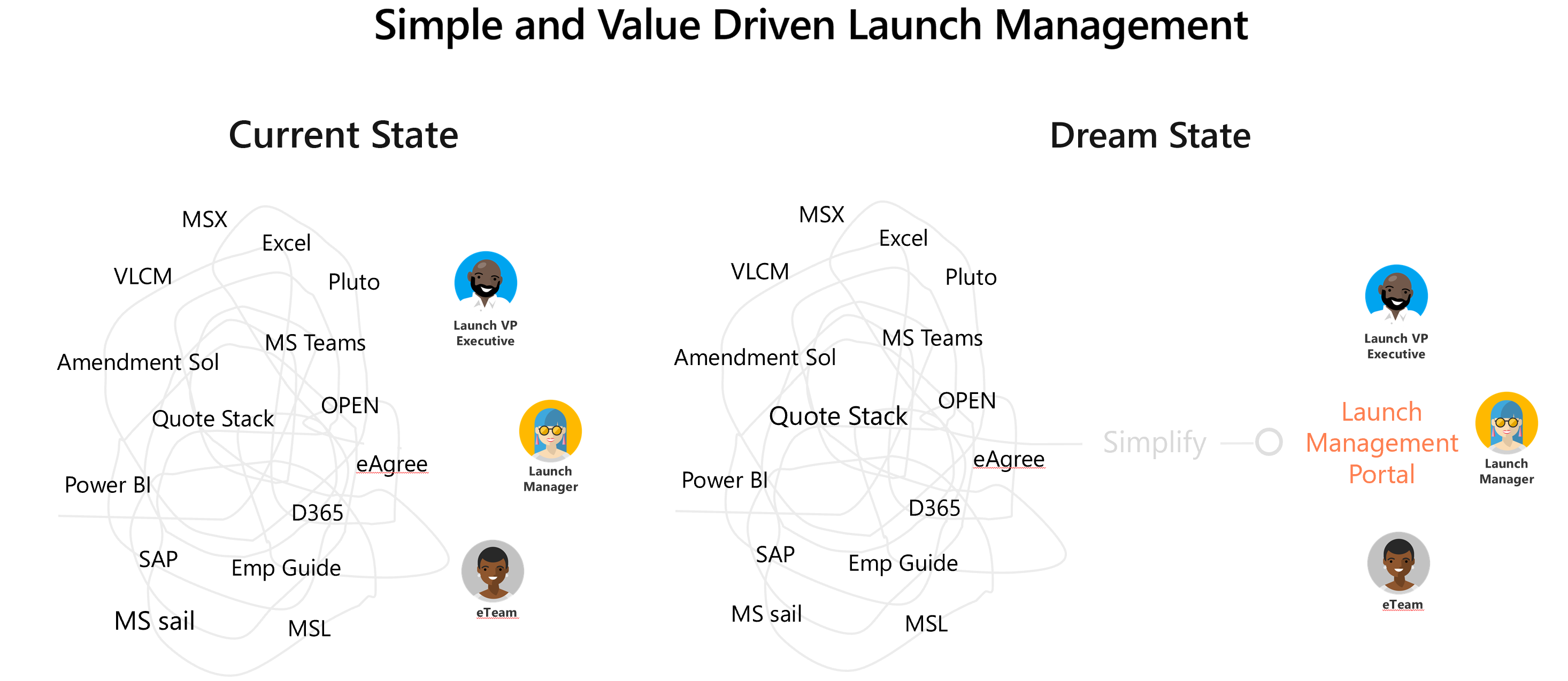
The Microsoft Launch is part of the business sector called MBO (Microsoft Business Operations). The launch community consists of a dozen different personas, such as, Portfolio Planner, Risk Manager, Compliance Manager, Portfolio Lead, Business Sponsor, etc. After the research and assessment, it made sense to start building a simple and value driven platform around the most impacting persona - the Launch Managers.
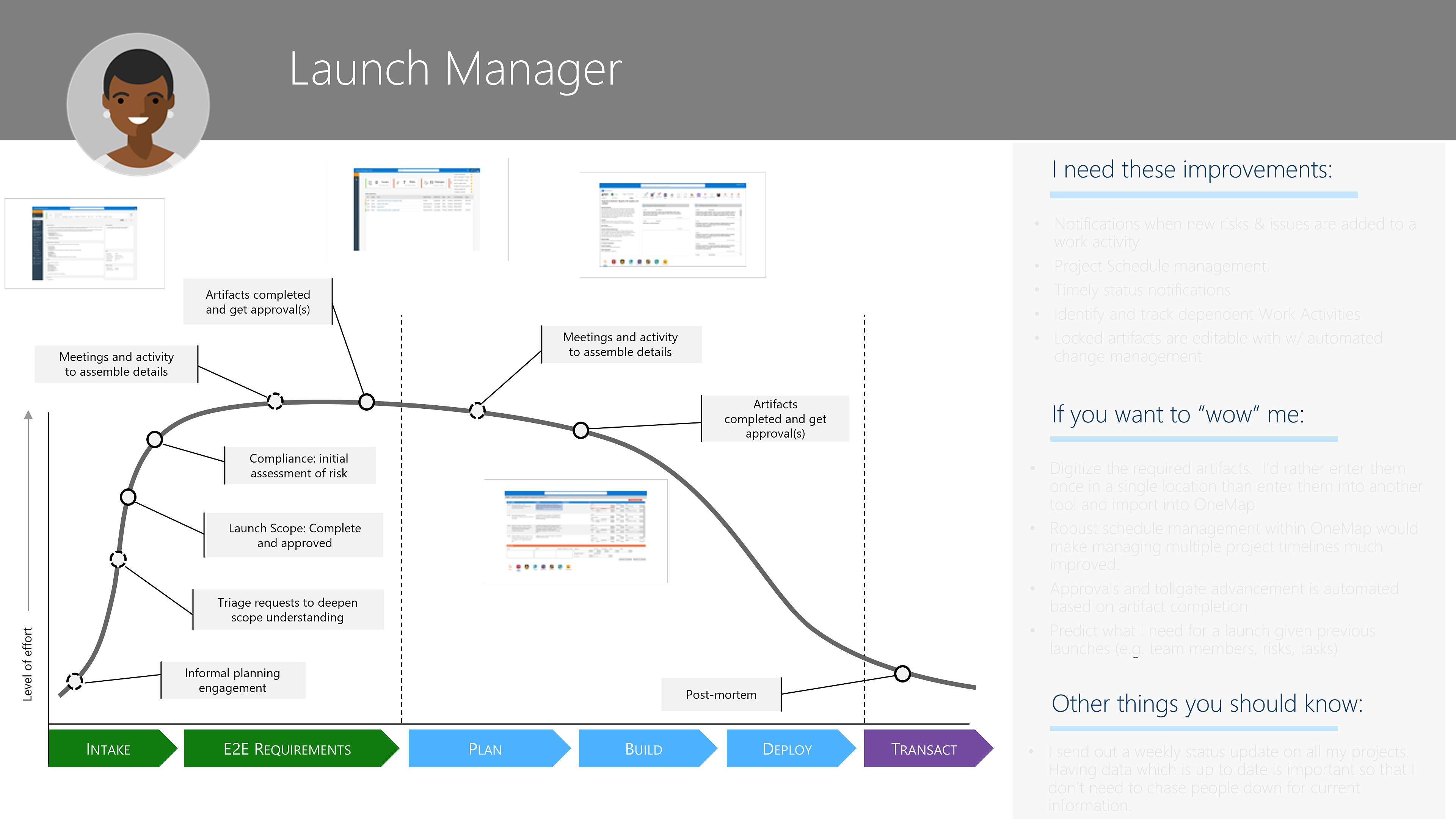
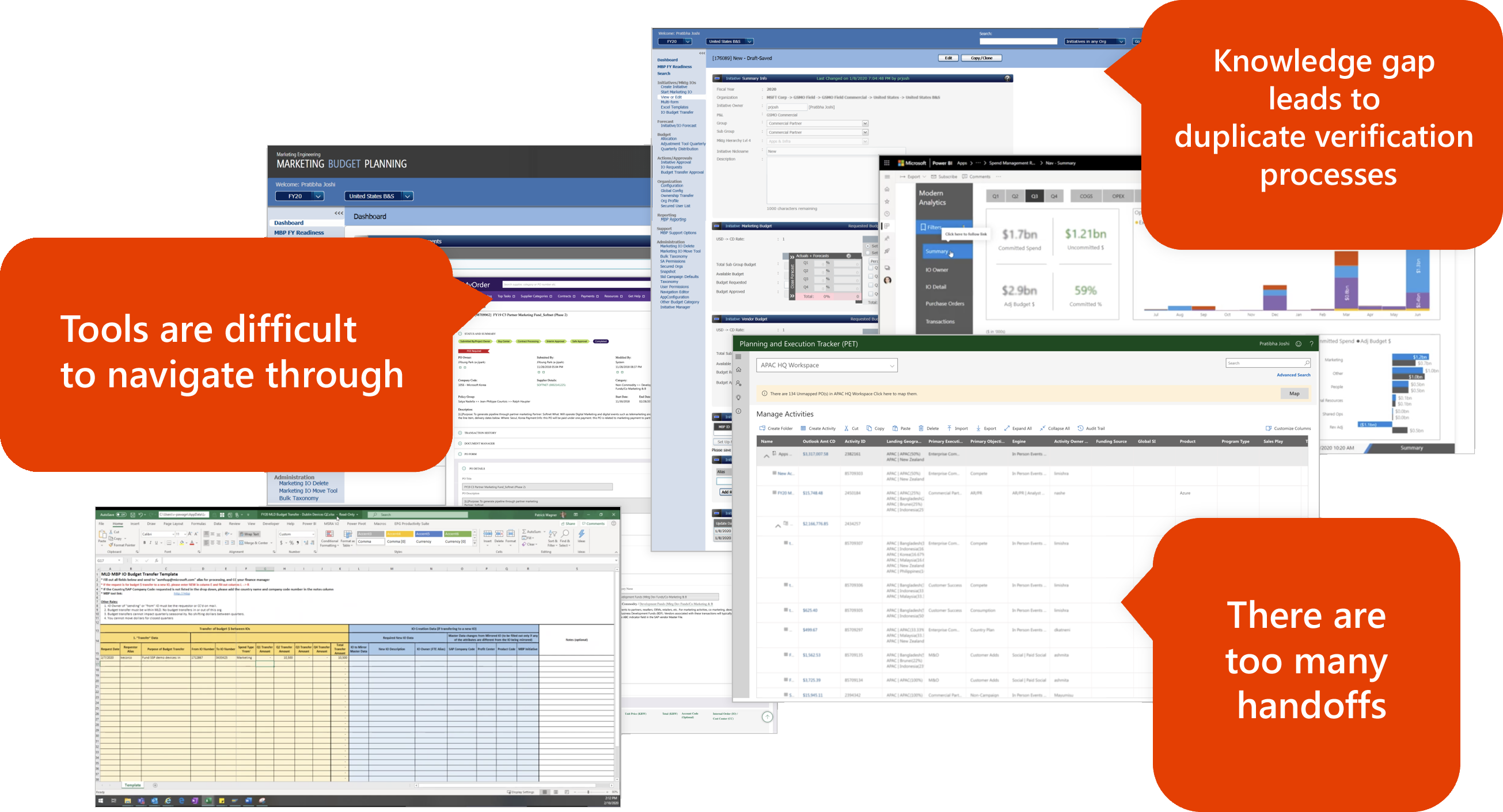
Launch Managers use ten different tools in line of their daily work. Those tools are difficult to navigate through and share information with other team members. Existing processes go through unnecessary verification steps and cause delays. I successfully collaborated with stake holders and team members, to streamline processes and consolidate tools to a platform that would provide an end-to-end solution for our clients.
Research, surveys, and customer feedback revealed the following pain points with the existing process and tools. Some of them are listed here.
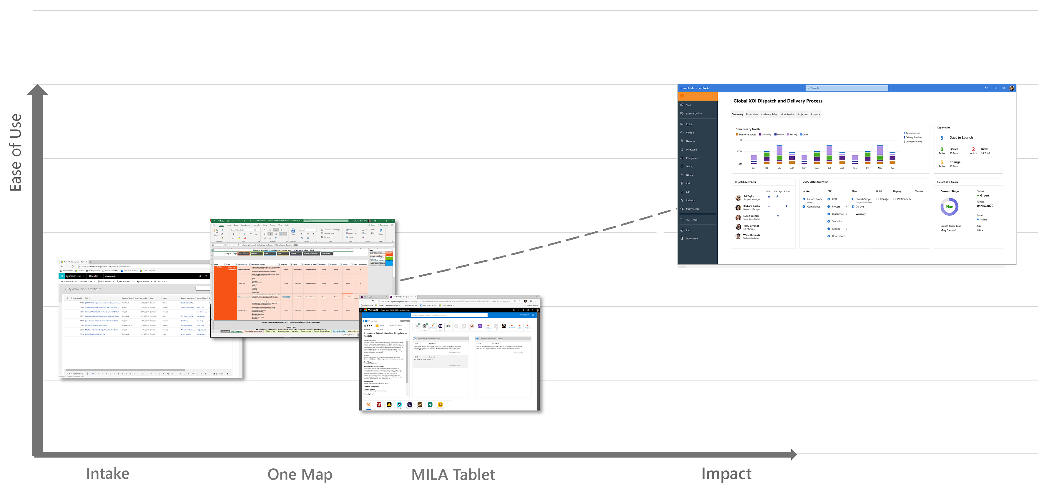
Once the product went to UAT, further user research was done along with Telemetry. One of the testing methodology applied was the HEART metrics.
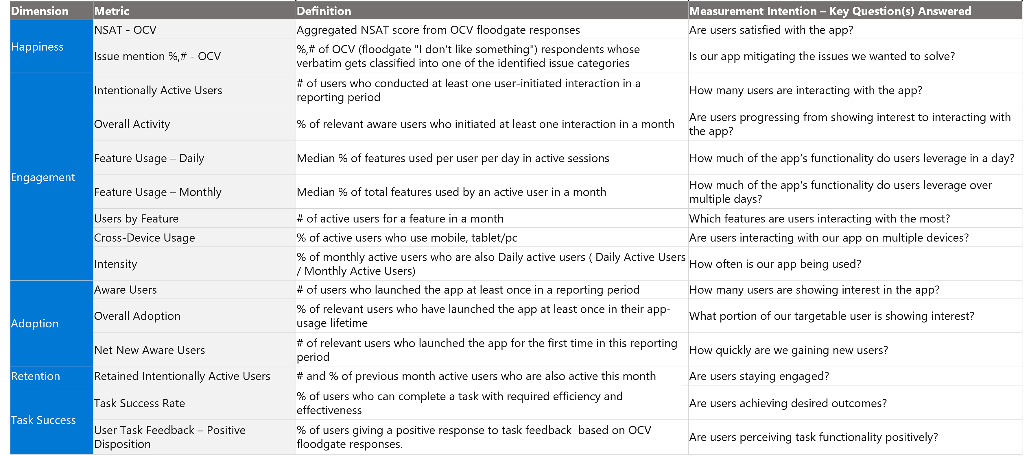
There were many other measurements as well. Some of those were:
The launch process goes through various planning, compliances, and approvals. The core aspect of a launch is divided into two categories: Continuous and PTD(Point in Time Deliverable). The continuous group were checks and balances that existed from the beginning to the end of each launch. PTDs however, were stage dependent.
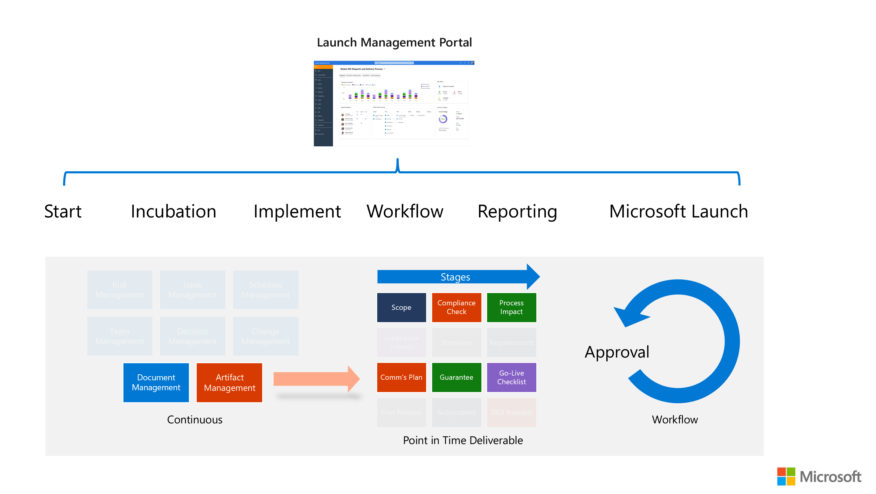
These two areas were most important and most challenging to transpose on to the new platform. Business rules around these were quite technical. What really made it complicated was the fluid nature of the business rules. The business team was in position of changing many of their rules surrounding the launch process.
However, I couldn't let so much uncertainty keep us back from designing. I focused on features we were certain and started building, so the development team can get their work done. By proactively leading and strategically focusing my efforts, I've been able to deliver projects ahead of schedule at an average rate of 8%.
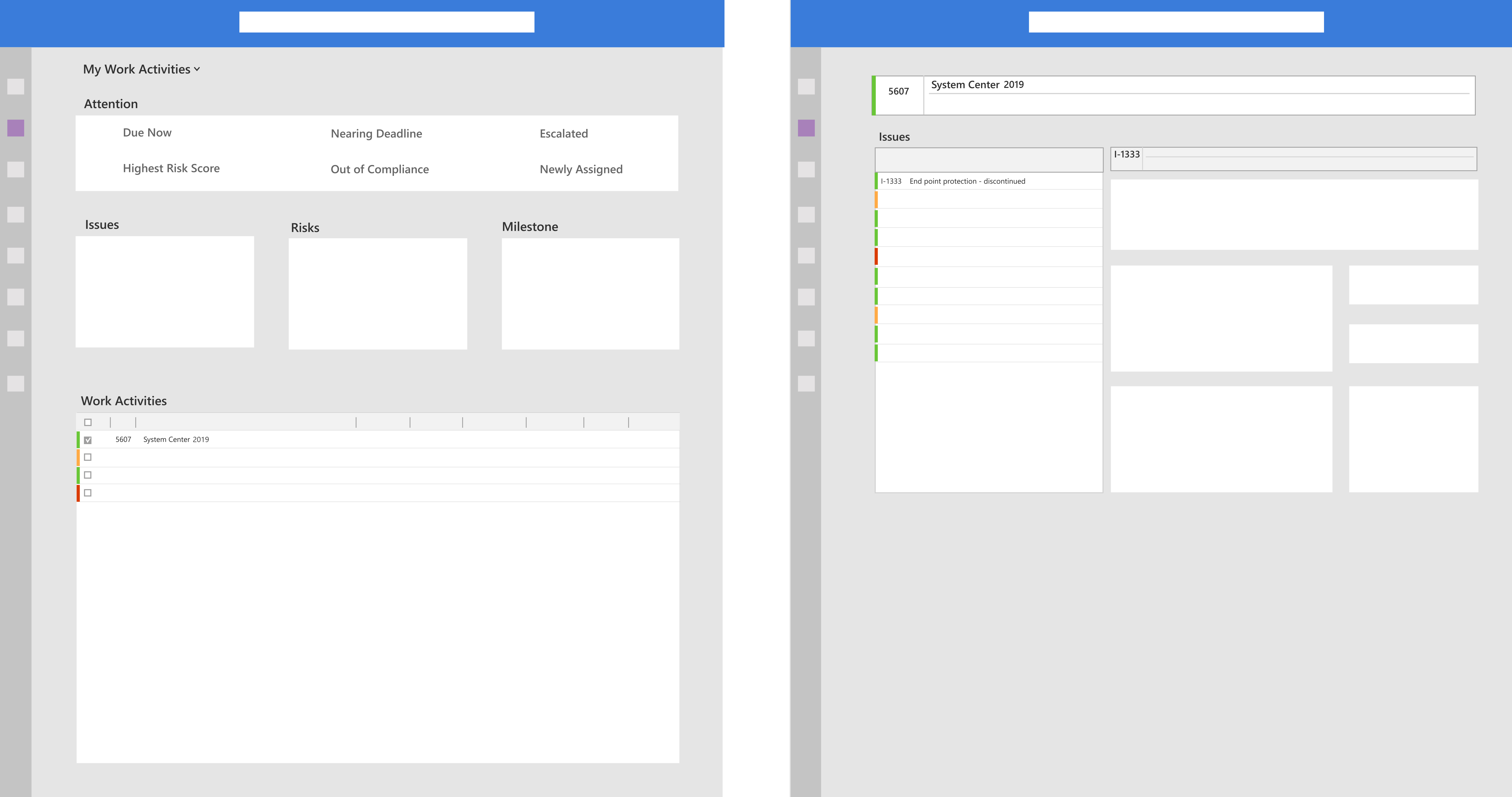
I sketched many ideas and brainstormed various possibilities with my product team and created low-fidelity wireframes and prototypes to discuss with our clients.
Functional consistency makes your product more predictable. Users know how an element behaves, and therefore will also feel more at ease to interact with it even on a page they visit for the first time. Visual consistency includes the colors, fonts, sizes, positions and other visual aspects of your UI which help your users cognitively identify and classify UI elements. A certain font color, for example, could be strategically used to help your users understand what they will get if they push a specific button.
I created many different components for layouts, inputs, grids, states, etc. Here are some of the examples.
Creating components such as the top navigation bar promotes consistency and speed. Once created, they can be applied everywhere and all of the children can be updated from a single parent component.
When I first joined the team, I created our own state items. About a month into this Launch Management project, I joined Microsoft's CSEO community and learnt that they had already created standards and components for the newly initiated Coherent standards for the entire company. All new web platforms at Microsoft are getting designed following the Coherent guidelines. Different from before, the new standard promotes simplicity and good use of white space.

The color palette below is resonant of Microsoft's new benchmark and produces a bright and cheerful mood. The darker colors are representative of the company’s corporate outlook, nicely balancing out the brighter colors. Data indication colors were frequently used on our mockups. These are a few of the color palettes we had used.

After creating the architecture and navigation flow, I started with the landing page design and a couple of key artifact pages. The challege was in bridging the two together. I suggested the following three tier approach.
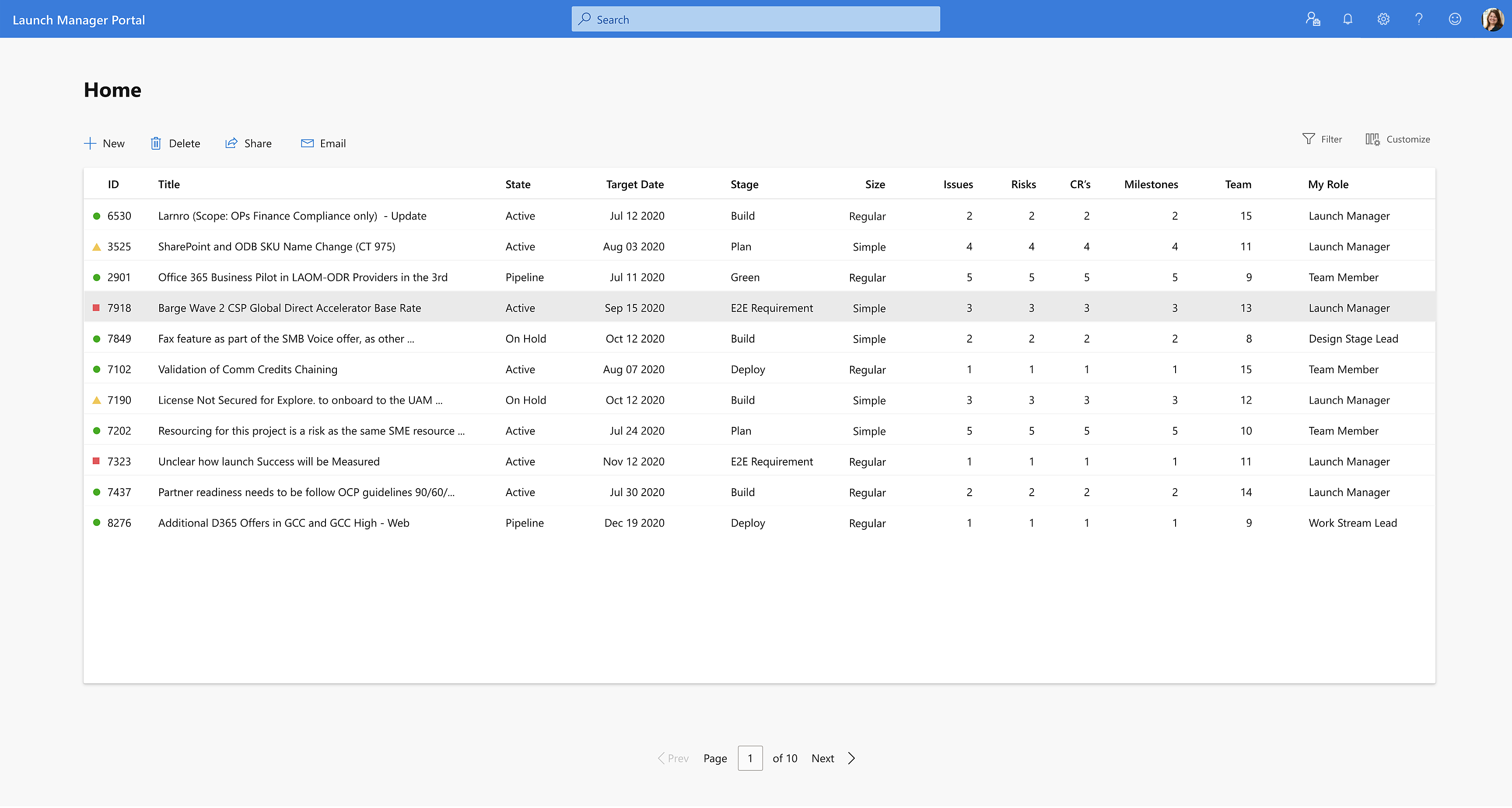
The portal is customized according to the user's persona. For a launch manager, the home page starts with a grid that displays launches specific to a user.
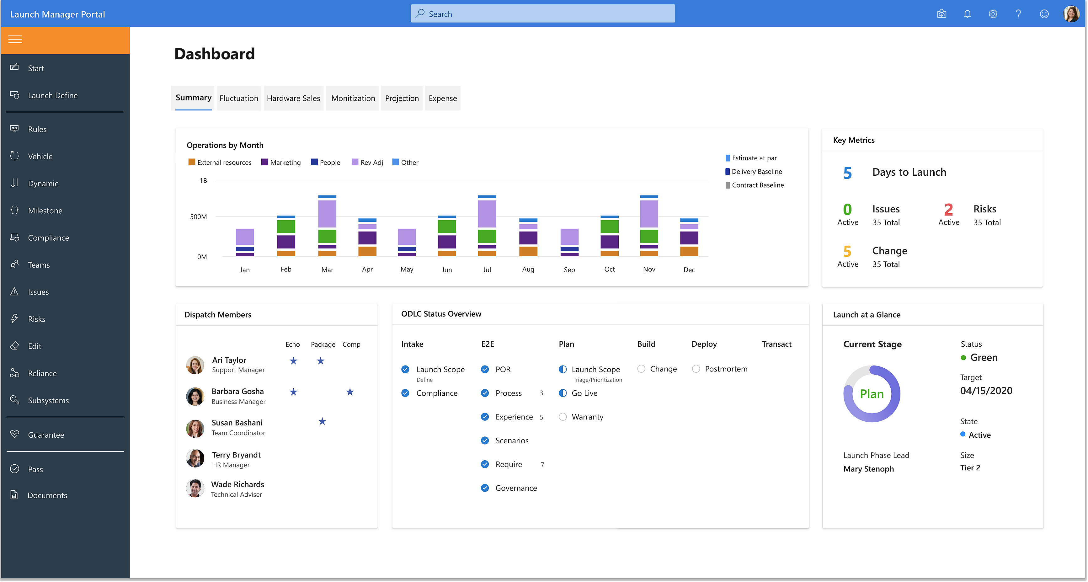
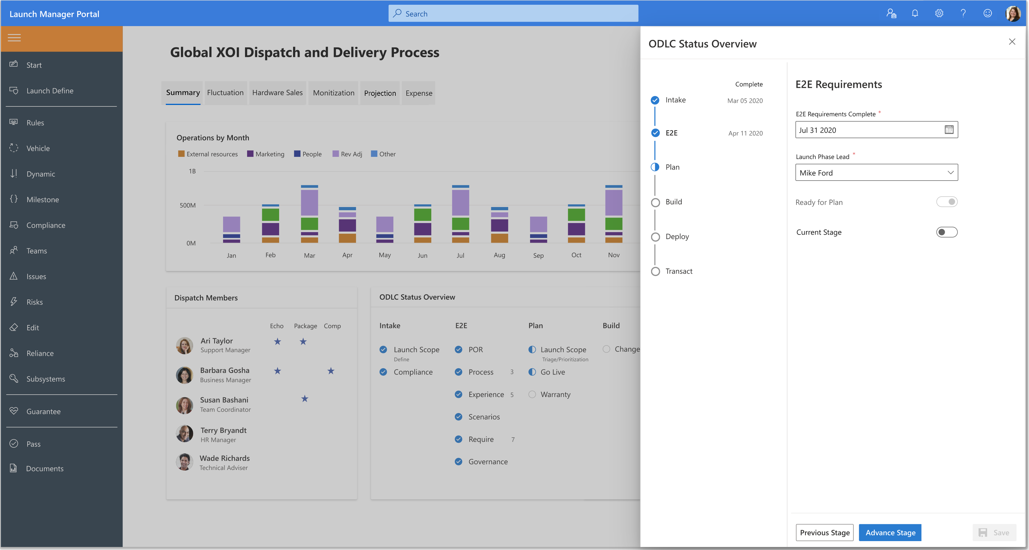
Here is an image of what the high fidelity dashboard looked like. As a starting base, I devised the project schedule, breaking down the project into milestones. Providing data driven launch process with displays such as these made amendments to the current UI for improved navigability and user experience. For the duration of the project I played the part of the following roles 1) User researcher, 2) UX/UI visualizer, 3) Project manager.
This dashboard holds two of the innovative ideas I had come up with. Each launch goes through six stages. Being able to properly keep track of the health and progression of an artifact (unique task within a launch) is vital. Through research, feedback, and creativity I came up with two widgets that wowed the customers.

Being able to mark, designate, and alter stages during the lifecycle of a launch was a must have feature for users. Here I used a vertical navigation control to allow users to view key fields, and mark the status of each of the stages.
At the initial part of a launch, key characteristics about that launch had to be defined. This was done on the Launch Scope page. An optimal number of characters people comprehend are 50-70 characters per line. That’s the ideal situation. However, that rule may not be best to apply on occasions when large font size comes to play, or other content need to fit on a page with limited space, etc.
Designs need to accommodate proper data sizes they display. Certain fields such as a drop down, might have a data size up to 15 characters. Larger text field sizes might have an average of 700 characters, and maximum of 3900 characters.
I ran queries to retrieve appropriate metrics from databases to create real life mockups. Fields need to be properly sized so users can view relevant data at a single glance without having to scroll if at all possible, and with minimum number of clicks.
In one example, two of the artifacts and five of the data fields were hardly being used. In another instance, I found out 14 of the 40 fields could be grouped better.
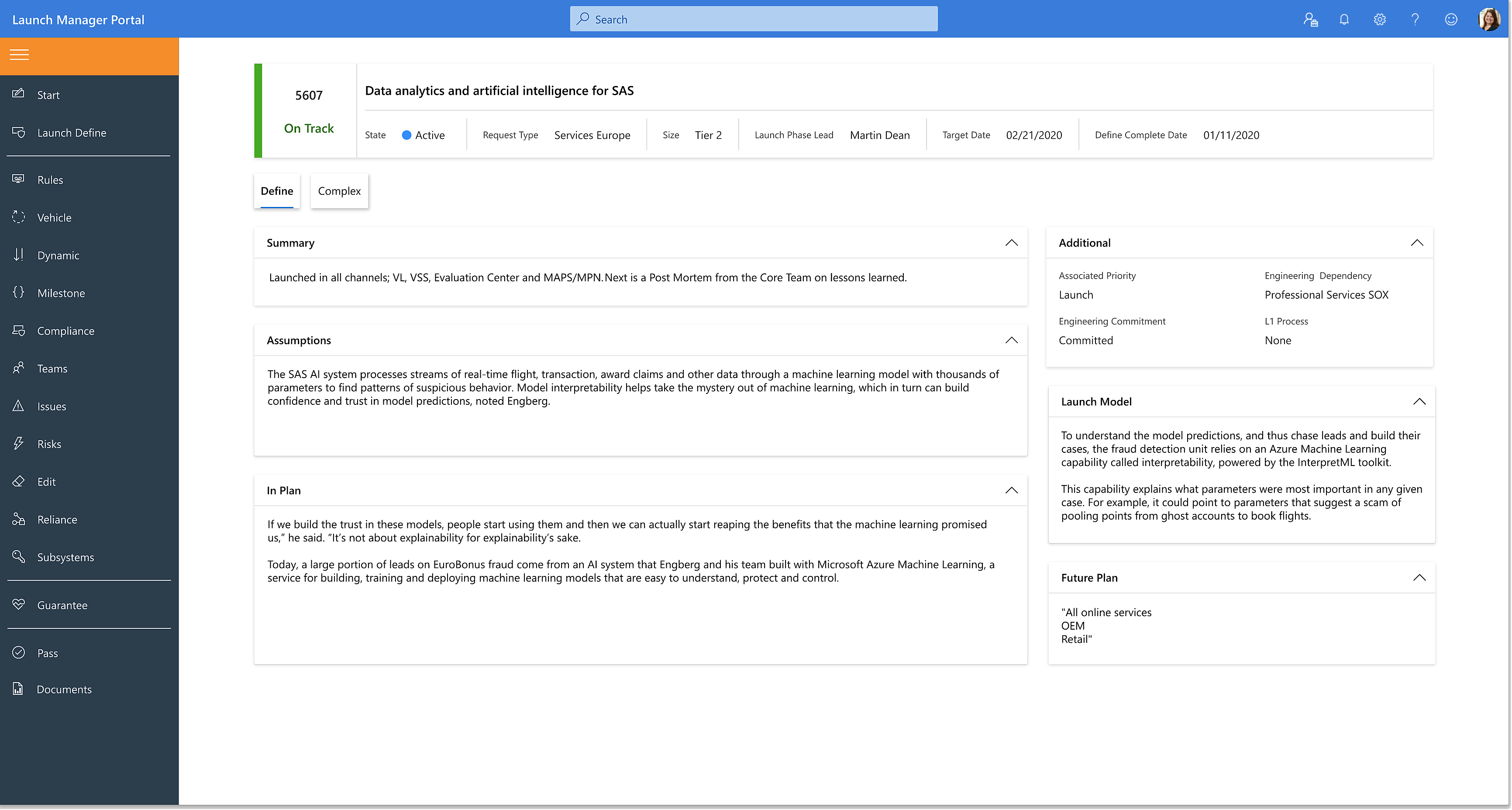
The launch platform was heavily data driven. I created grid pages like this, which allowed the launch community to get the metric data they needed for analysis and processing.
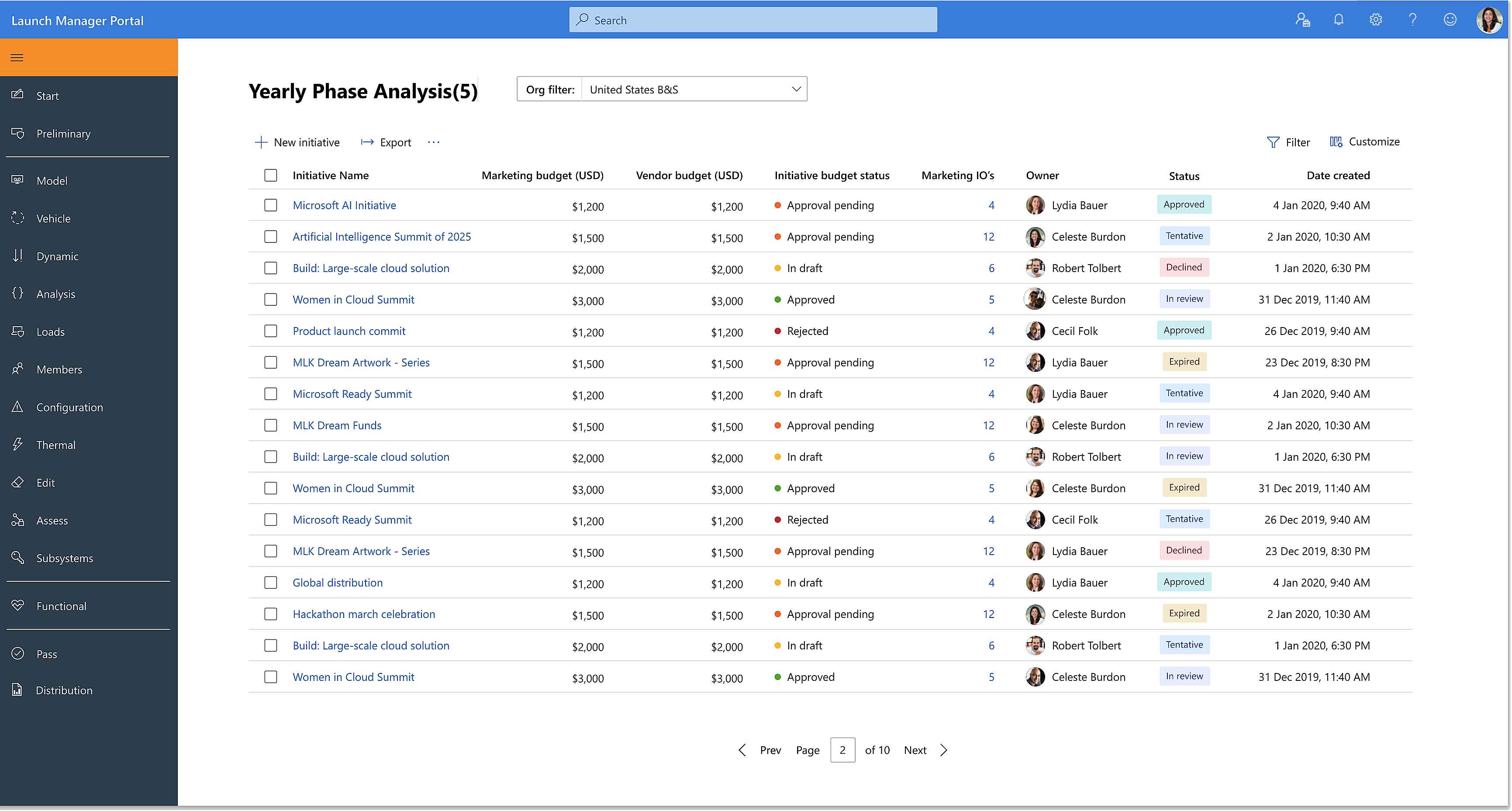
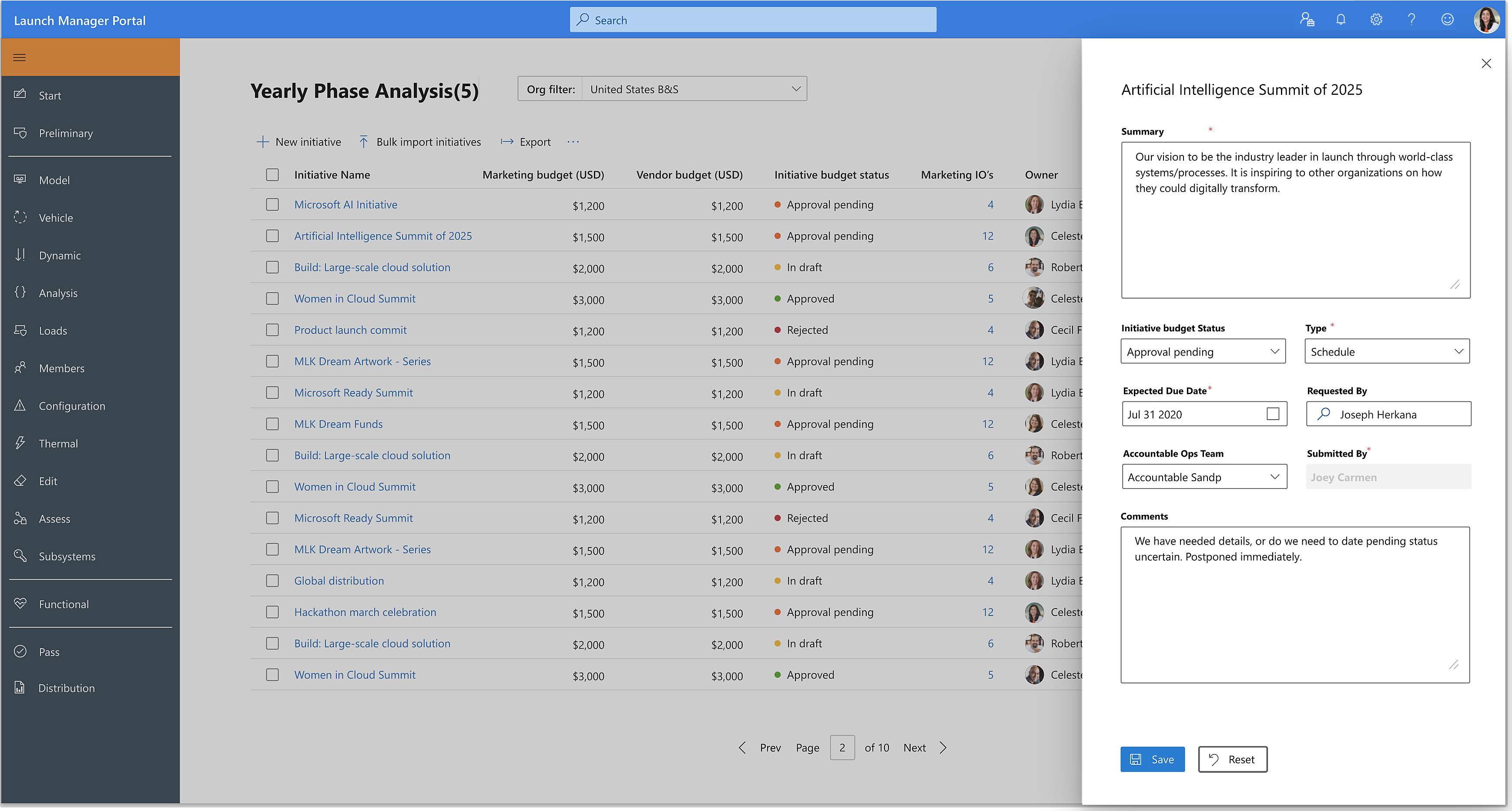
Sliding panels simplified the user experience. With panels such as this, users were able edit and perform tasks at a deeper level.
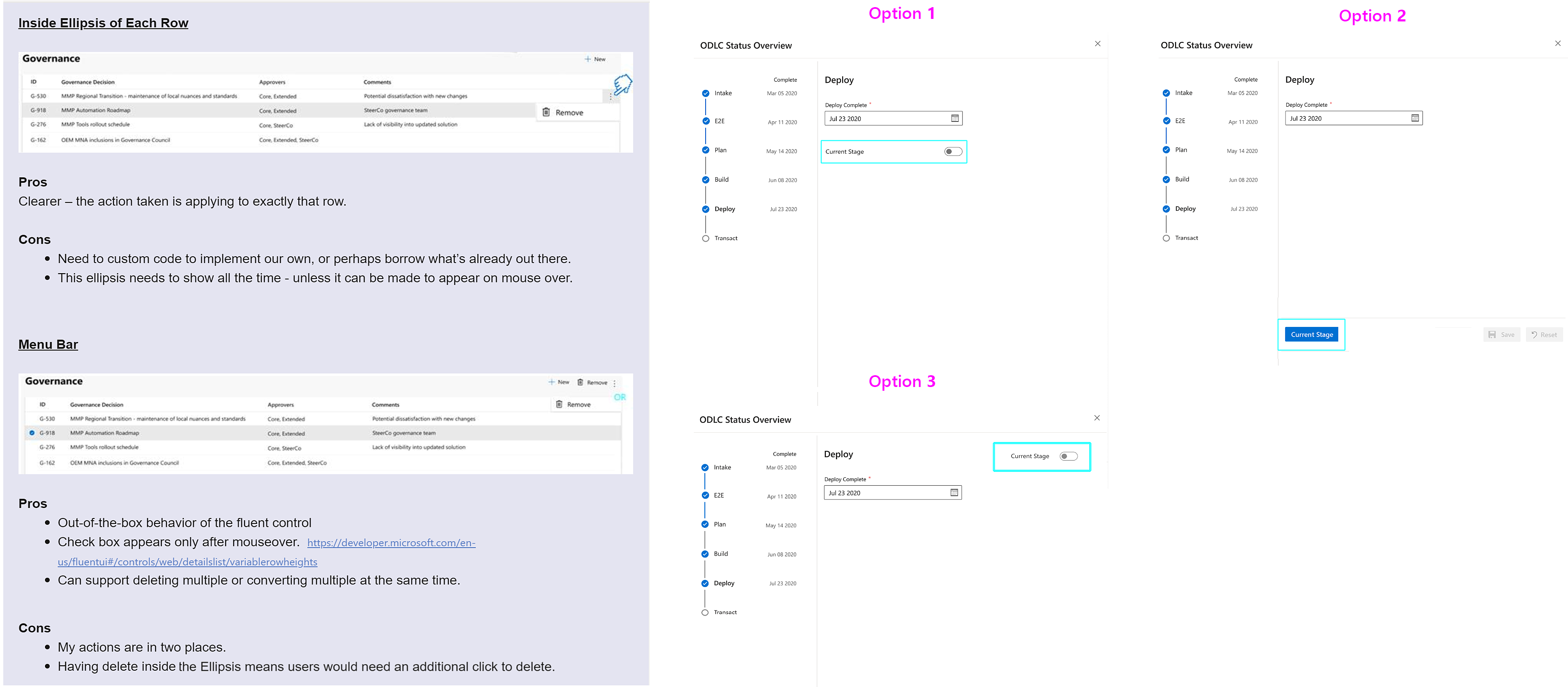
When disagreements arise, the first immediate action I take is to see from that person's point of view. I validate the individual and the view pointing out how it'd be true in specific situations. I then follow with reasons why the situation is different, and share several solutions - labeling each of them: 1, 2, 3. I share my solutions with a list of 1) pros and cons 2) references along with my reasons.
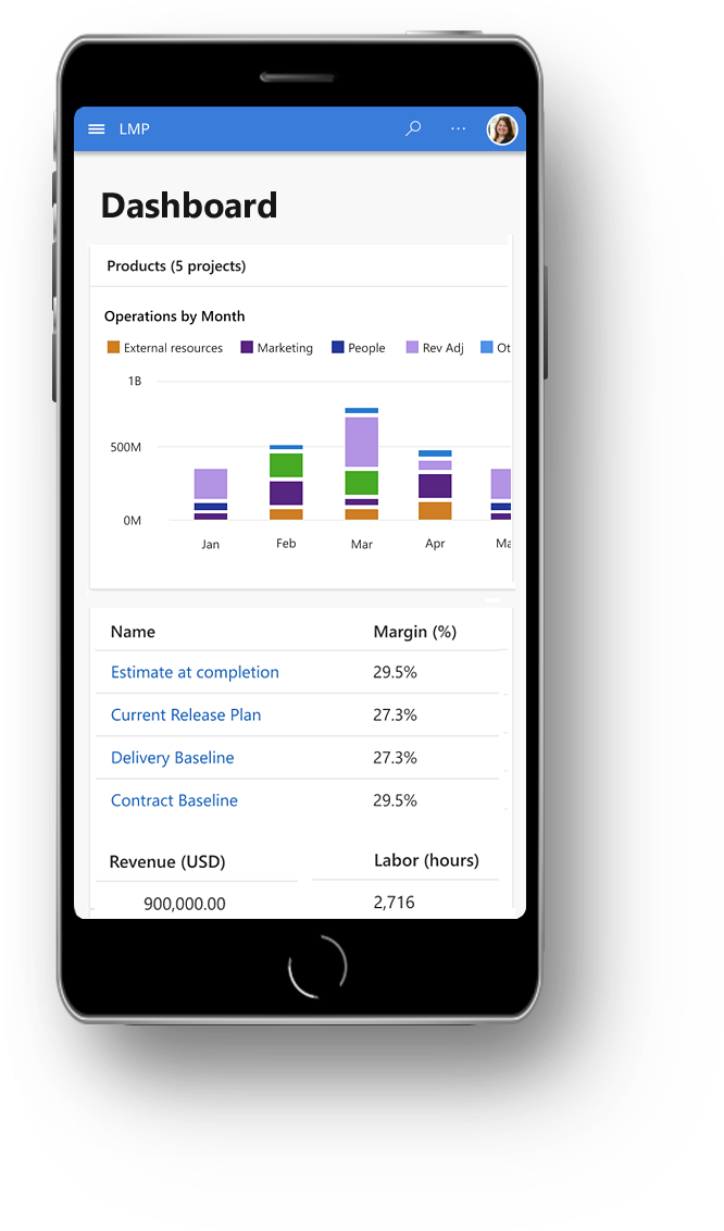
Due to the number of features and complexity of the platform, we started with the web version first, then went on to mobile solutions. All of our designs were made for web, mobile, and tablet. Here are some of the mobile versions I designed.
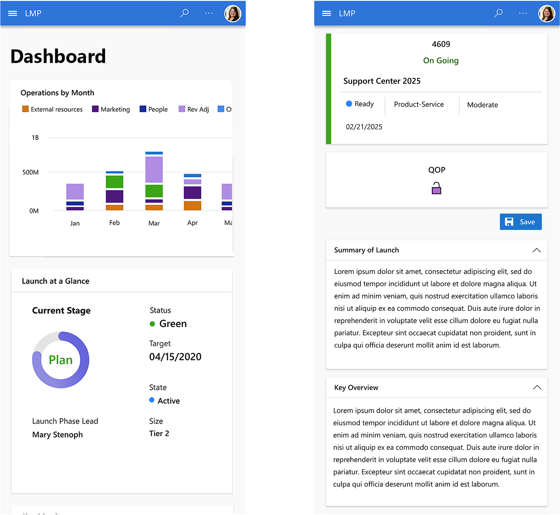
The platform is in production. Stakeholders, users, and my team have been most delighted with the outcome. This was a true win situation for everyone.
Made our product deliveries faster and easier as the best-in-class launch management practice.
A large number of tasks have been reduced.
Became centralized and standardized, with steps to ensure compliance in all areas.
It was automated with processes that use AI and ML.
By the middle of 2024 it was used for 70% of Microsoft’s launch volume, with 1,500 users on 5 teams representing $80B in revenue and continued to grow.
The next step for me is to expand the design to accommodate many different personas who are involved in the launch process. I drove the user experience design from the concept stage, all the way up to now. In each sprint, the main driver was to identify the most important features for that sprint, and deliver quality products in a timely manner. During the capacity planning, I kept the business and organizational goals in mind, focused on the areas of value, and on simplifying the user experience.
I am passionate, yet pragmatic when it comes to designing. On this project, like others, I thrived on analyzing customer behaviors, identifying opportunities to solve problems, and creating innovative customer experiences in a fast-paced and collaborative environment. My calling is about working strategically with designers and other senior leaders to create and deliver big, visionary and customer-focused experiences.
More than ever I learned the weight of the voice of customers and importance of doing the job well and correctly the first time. As the saying goes "Measure twice and cut once." At the same time, there's no substitute for Bias for Action. I don't want to overly analyze but build momentum, take risks, and make corrections along the way.
It was sad to hear how the engineering team's previous platform development was disapproved by the launch community. I don't know all the details that contributed to that failure…perhaps because it was "quicker, cheaper, we always did it this way?" Somethings are harder to redo than others. That made me even more careful in listening to the voice of the cutomers.
Some people place a negative connotation to the term, "MVP". I don't see it as "Minimum Viable Product" - as a way to deliver less and get by. I see it as "Maximum Viable Product", and put emphasis on identifying the most impactful features that can be delivered to our customers within a given timeline. Not as a way to check off a given list, but to delight our customers.
Clients would say, "Lets have this and add these other new features." Amidst many conversations and directions, it's easy to mistaken clients' "Nice to haves" for "Must haves". It's important to gain clarifications on these from stakeholders.
What I've done with this project will stay with our customers and this company. What I will carry with me are, what I've learned, experiences, and stretch marks toward my next project and onward. I am thrilled and look forward to creating more fun designs, innovative features, and WOWing my customers more than ever.